Things to Consider: biological history of cities; what is the meaning of a building; degradation; gentrification
August 18, 2019
Overall, I really enjoyed this reading. I now think about cities and human environments so differently. My favorite sections were the first three.
Environments sometimes take on a life of their own. The most interesting topics were related to how spaces are influenced by people (how they may possibly degrade) and gentrification.
I also enjoyed how the third reading framed landscapes as living beings. The examples about the islands of New York having a dark history of being a place or sick and homeless people to being an animal sanctuary conceptually intrigued me.
Click the link below for my full notes and thoughts!
Barley, Nick., (2000) Breathing Cities: the architecture of movement. Birkhäuser.
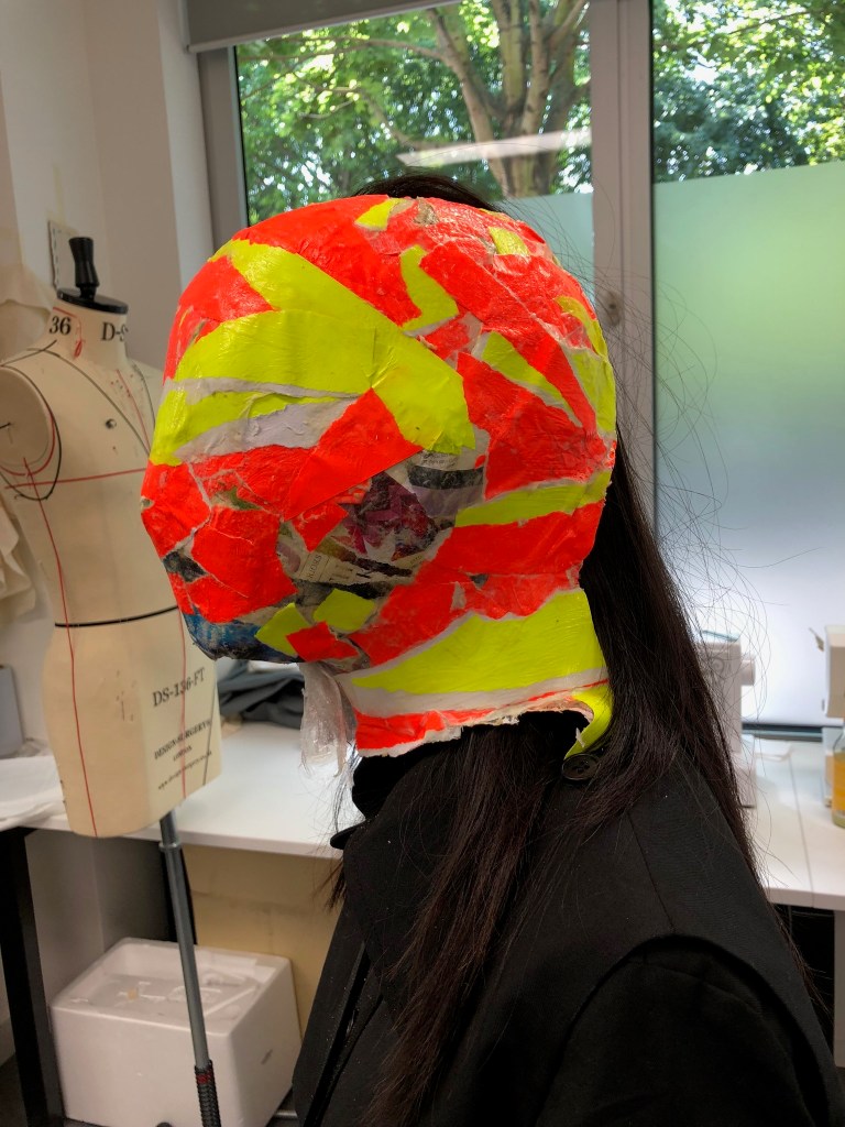
I was really excited to create this short video clip. Integrating a variety of different sounds helped with the overall tone and mood. I wish I had gotten more poses and angles, but it was raining and the mask is very fragile, so that was not possible
If I were to move forward with this, I would definitely make more masks and capture more actions and angles.
Overall, I’m happy with how many different avenues I’ve explored. I wish I had had this mindset earlier in the process, because it has been so freeing.
I’m starting to view fashion in a very different light. I’m interested in exploring fashion from a more, “immersive” angle. I have been reading the V&A’s book on Alexander McQueen, and I think one of the many factors that made him so successful was the fact that his shows were such a sensory experience. For example, his Joan of Arc (1998) collection included moving lights, fire, and music. A lot of his work was a performance. I think including these aspects would make my personal practice evolve and engage more viewers.
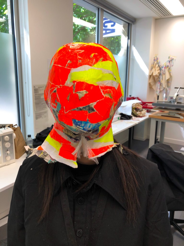
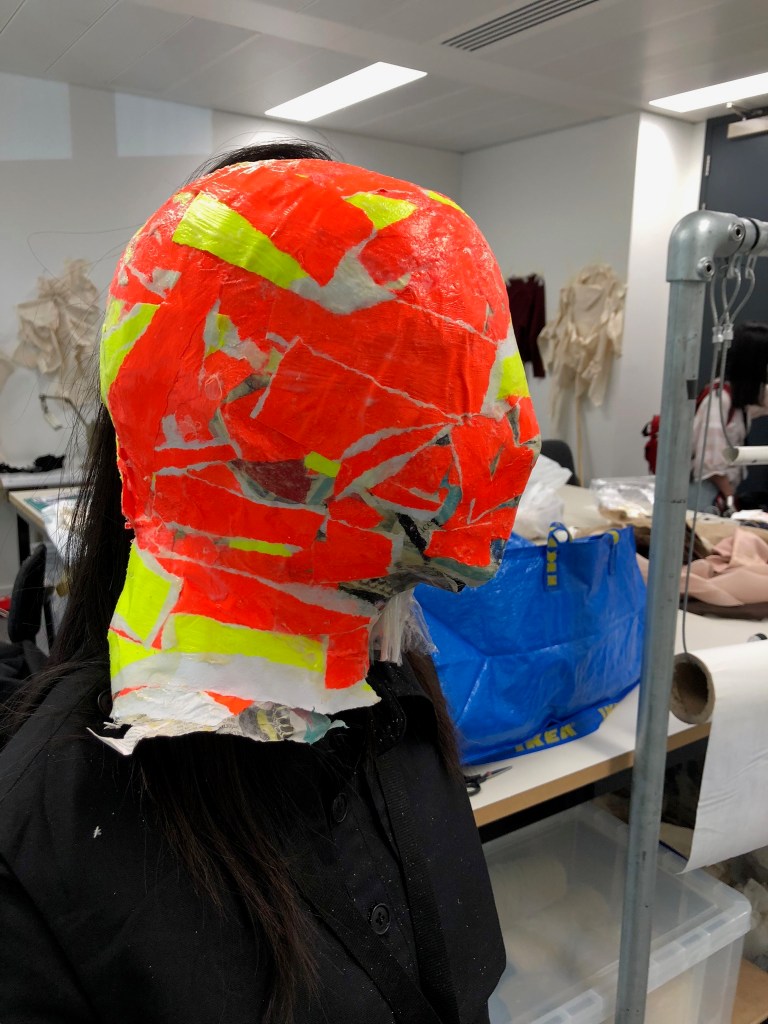
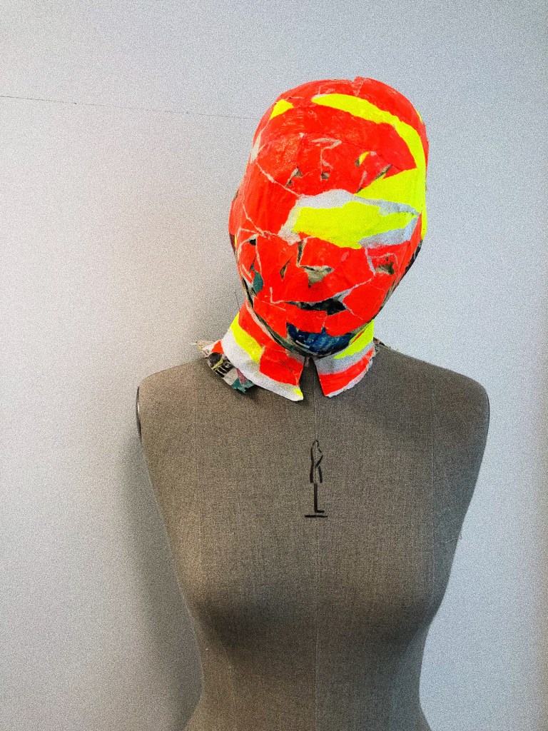
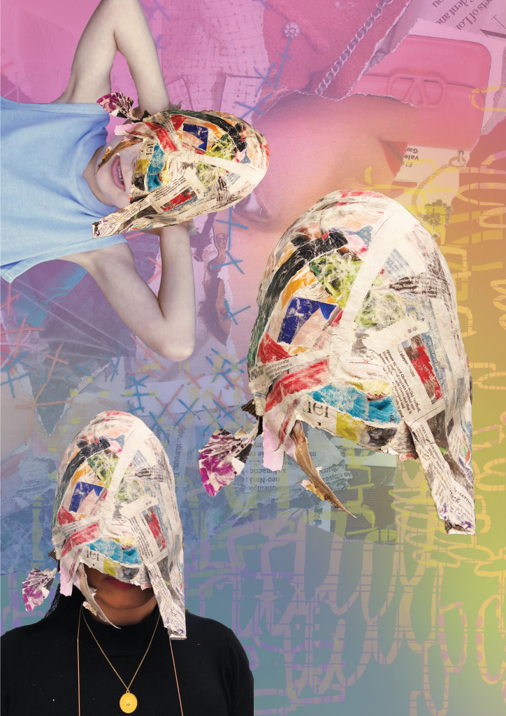
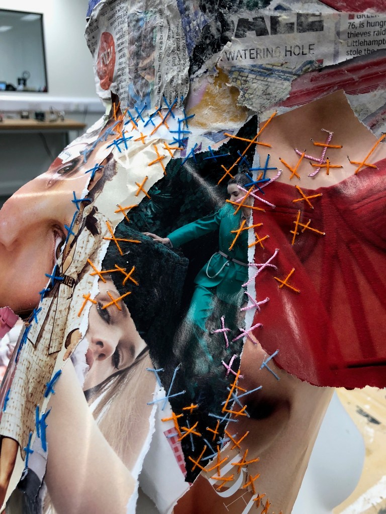
Today I started re-collaging over one of the original masks that I didn’t care for at the beginning of my process.
I really regret to say that I threw the scraps of the other mask away after I used it in my attempts at digital collage.
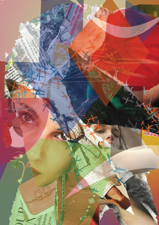
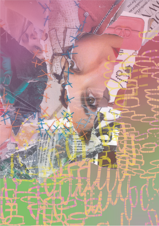
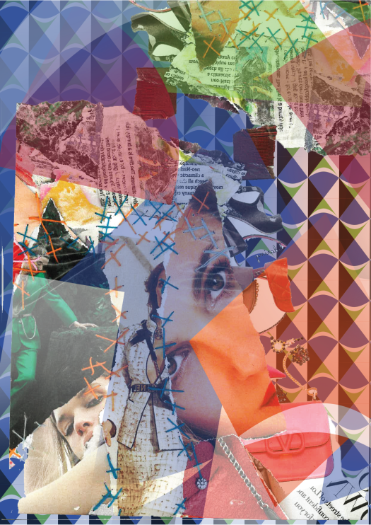
But… today I was thinking about the piece I had seen at the Tate Modern by Romare Bearden and how he has influenced my work. On my digital croquis I was playing with scale (like he and Nick Cave do) and color. I thought it may be interesting to take some of these elements back to the 3D realm. I started collaging over my mask with very loud colors, and it definitely created more visual intrigue.
As I was ripping up my papers, I was thinking about how Bearden took his reality (as a black man living through the Civil Rights Movement), and used collages as a method to re-imagine how life could actually be and communicate his reality or story.
I was listening to the sound of the paper ripping.
I was thinking about Olafur Eliasson’s immersive exhibition that I had seen (how he utilizes all of the senses).
And this idea that media bombardment is not just a thing you look at, it’s a space you’re in. It’s where we live, how we live, it’s what we smell, what we see, and in a way it is part of who we are and how we live.
And this all culminated with the idea of creating a short clip of a person ripping the mask off themselves. It is kind of symbolic in a way of somebody freeing themselves from this media bombardment. In my group we talked a lot about what our, “resolution” is and we decided that we wanted to promote this idea of critical thinking when the public is viewing advertisements.
So I think in the video I want to have my model pick up a newspaper after she rips it off her face, and she will read the newspaper and look content and less serious because she will have this newfound knowledge.
This way, the video clip is me using my materials and my subject to re-imagine how people could live and be. (perhaps my model will relax and slouch a little when she is reading the paper).
Note to self: think about the how the audio will change at this point in the video.
Playing with Scale and Color Digitally
I’m not sure yet if I love or hate the hair showing through the slit in the mask
I’m still exploring the idea of identity and media bombardment as I create collages. I’m liking them and also regretting having torn apart and trashed my original masks.
This whole assignment is giving me crippling anxiety. I am such a craft/product person, and it is very foreign for me to spend so much time researching. I have found the time valuable, as I have researched so many different artists and concepts, but not being able to quantify all of my work with a well-made product is driving me crazy.
I do, however, feel like my visual research skills have developed immensely.
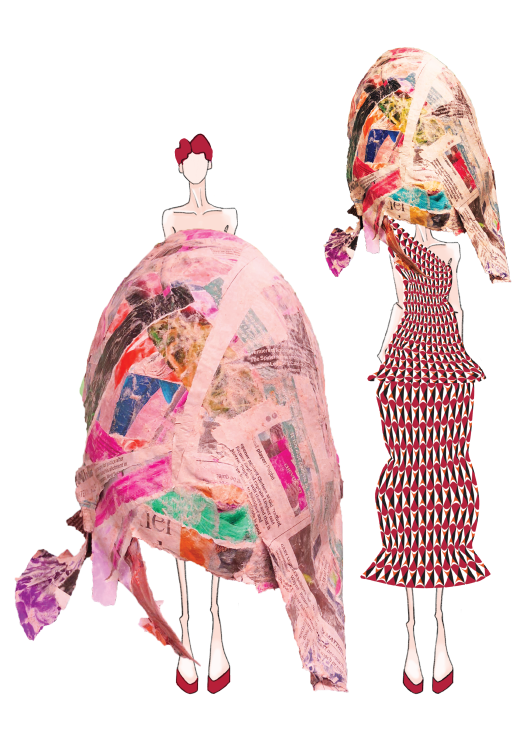
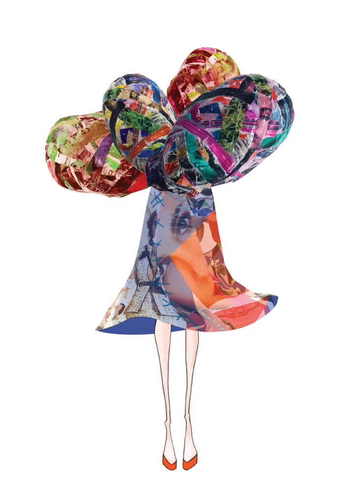
Here are some pieces I’ve made. I don’t know how, “realistic” they are, but I think they address my concepts in a more figurative way than the original masks did. I also think there is more room for interpretation (which could be good or bad).
I was attracted to this exhibition because there were a few pieces which used collage as a method of creating. The technique of collage was first called paper collé in French (glued paper). It originated a century ago.
The artists in the exhibition (Man Ray and Joan Miró) embraced the surrealist idea that unexpected combinations can have a certain power to them.
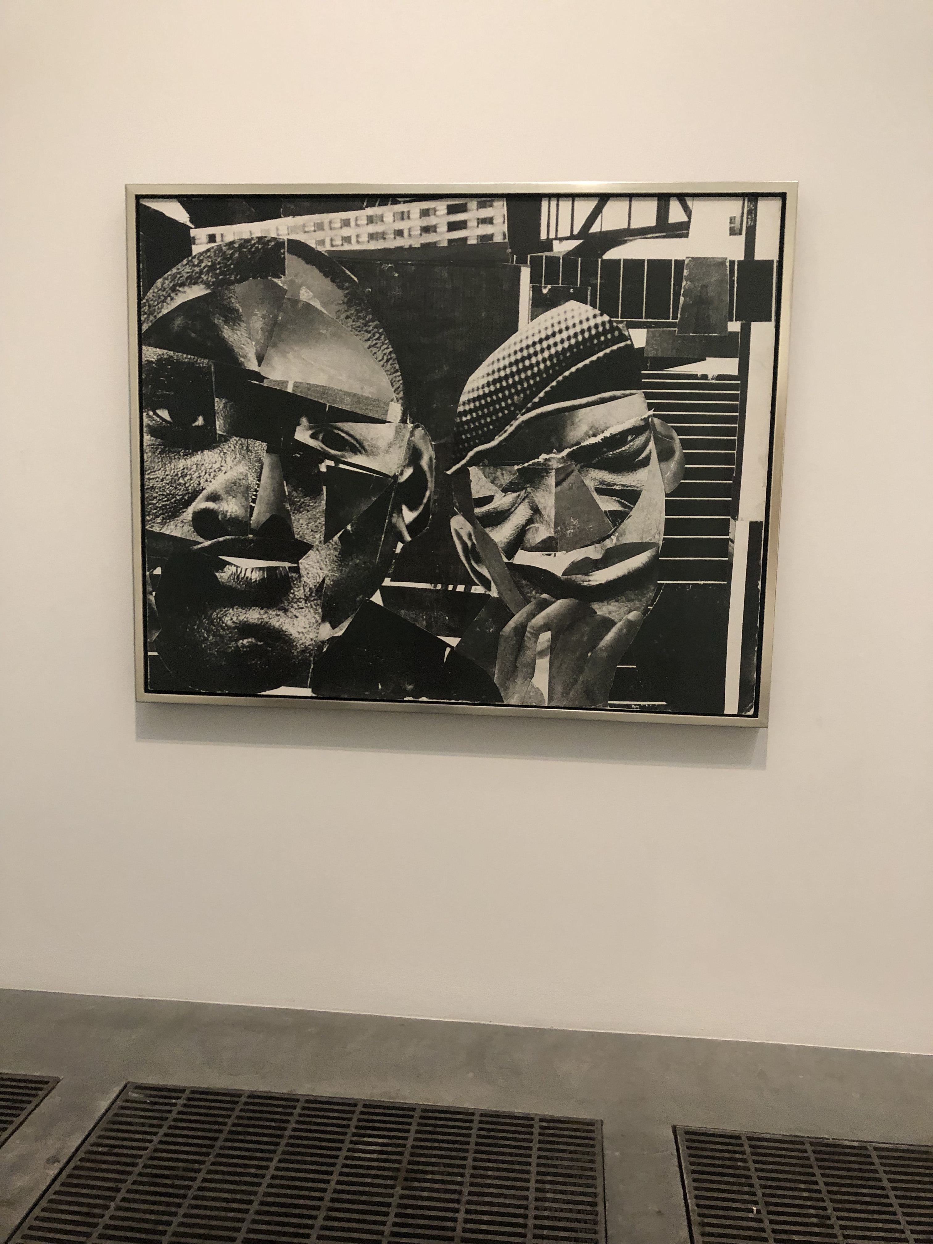
I was particularly inspired by Romare Bearden’s work, ‘Pittsburgh Memory’ (1964). He used collage as a method to respond to the Civil Rights Movement in the United States. With theis medium Beardden could, “invent new scenes using existing images from magazines, creating alternative representations of African American experience to those offered by photojournalism and Advertising” (‘Materials and Objects’, Tate Modern, 2019).
Pittsburgh Memory by Romare Bearden (1964)
I was very attracted to the scale of this piece. Usually collages seem to be a fairly standard size, but when enlarged the impact is so much more strong.
Also, I liked how Bearden took what was already there and completely subverted whatever the original meaning was to share his own messages and ideas.
I regretted not seeing this exhibition sooner, because it gave me so many ideas and inspirations around the medium I had been working with. I am thinking about ripping up my masks and using them to collage (maybe scanning them?) In Illustrator I could play with scale, color, and placement more. This may make my print explorations more cohesive and interesting.
I was looking for inspiration on color and patterns during this trip. I was waiting to get into the Olafur Eliasson exhibition for a few hours, so I decided to meander around the galleries.
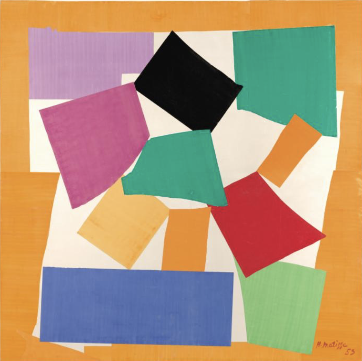
The first Gallery I looked at was the “Start Display” because it addresses color. I found Matisse’s work (The Snail) very interesting because it heavily focused on color placement.
Henri Matisse, 1953, Photo taken from the Tate Modern Website
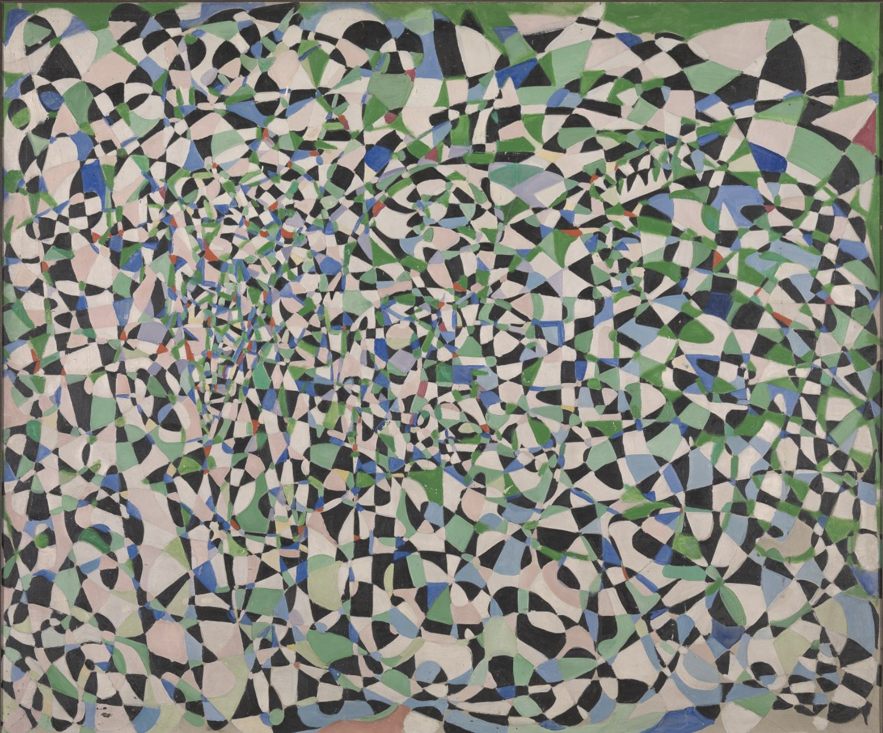
I also enjoyed Frahrelnissa Zeid’s abstract painting. She used swirling and crossing lines to created a kaleidoscopic effect. I think the shape, movement, and pattern are very relative to what I’m doing. This is most definitely visually bombarding and intrusive.
Fahrelnissa Zeid; 1950s; Photo taken from the Tate Modern Website
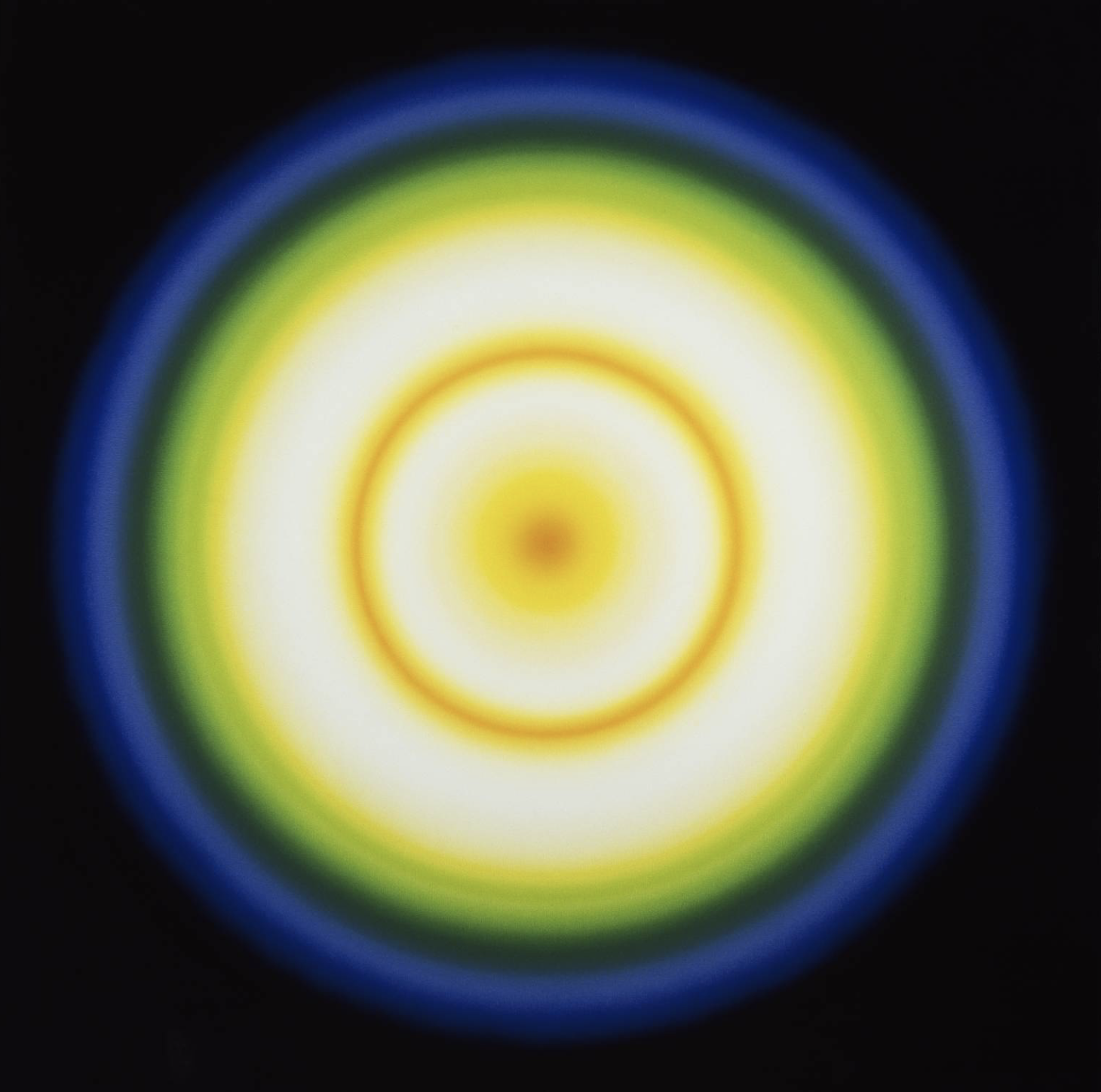
The final piece in the gallery that inspired me was Peter Sedgley’s work (Color Cycle 3). I found his work very hypnotic and somewhat jarring. The exploration of light used in conjunction with color was effective and beautiful.
I met with Lee and we talked about why I hated what I was working on, and why I was bored. I think overall I jumped at the chance to make one of my first Ideas, and it was not fully informed.
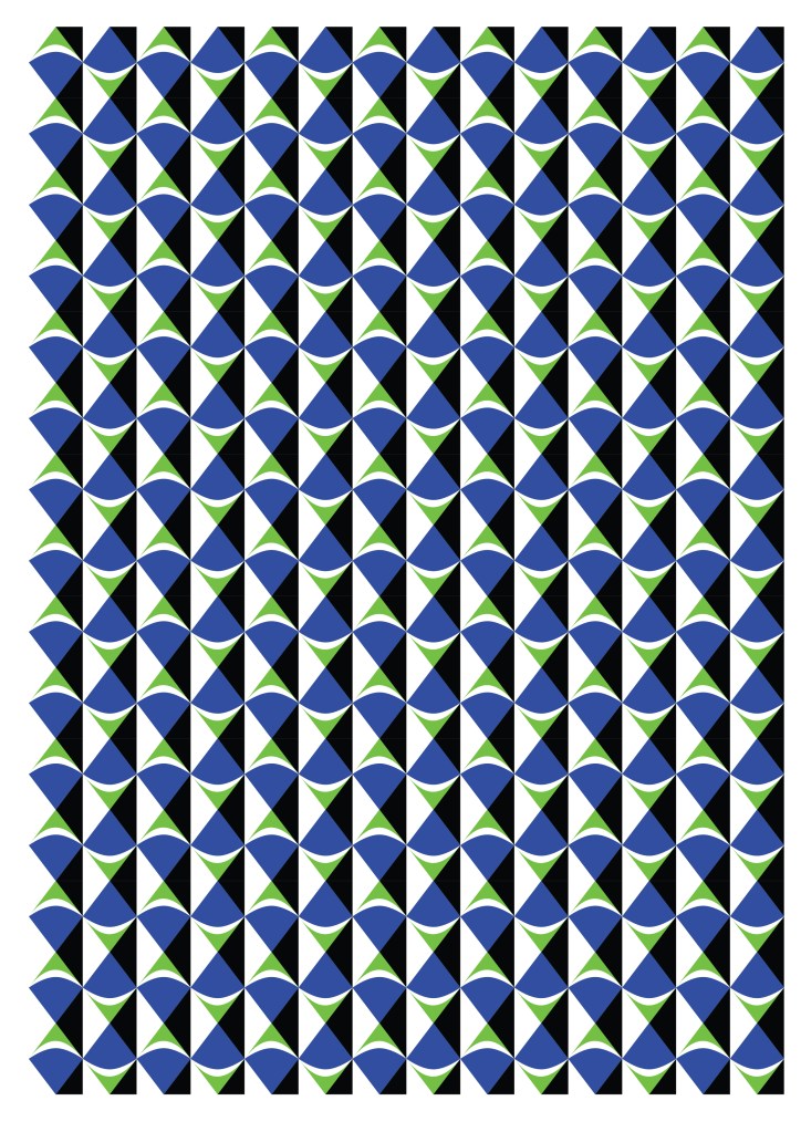
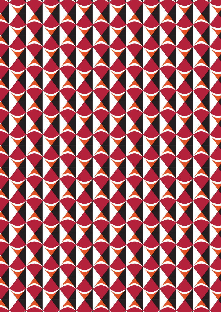
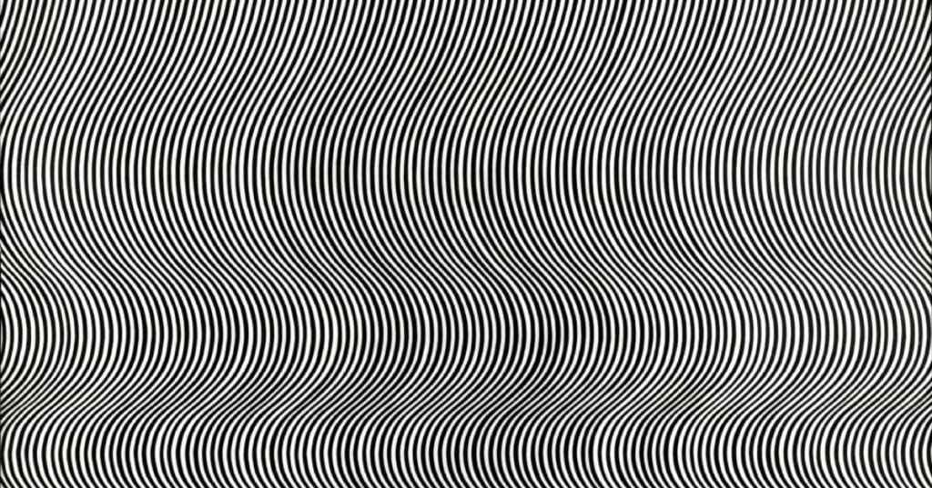
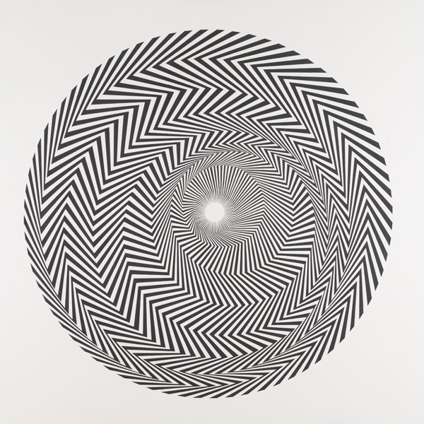
So I started thinking about other ways to visually bombard viewers. Here are some optical prints I made: If you enlarge the blue one and stare at it long enough it actually does move! These were both inspired by my investigations of Bridget Riley’s work in Optical Art.
Inspired by Bridget Riley
Inspired by Bridget Riley
This got me really excited about prints and print mixing. I thought optical illusions and overbearing prints could cause the sensation I was looking for.
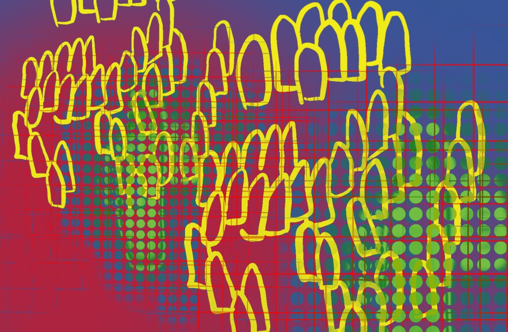
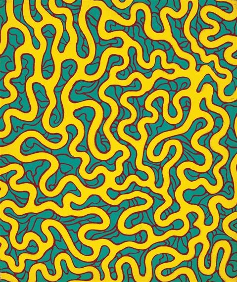
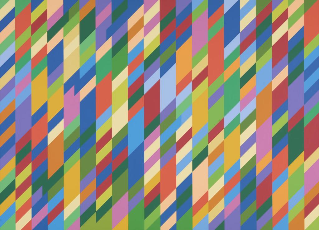
I continued making some prints inspired by artists and designers I was researching. Here is a piece inspired by Yayoi Kusama’s Phallic Chairs. It is not a perfect repeat pattern like the former ones, but I really enjoyed making it as well. While I was watching a biographical movie on Kusama, I started subconsciously doodling motifs.
I’m not sure how this will all fit together, but I’ve planned a trip to the Tate Modern to look at other artists and hopefully get some more inspiration.
Yayoi Kusama and Bridget Riley- patterns, shapes, and prints
“From the Point of View of one who creates, everything is a gable, a leap into the unknown”
Yayoi Kusama
My manifesto work has taken a new and surprising turn. After some thought and research, I no longer think that the masks are suitable. They are a bit literal, and I have found so much more inspiration from other artists, who use different methods to overload the senses and convey the ideas that I want to convey.
Advertisements are ubiquitous, bombarding, visually assaulting, and they attack the senses. It seemed a bit to conventional to translate this into a mask, so I have shifted gears.
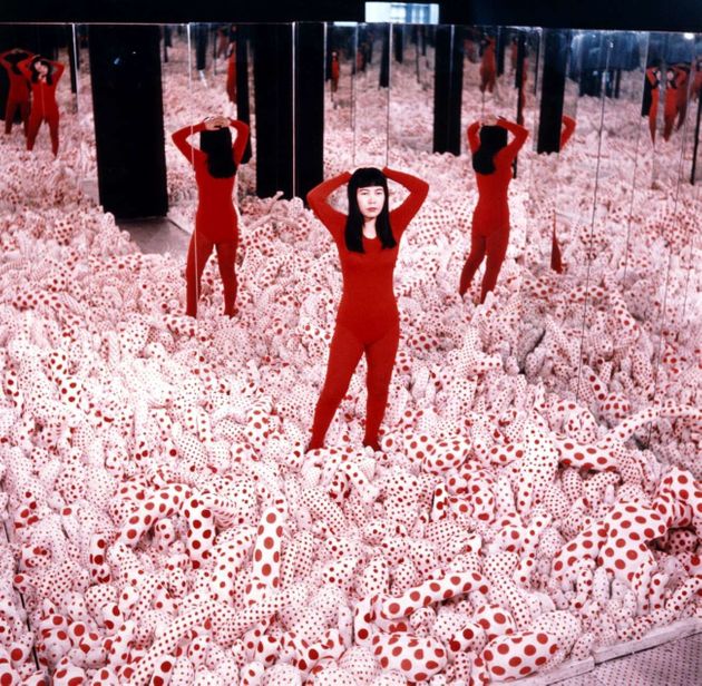
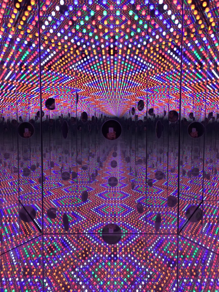
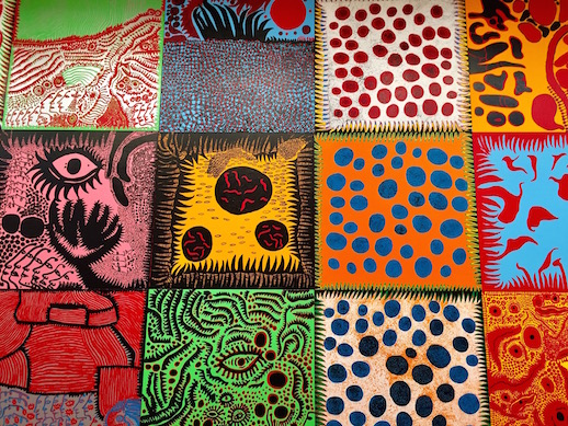
Researching Kusama has inspired me, because she uses excess to call attention to things. She also uses vibrant colors and patterns. Her work creates a sense of space and excess. Everything about her work is overloading (see below).
As an individual, I admire her tenacity. She was a Japanese female working in an arena dominated by white men who constantly stole her ideas and devalued her, however she produced work prolifically. Her OCD and childhood trauma both feed into her work. Everything about her work is encompassing. It’s magical and loud.
Another artist inspiring me is Bridget Riley (an RCA alum, woo!). Riley’s work has a similar feel to some of Kusama’s work. The bold shapes and colors of pop and op art have a dramatic impact on the eye (it’s not always comfortable to look at). Riley’s optical art is sometimes peaceful, however other times it is really difficult to look at it without getting a headache. See Riley’s work below.
Op art has been utilized by fashion throughout history, but it may be interesting and new to tie in my group’s topic through text and optical art. I’m thinking of using very loud, obnoxious patterns overlaid together to create a sense of visual confusion and overload… Not sure about a, “Final Product”.
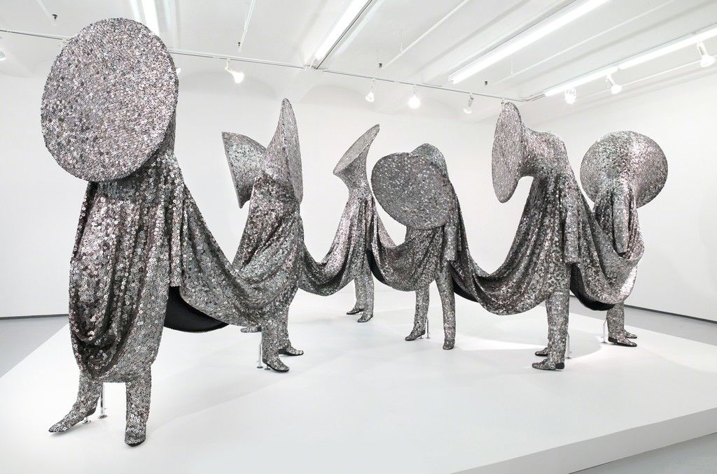
An artist addressing identity, movement, and materiality
after my session with Julian, I started researching the artist Nick Cave- he caught my attention because he has a permanent piece in the North Carolina Museum of Art.
I particularly liked this interview (linked below) with him because he talks about how he sources materials and let’s them influence his work in a very natural way. He might not know what the end outcome will be as he gathers materials, but he collects the things that capture his attention.
He also talks about how he loves to create pieces that mask the gender, race, sex, and sexuality. His first piece was inspired by the Rodney King incident in 1991, and issues of violence against people of color seems to have had a massive impact on Cave throughout his career. His, “soundsuits” illustrate his desire to create a sense of equality among people.
His works are also a call to action. In many of his pieces, the heads look like brass instruments which have been covered up in a rather chilling way. He calls his viewers to speak up against injustice, while simultaneously illustrating the struggle to do so.
Cave is truly a material expert and his work shows such emotional intensity. He even understands movement and performance art in such a different way-where it’s morenabout the freedom and liberty to move and create without having so many labels. Caves work is so inspiring.
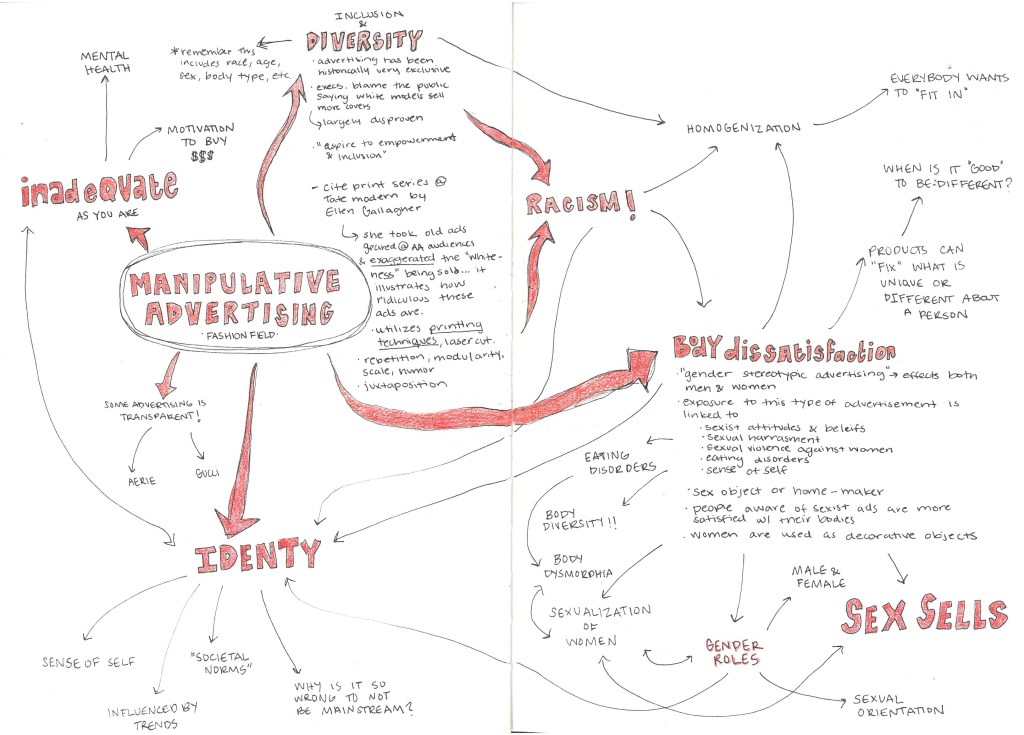
My group’s manifesto topic deals with manipulative advertising and media bombardment, and how it effects people today (whether positive or negative). To begin investigating this topic, I created a mind map dealing with the sub-categories and associated topics of manipulative advertising. I focused in on fashion advertising, as that is my specialism.
As you can see, there are a lot of social issues attached to this idea of manipulative advertising. Many of these effects are negative. After viewing this map, it seemed like most advertisements are related closely to the consumer’s identity, and they function by making the consumer feel inadequate or abnormal.
In addition to the mind map, I began researching precedents of artists, designers, and companies who have addressed this issue in the past. Attached are a few of my resources:
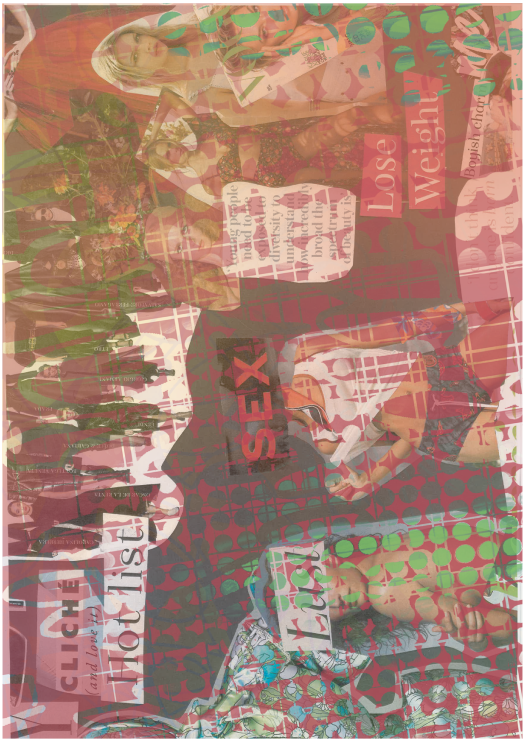
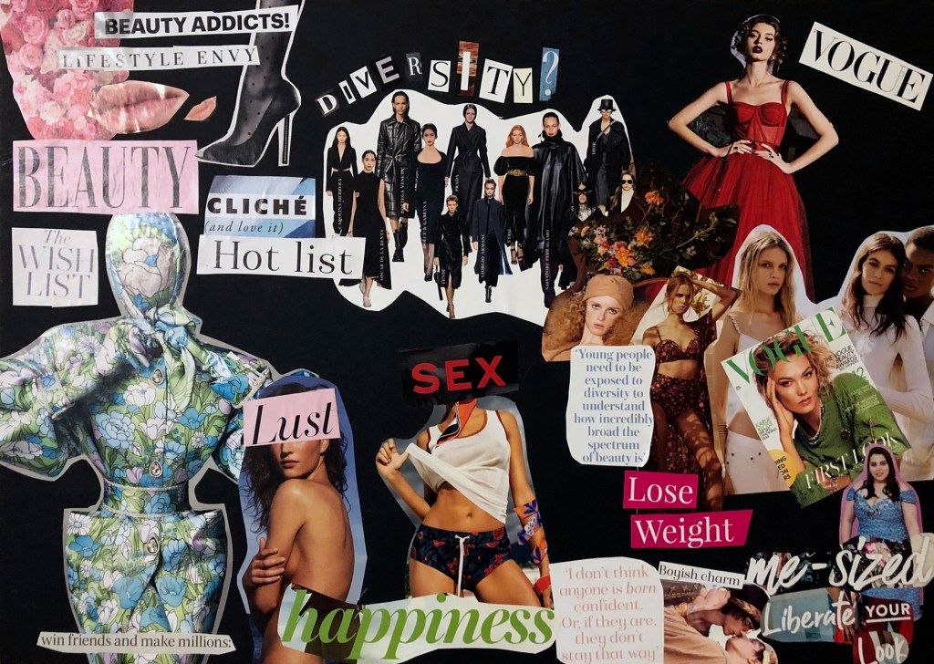
To continue my research, Lee recommended that I do some visual research. I became fixated on this idea of identity, and how the media has such a massive impact on how we see ourselves as individuals. In the collage I played with body image, diversity, inclusion, identity, and mental health.
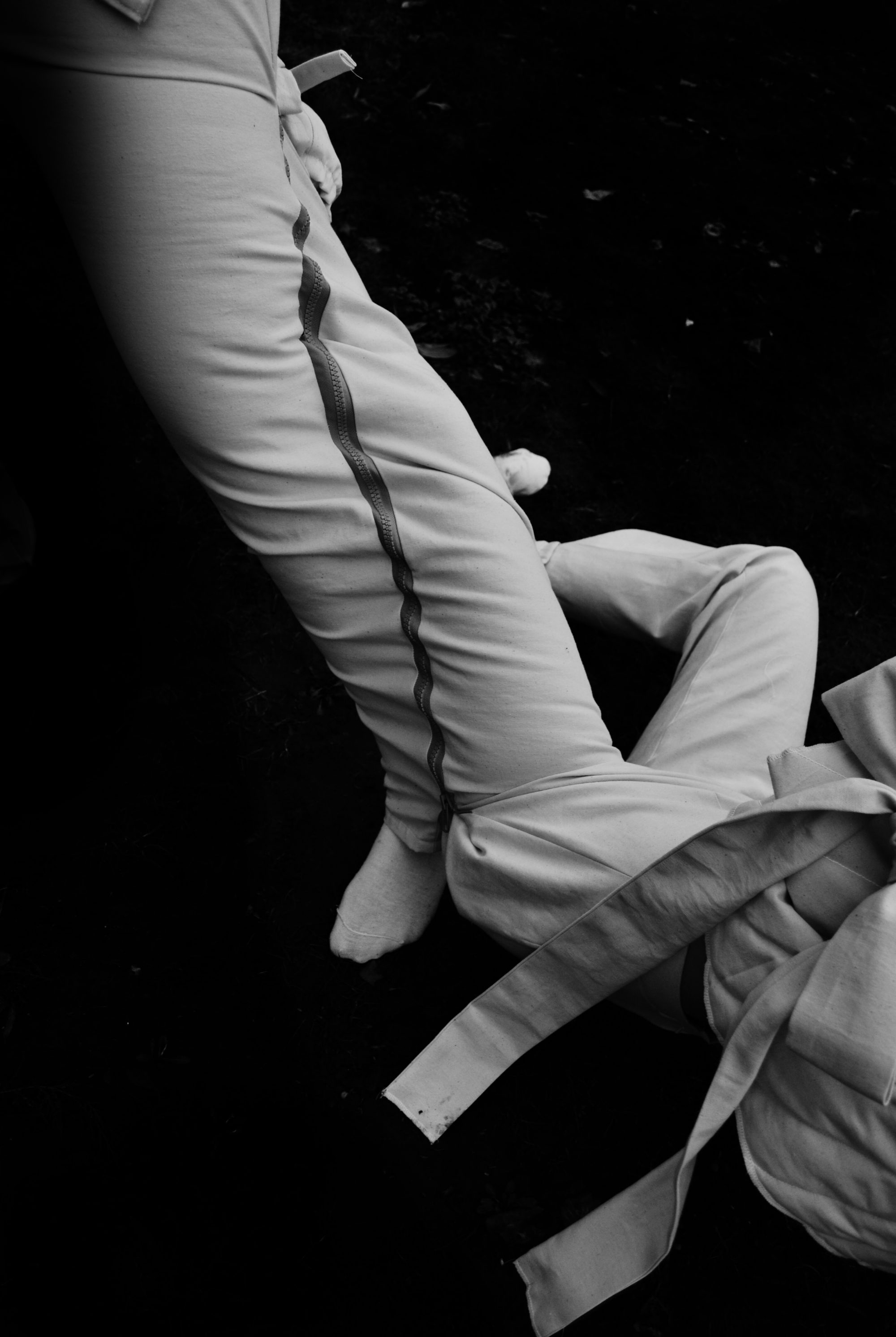
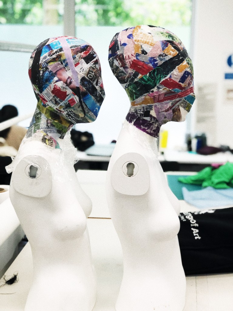
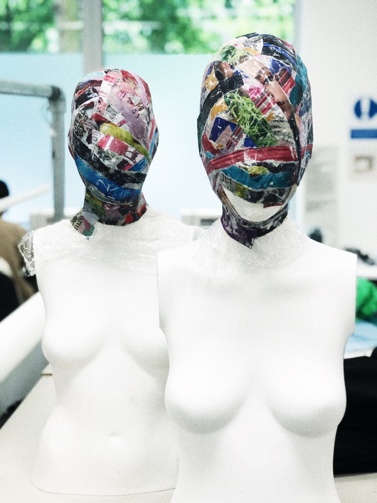
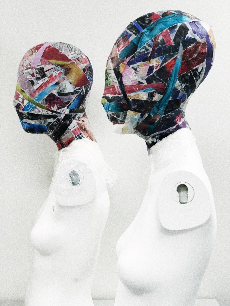
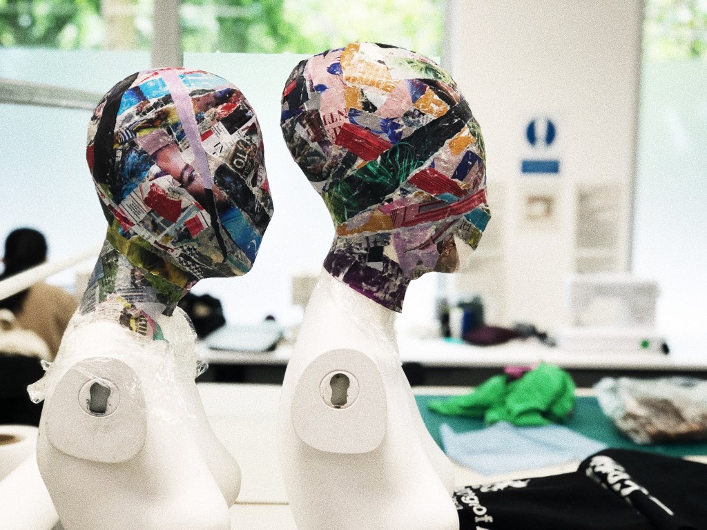
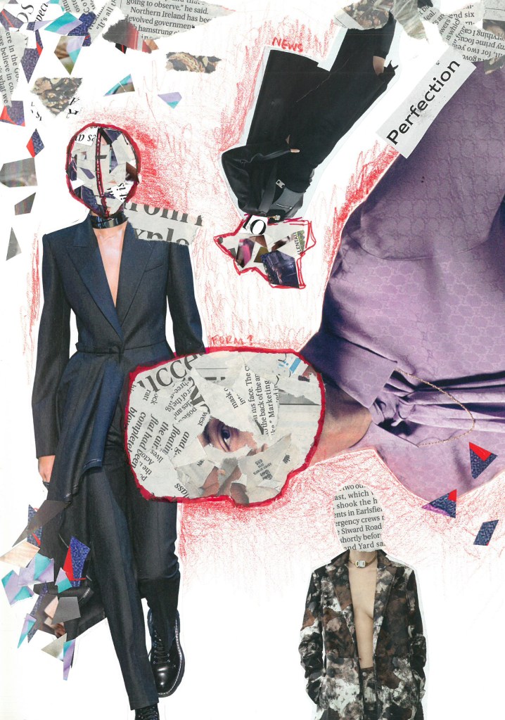
I am fixated on the idea of making a mask out of advertisements. This would symbolize the massive amount of media bombardment and not being able to escape it. It also relates to a struggle with identity.
I envision the photoshoot for this piece in the tube station with advertisements in the background, and the model, “reading” advertisements (even though their eyes will be covered). Then I want to create an advertisement with the photo, so it is kind of ironic and it relates back to the idea that advertisements are everywhere.