Cherry on Top for “Investigate” Project

I’ve been reviewing my portfolio and feedback from module 1, while I am preparing my work to be viewed for Module 2 and I’ve found some areas I would like to tighten up before the final review.

For the investigate project, I loved the concept of making and un-making but It feels a bit unresolved. I love the dissected corset pieces, and i think the project could reach a whole new level of refinement if I tried to create a garment that would contradict the idea of the corset. I also feel like my portfolio would be a lot stronger with just an extra page in this project.

I’ve decided to make a look with nude spandex mesh. I am going to make the nude spandex/mesh in a super draped way. How it is photographed will show how the piece helps the user re-frame how their body is viewed (through movement). I also like the idea of subverting how a corset would typically be used (restrictively).

Here are my pics!

Cherry on Top for “Navigators” Project

Along with beefing up the ‘Investigate’ project, I wanted to add to my Navigators project for my portfolio. I realized that none of the outcomes for this project felt super resolved.

When I was looking back at the pieces, I saw that there were some really interesting geometric shapes happening with how I draped the leather. I’m really into the idea of working with triangles. I then cut out dimensional triangles and started draping them on a mannequin.

For me, this adds layers of developmental work that were missing from my portfolio.

Research Images for Publication

I realized that I never posted about some of my independent research for the publication because we shared in person with Julian. On our trip to the library, I gravitated towards full bleed images that used very minimal text. For me, the angles and lines in the images can be used to direct the viewer’s eye throughout the composition, which is so nice.

In the first round I proposed more of this kind of aesthetic. I think the group liked it, so that is what we went with.

My layouts…

On a side note, on our trip to the library I was able to look at some really cool, older versions of magazines, which was fun. The layouts were unique and they were dealing with similar social issues over 100 years ago. It would be interesting to revisit these as a source material in the future.

Publication Documentation/Presentation Notes

Because we won’t have the publication Launch at uni, we are unsure of what resources we will have available to us. We have created an Instagram page, a printed book, and a digital book (it would be ideal to show this on a projector, but a computer screen may have to do.

Overall, I’m so happy with how the printed book turned out. We ended up printing on fabric to bind the edges, because stitching it with thread was not possible with our layouts and paper selection, but I’m even happier with this outcome.

500 Words for Publication

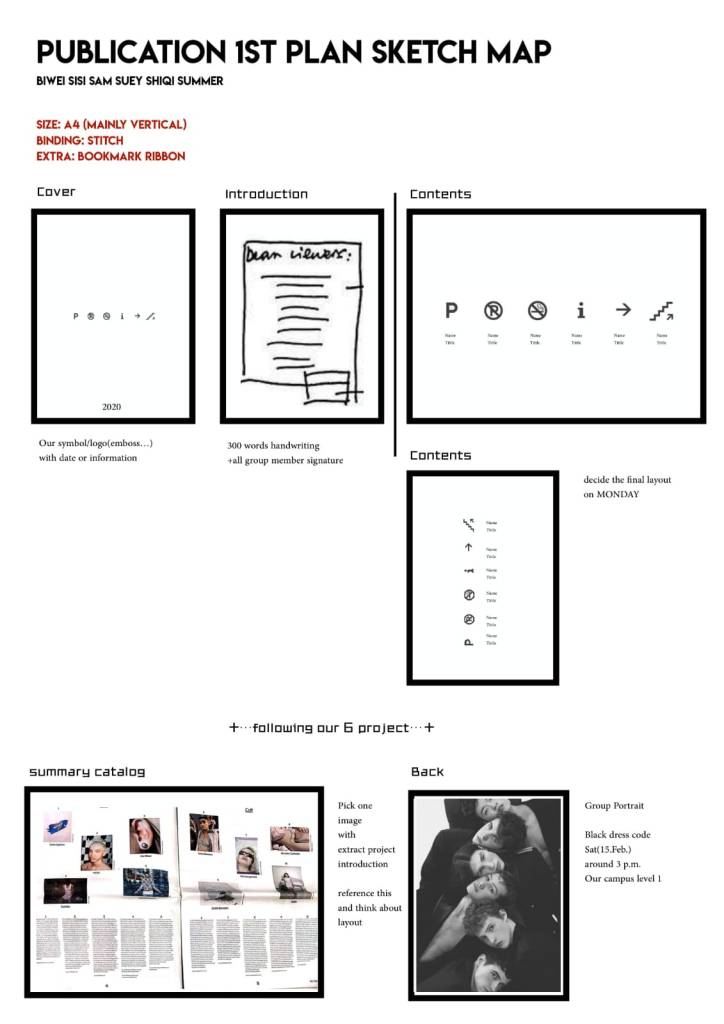
I really liked how I talked about my work in the publication. I put a lot of thought into it because putting words to my work feels very final. For the publication we decided to write in the third person, because we wanted it to look & feel like a magazine, which was weird but our final printed publication looks so amazing.

I’m so proud of how my team worked so quickly to lay everything out and get it printed. We completed the whole thing in a matter of a few days because we wanted printed copies for the final assessment.

Here is my writing in response to the 300 words:

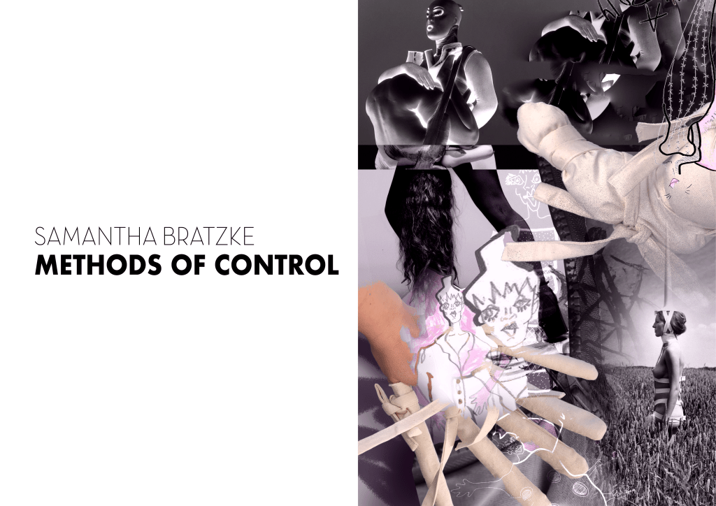
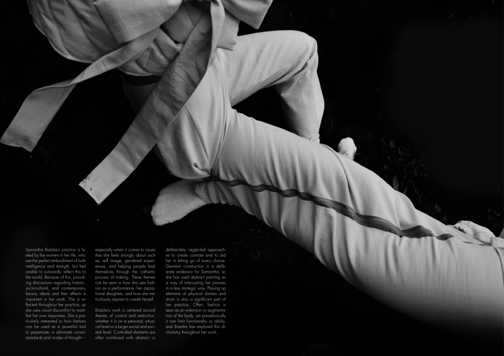
Samantha Bratzke’s practice is fueled by the women in her life, who are the perfect embodiment of both intelligence and strength, but feel unable to outwardly reflect this to the world. Because of this, provoking discussions regarding historic, socio-cultural, and contemporary beauty ideals and their effects is important in her work. This is reflected throughout her work, as she uses visual discomfort to manifest her own responses. She is particularly interested in how fashion can be used as a powerful tool to perpetuate or eliminate certain standards and modes of thought—especially when it comes to issues that she feels strongly about such as, self image, gendered experiences, and helping people heal themselves through the cathartic process of making. These themes can be seen in how she uses fashion as a performance, her aspirational designers, and how she meticulously aspires to create herself. 

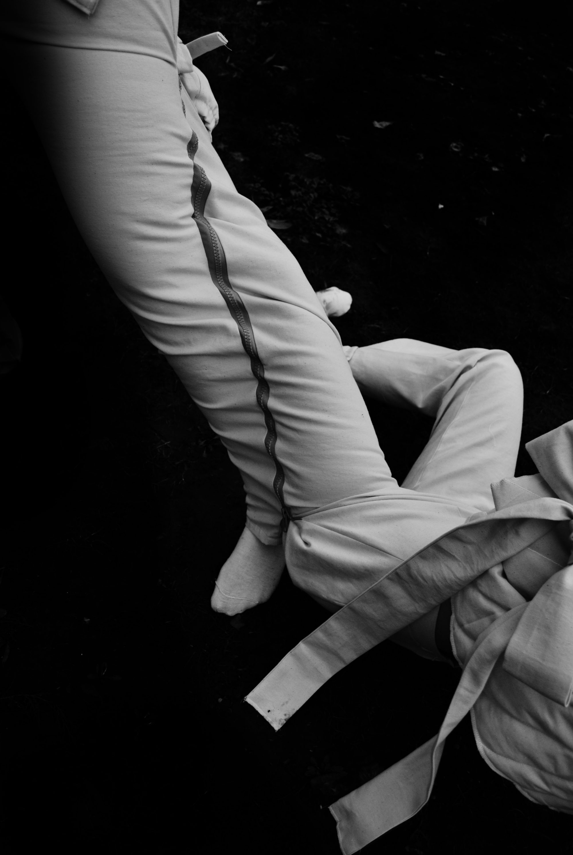
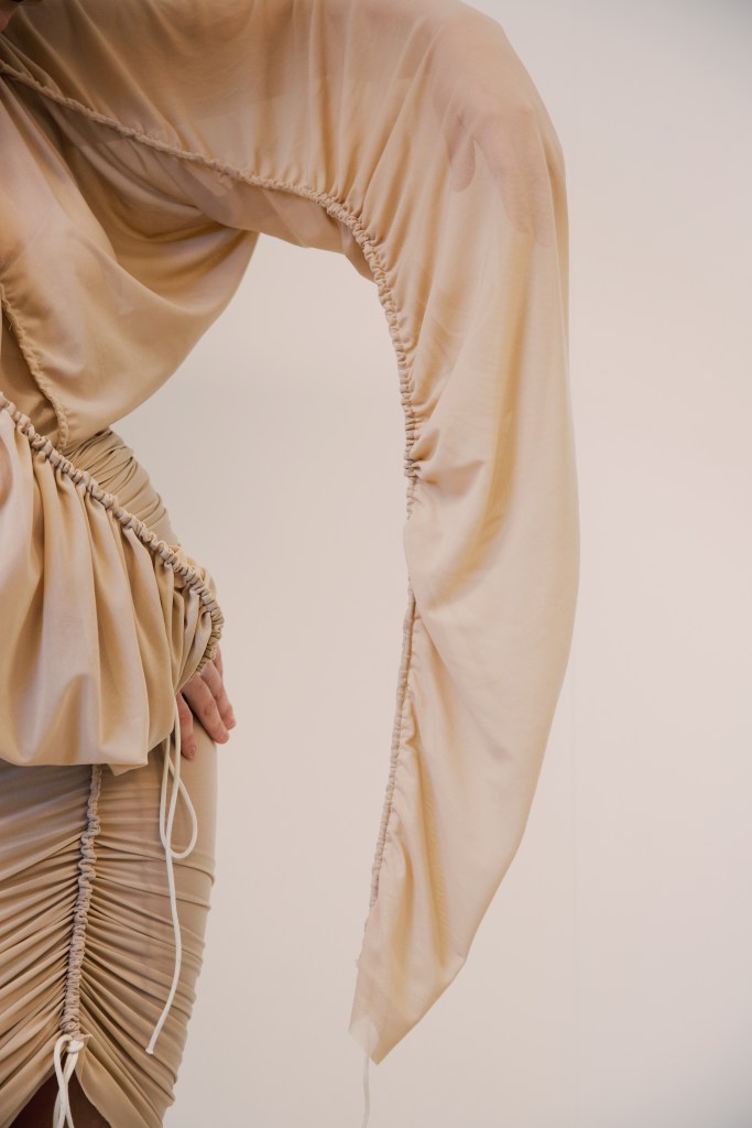
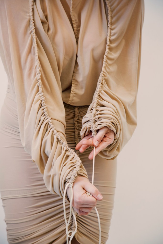
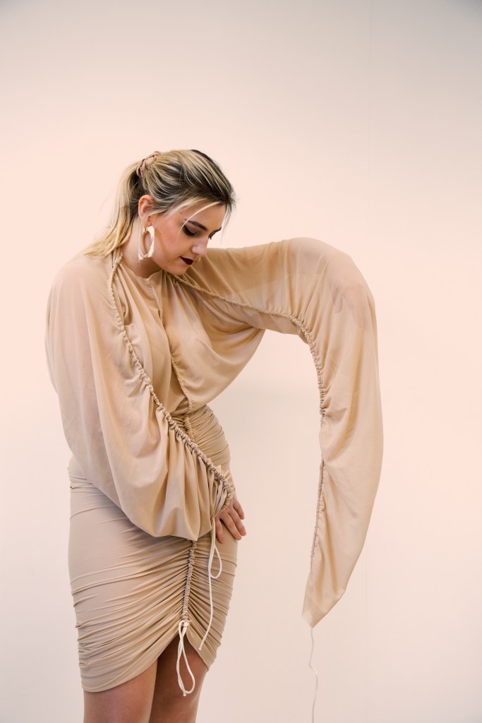
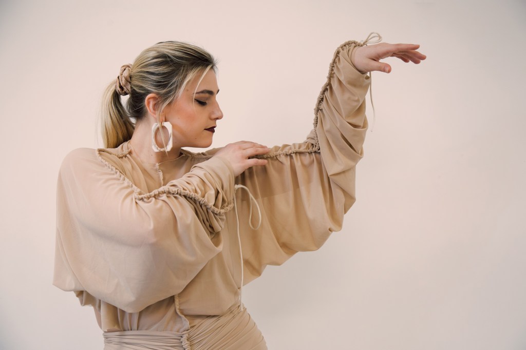
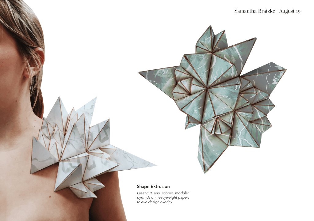
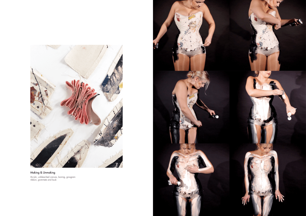
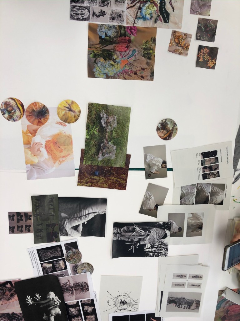
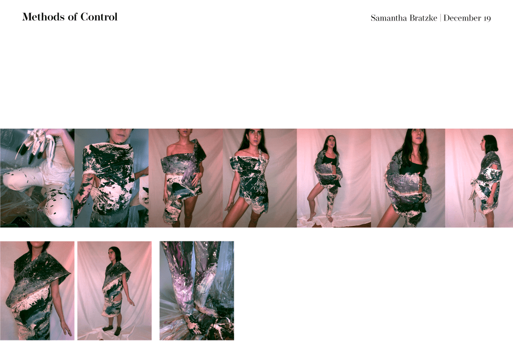
Samantha’s work is centered around themes of control and restriction, whether it is on a personal, physical level or a larger social and societal level. Controlled elements are often combined with abstract or deliberately neglected approaches to create contrast and to aid her in letting go of every choice. Garment construction is a deliberate endeavor for Samantha, so she has used abstract painting as a way of interrupting her process in a less strategic way. Playing up elements of physical restriction and discomfort is also a significant part of her practice. Often, fashion is seen as an extension or augmentation of the body, yet paradoxically it can limit functionality or ability, and Bratzke has explored this dichotomy throughout her work. 

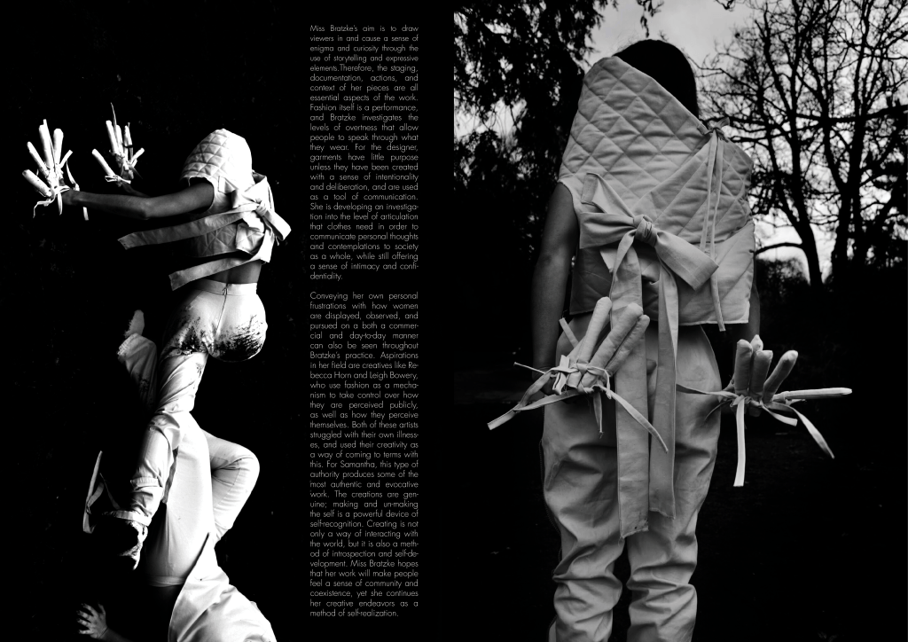
Miss Bratzke’s aim is to draw viewers in and cause a sense of enigma and curiosity through the use of storytelling and expressive elements. Therefore, the staging, documentation, actions, and context of her pieces are all essential aspects of the work. Fashion itself is a performance, and Bratzke investigates the levels of overtness that allow people to speak through what they wear. For the designer, garments have little purpose unless they have been created with a sense of intentionality and deliberation, and are used as a tool of communication. She is developing an investigation into the level of articulation that clothes need in order to communicate personal thoughts and contemplations to society as a whole, while still offering a sense of intimacy and confidentiality.  

Conveying her own personal frustrations with how women are displayed, observed, and pursued on a both a commercial and day-to-day manner can also be seen throughout Bratzke’s practice. Aspirations in her field are creatives like Rebecca Horn and Leigh Bowery, who use fashion as a mechanism to take control over how they are perceived publicly, as well as how they perceive themselves. Both of these artists struggled with their own illnesses, and used their creativity as a way of coming to terms with this. For Samantha, this type of authority produces some of the most authentic and evocative work. The creations are genuine; making and un-making the self is a powerful device of self-recognition. Creating is not only a way of interacting with the world, but it is also a method of introspection and self-development. Miss Bratzke hopes that her work will make people feel a sense of community and coexistence, yet she continues her creative endeavors as a method of self-realization.

Team Meeting 2

So in our second meeting we looked at a variety of different catalogues to decide how we should lay out our pages and what “special” things we are going to do. We decided on a basic A4 layout, and we decided to take group photos and used embossed and/or transparent paper. We are also going to do a stitched binding (appropriate for our field and topic) but we are not sure if that will work, as we have a variety of special papers we want to use, and our layouts are set to A4.

Our topic is about using narrative elements to evoke emotions so we tried to make sure all of our choices aligned with the theme. The embossed/transparent paper forces people to be drawn in and use their sense of touch to engage with our publication.

We also took some really cute group photos for the back cover this weekend!

Team Meeting 1

My team and I got together to discuss how our work would flow together and how we could collaborate as a team. We tried rearranging how the work would go together in a few different ways, but decided that sequential order is more readable. It is up for change if need be, but it was hard to mesh some of our aesthetics together on one page. Here are a few of our options:

We also discussed our overall theme and decided that our group explores a variety of emotional responses to different aspects of life through the lens of narrative story telling. We will develop this further tomorrow with Aleya. 

Notes on Crit feedback

The feedback from my critique was very positive! I think everyone understood my source material and inspiration, and everyone loved the photos.

I also feel good about how I talked about the work while I was presenting. I feel like it was very logical to follow and everyone understood what I was trying to say, which is something I have always struggled with (so I’m pretty proud).

Cato suggested that the visual layout of my presentation needed to be a bit more cohesive. He said that there were some visuals I should have carried out on every page (which I understand honestly) to make it more easily readable.

One thing we talked about that was interesting was the difference between wearable art and marketable fashion. I feel like a lot of the stuff I make is more wearable art geared at communicating a theme or opinion, and in the future it may be interesting to challenge myself to make a more ready-to-wear version of my work.

I’m pretty pleased with this project and how it turned out. I feel like l could have pushed it to an even further level if I wasn’t also focusing on my MA application, but overall I’m pretty happy and I have ideas about where I want to go in the future.

Color Experiment

So, I mixed some colors and did a little experiment with painting and rearranging how the garments are oriented on the body. The colors I mixed looked really nice and I’m pretty proud of the palette, and even on the body they mixed to create some lovely lavenders and purples.

Its really really difficult for me to sew in an “abstract way” so putting paint on the clothes helps me kind of lose preciousness with them… then I’m not afraid to chop them up and re- orient them. The paint kind of “devalues” the garments for me.

This was a good little experiment for my portfolio I think.

Performative Rubber Garments by Fredrik Tjærandsen

Tjærandsen’s garments are most definitely performative in nature, as they can inflate and deflate (wicked cool).

What I love about his work though, is how he uses color and the transparency of the colors to add a sense of mystique to his work. I’m not sure if that is something I can feasibly execute now that I have my chosen medium, but I think that color mixing might be another interesting way of adding layers to my color choices.

“I was inspired by my own early childhood memories. I wanted to recreate the fogginess and the ‘mist’ of the memories themselves,”

Fredrik Tjærandsen
Design a site like this with WordPress.com
Get started