I met with Lee and we talked about why I hated what I was working on, and why I was bored. I think overall I jumped at the chance to make one of my first Ideas, and it was not fully informed.
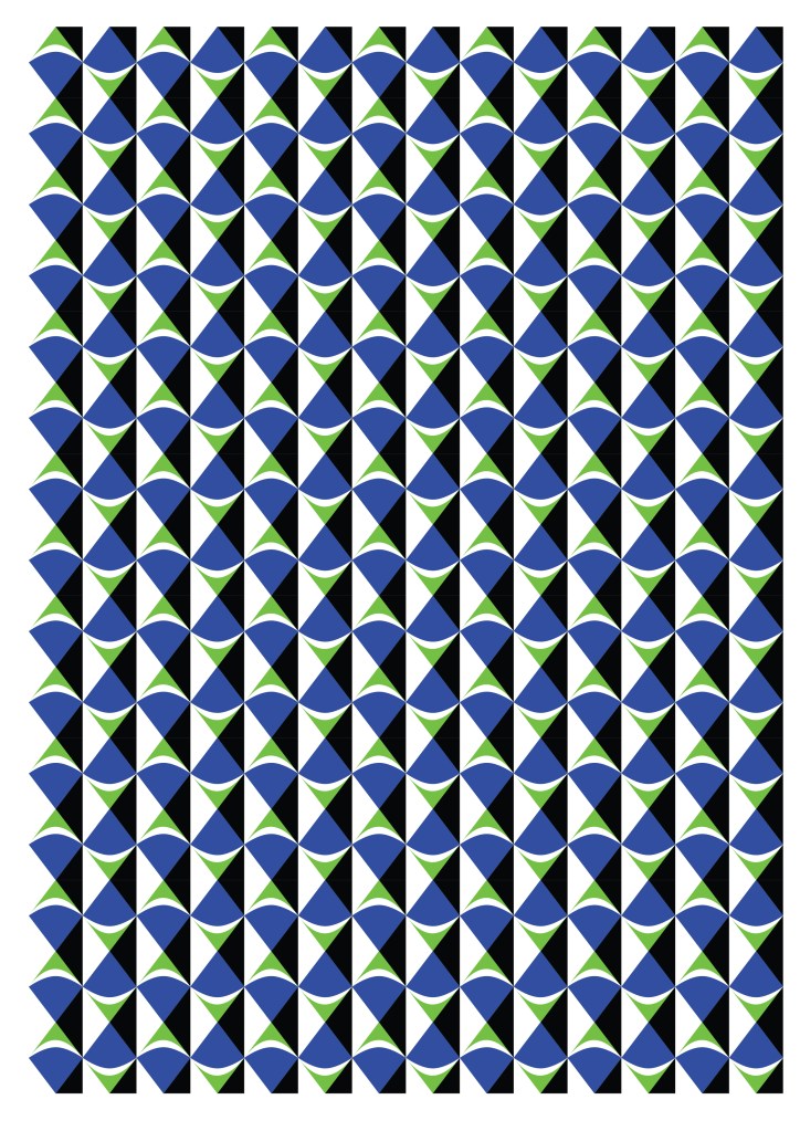
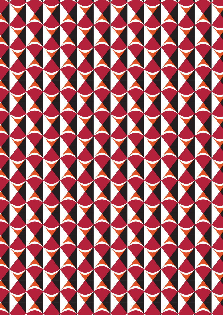
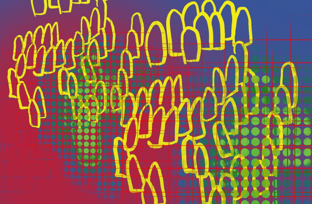
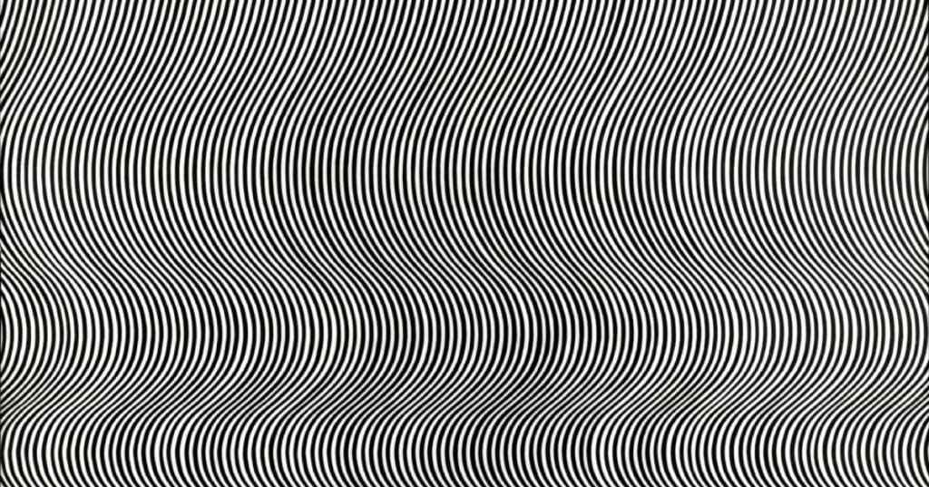
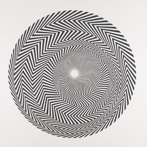
So I started thinking about other ways to visually bombard viewers. Here are some optical prints I made: If you enlarge the blue one and stare at it long enough it actually does move! These were both inspired by my investigations of Bridget Riley’s work in Optical Art.
Inspired by Bridget Riley
Inspired by Bridget Riley
This got me really excited about prints and print mixing. I thought optical illusions and overbearing prints could cause the sensation I was looking for.
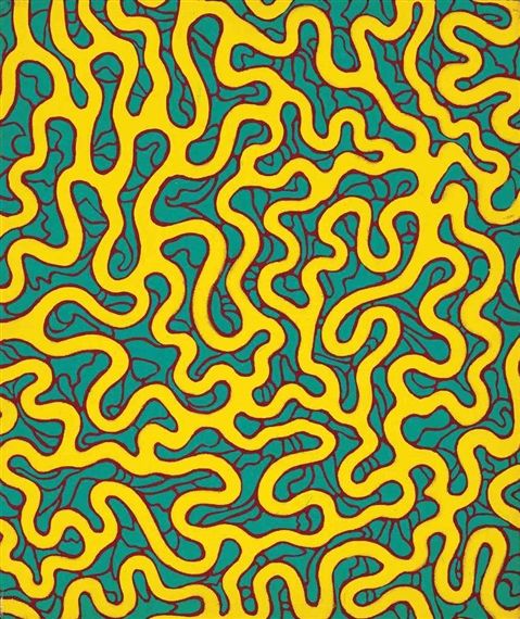
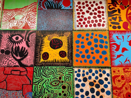
I continued making some prints inspired by artists and designers I was researching. Here is a piece inspired by Yayoi Kusama’s Phallic Chairs. It is not a perfect repeat pattern like the former ones, but I really enjoyed making it as well. While I was watching a biographical movie on Kusama, I started subconsciously doodling motifs.
I’m not sure how this will all fit together, but I’ve planned a trip to the Tate Modern to look at other artists and hopefully get some more inspiration.
Yayoi Kusama and Bridget Riley- patterns, shapes, and prints
“From the Point of View of one who creates, everything is a gable, a leap into the unknown”
Yayoi Kusama
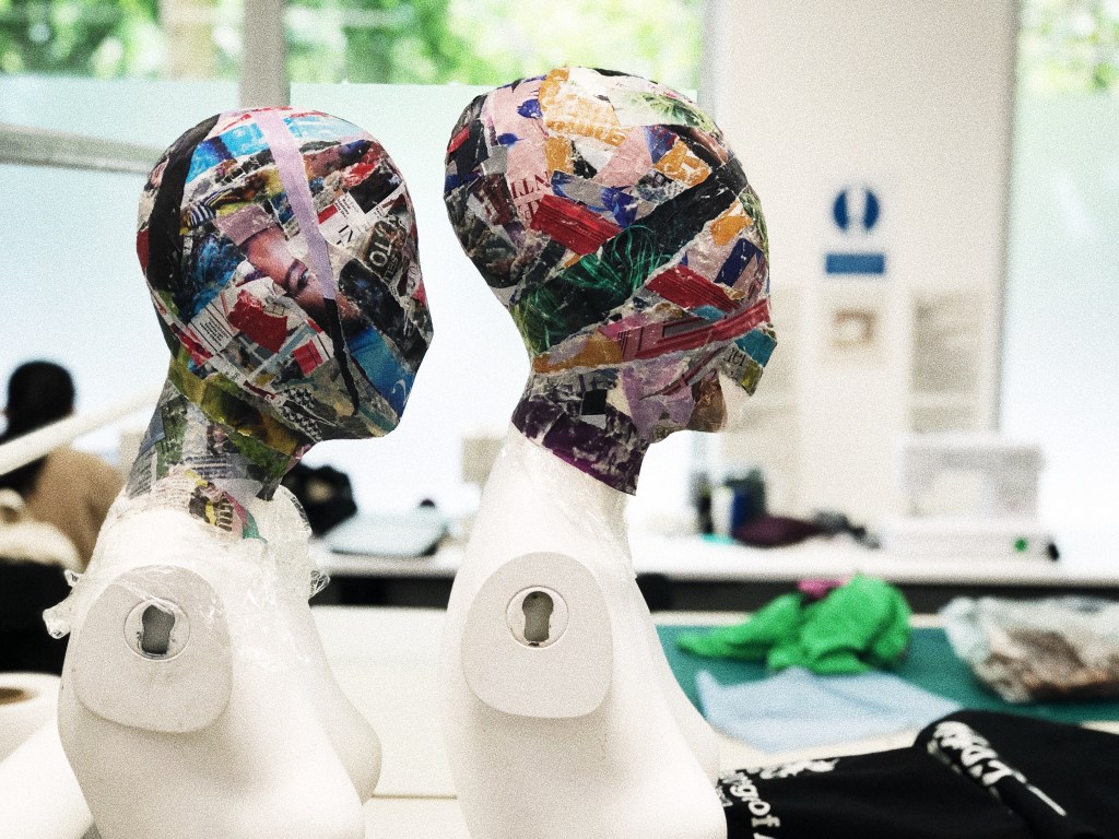
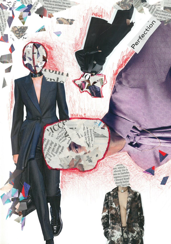
My manifesto work has taken a new and surprising turn. After some thought and research, I no longer think that the masks are suitable. They are a bit literal, and I have found so much more inspiration from other artists, who use different methods to overload the senses and convey the ideas that I want to convey.
Advertisements are ubiquitous, bombarding, visually assaulting, and they attack the senses. It seemed a bit to conventional to translate this into a mask, so I have shifted gears.
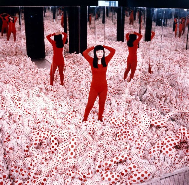
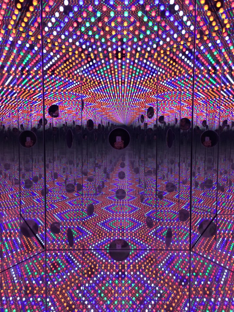
Researching Kusama has inspired me, because she uses excess to call attention to things. She also uses vibrant colors and patterns. Her work creates a sense of space and excess. Everything about her work is overloading (see below).
As an individual, I admire her tenacity. She was a Japanese female working in an arena dominated by white men who constantly stole her ideas and devalued her, however she produced work prolifically. Her OCD and childhood trauma both feed into her work. Everything about her work is encompassing. It’s magical and loud.
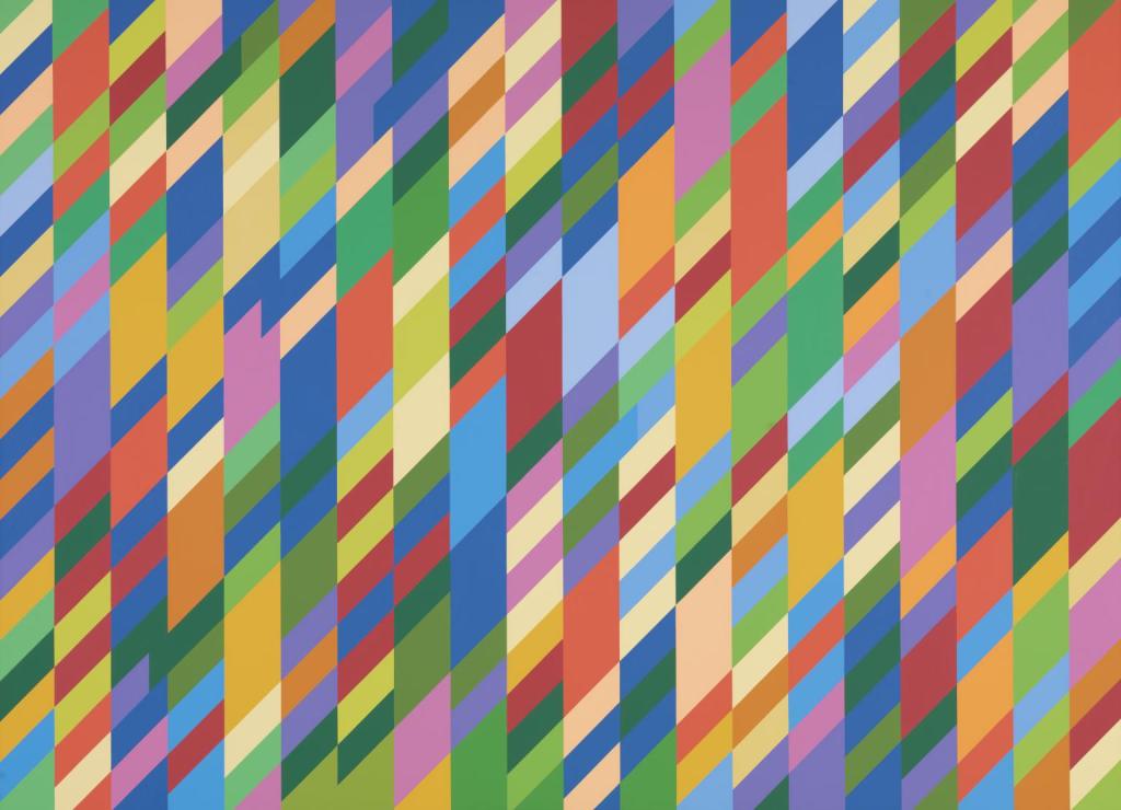
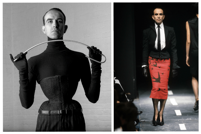
Another artist inspiring me is Bridget Riley (an RCA alum, woo!). Riley’s work has a similar feel to some of Kusama’s work. The bold shapes and colors of pop and op art have a dramatic impact on the eye (it’s not always comfortable to look at). Riley’s optical art is sometimes peaceful, however other times it is really difficult to look at it without getting a headache. See Riley’s work below.
Op art has been utilized by fashion throughout history, but it may be interesting and new to tie in my group’s topic through text and optical art. I’m thinking of using very loud, obnoxious patterns overlaid together to create a sense of visual confusion and overload… Not sure about a, “Final Product”.
An artist addressing identity, movement, and materiality
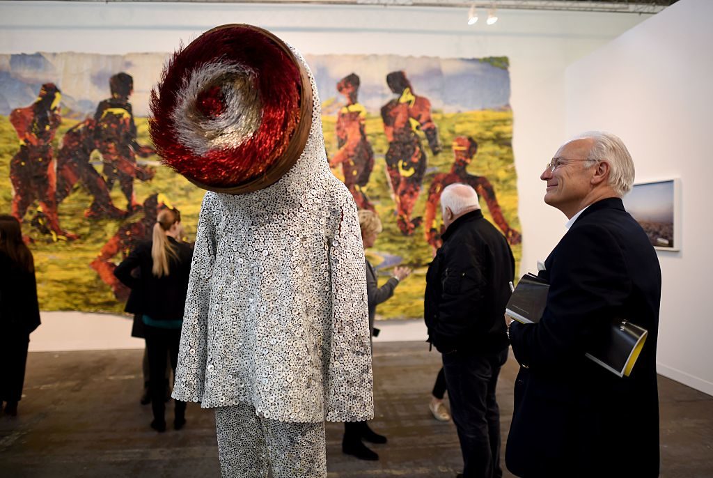
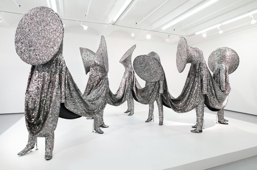
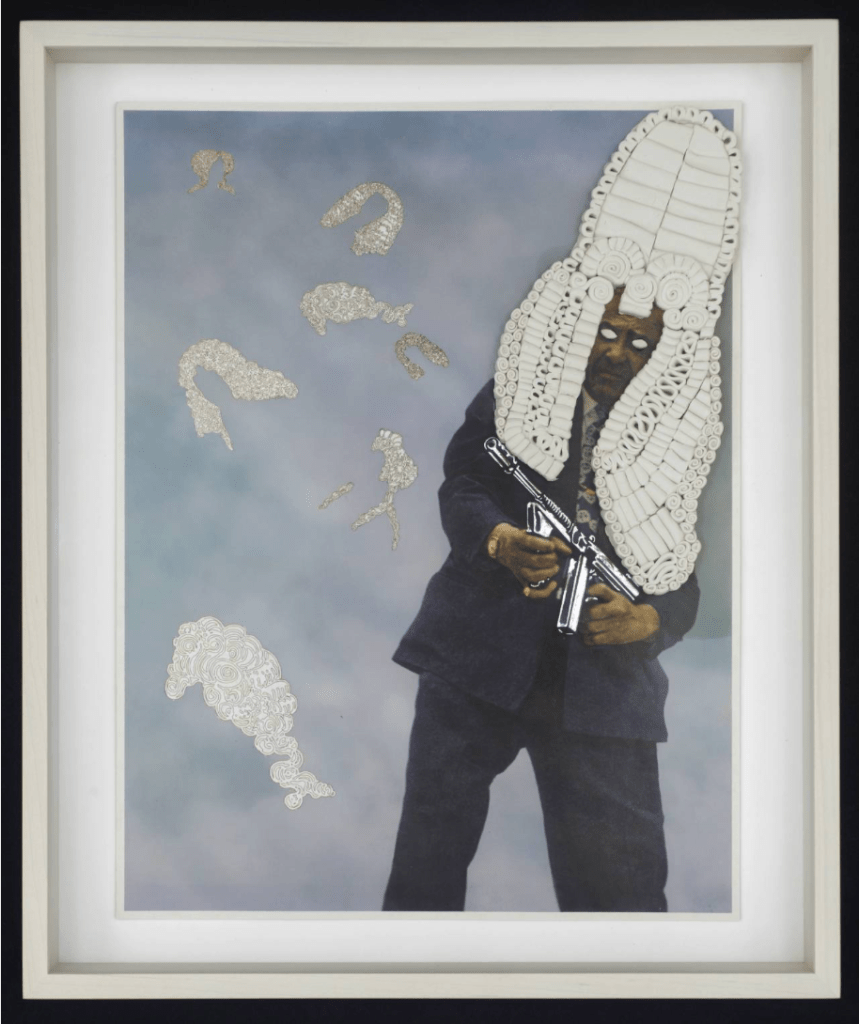
after my session with Julian, I started researching the artist Nick Cave- he caught my attention because he has a permanent piece in the North Carolina Museum of Art.
I particularly liked this interview (linked below) with him because he talks about how he sources materials and let’s them influence his work in a very natural way. He might not know what the end outcome will be as he gathers materials, but he collects the things that capture his attention.
He also talks about how he loves to create pieces that mask the gender, race, sex, and sexuality. His first piece was inspired by the Rodney King incident in 1991, and issues of violence against people of color seems to have had a massive impact on Cave throughout his career. His, “soundsuits” illustrate his desire to create a sense of equality among people.
His works are also a call to action. In many of his pieces, the heads look like brass instruments which have been covered up in a rather chilling way. He calls his viewers to speak up against injustice, while simultaneously illustrating the struggle to do so.
Cave is truly a material expert and his work shows such emotional intensity. He even understands movement and performance art in such a different way-where it’s morenabout the freedom and liberty to move and create without having so many labels. Caves work is so inspiring.
“…To continue to borrow research methods from other fields denies the intellectual maturity of art practice as a plausible basis for raising significant life questions and as a viable site for exploring important cultural and educational ideas” (p. 95)
After reading Art Practice as Research by Graeme Sullivan, I began to think about how I can research more effectively. Reading and writing have always been staples, but my approach to visual research is definitely lacking. At the recommendation of Lee, I did quite a bit of collaging for the Manifesto project. I have found this method to be very helpful.
“the visual artist is not only adept at expression and communication, but also plays a crucial role in a cultural critique, historical inquiry, and educational development” (p.97)
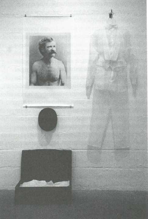
I found this work by Anne Graham to be so inspiring because she created work based on Mark Twain, that critically analyzed who he was as a person. This work has a greater meaning attached to transparency in politics as well. I think it addresses things in both literal and metaphorical way. Graham makes it easier to understand complex ideas and concepts through her creative practice.
Anne Graham: Mark Twain’s New Clothes
“the artist or researcher is also changed by the creative inquiry process” (p. 104)
I had a really thought-provoking conversation with Nathan about this idea that the creative process is so transformative for the creator. It is hard not to be self critical, when my level of knowledge by the end of a project is so much greater than at the beginning.
Overall this reading was pretty interesting. It later discussed the levels of interaction between artistic research and more traditional types of research and understanding.
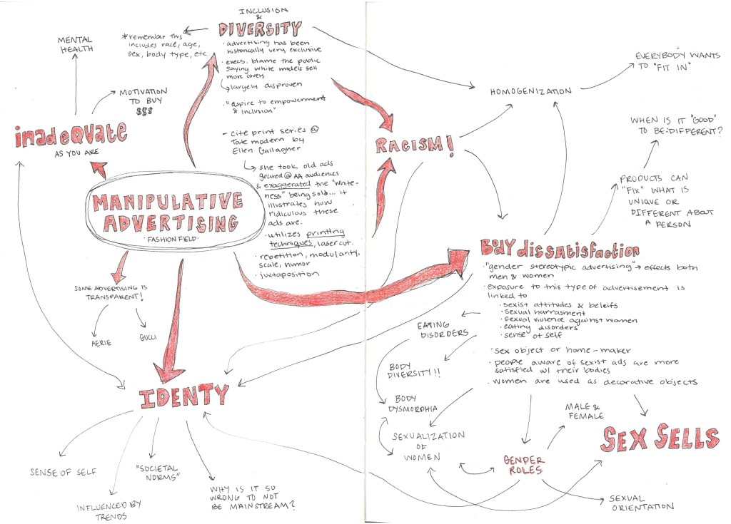
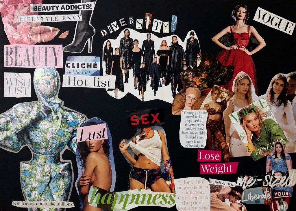
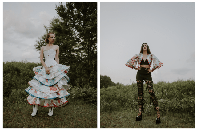
My group’s manifesto topic deals with manipulative advertising and media bombardment, and how it effects people today (whether positive or negative). To begin investigating this topic, I created a mind map dealing with the sub-categories and associated topics of manipulative advertising. I focused in on fashion advertising, as that is my specialism.
As you can see, there are a lot of social issues attached to this idea of manipulative advertising. Many of these effects are negative. After viewing this map, it seemed like most advertisements are related closely to the consumer’s identity, and they function by making the consumer feel inadequate or abnormal.
In addition to the mind map, I began researching precedents of artists, designers, and companies who have addressed this issue in the past. Attached are a few of my resources:
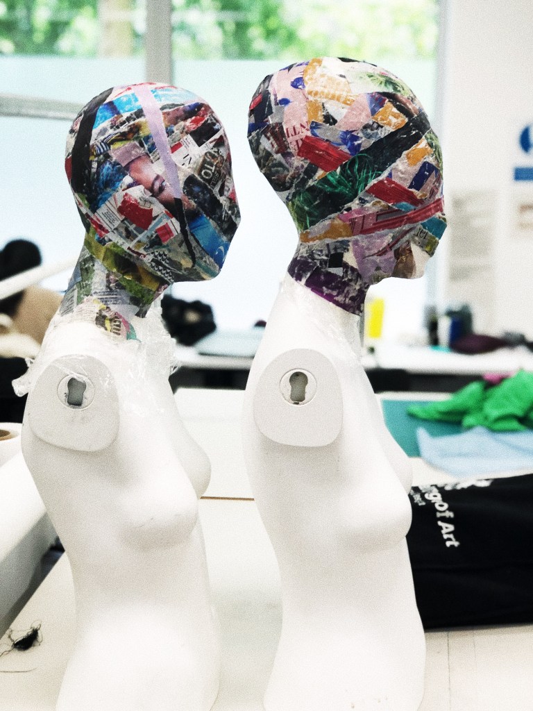
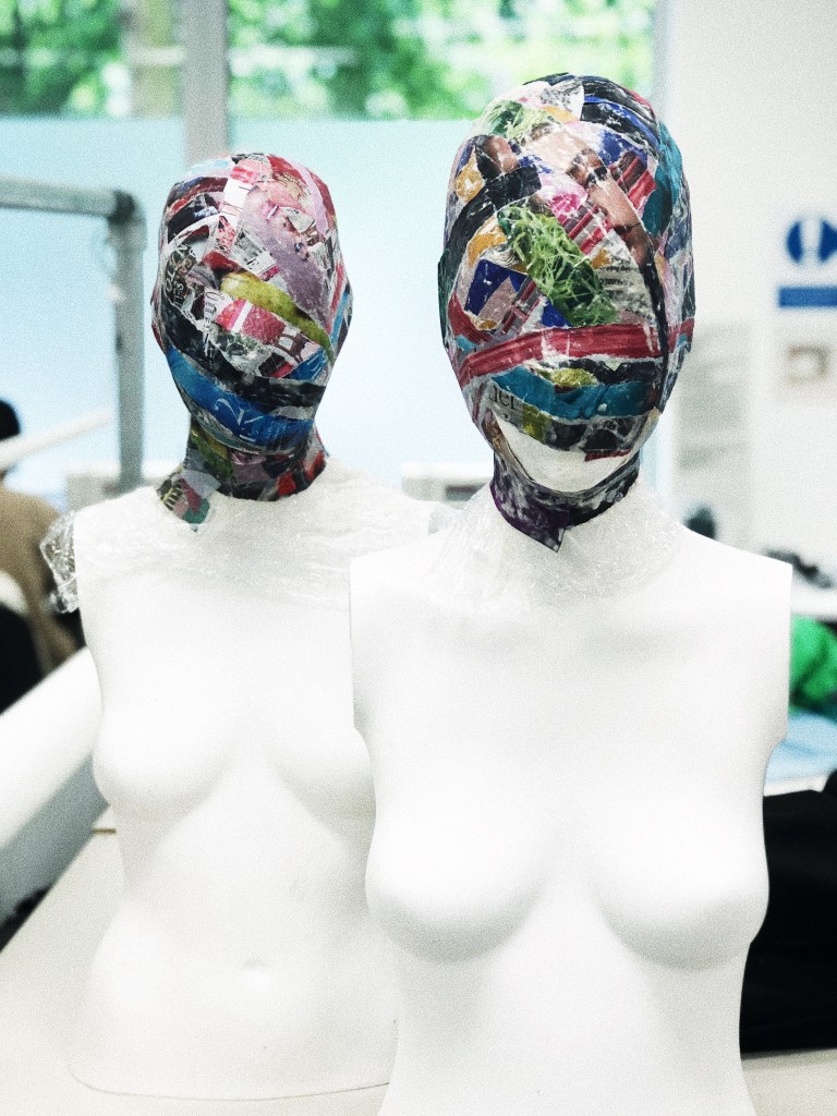
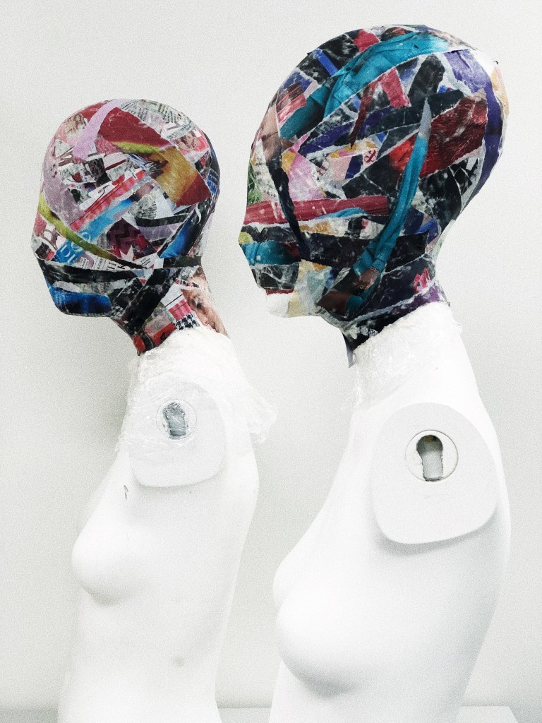
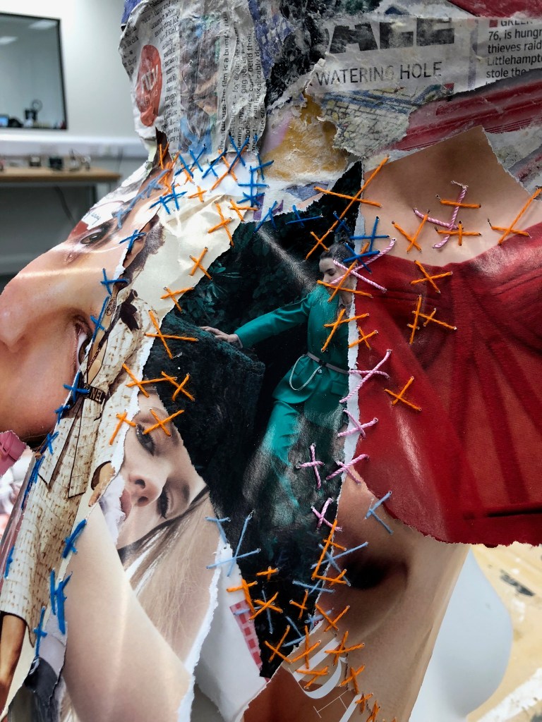
To continue my research, Lee recommended that I do some visual research. I became fixated on this idea of identity, and how the media has such a massive impact on how we see ourselves as individuals. In the collage I played with body image, diversity, inclusion, identity, and mental health.
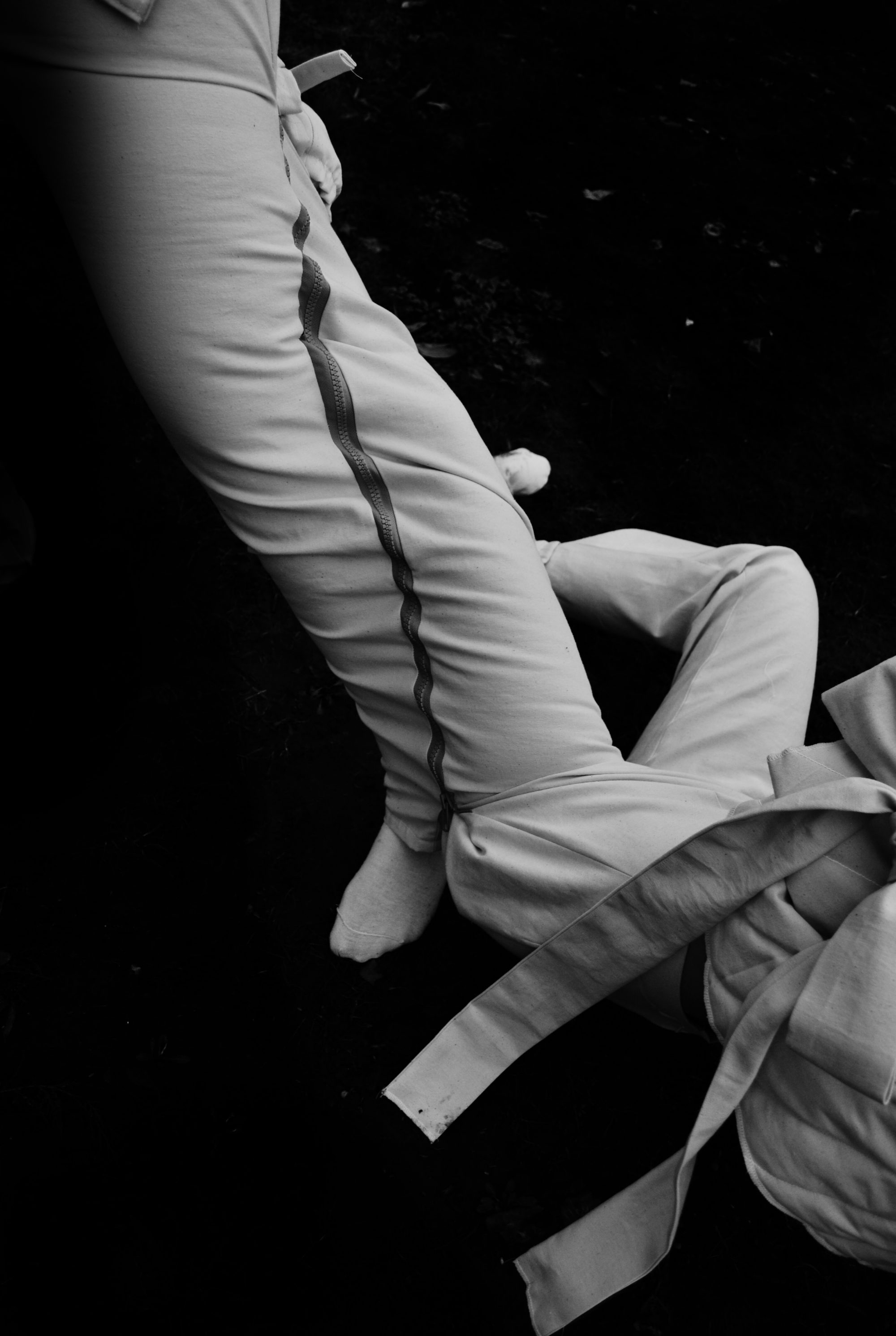
I am fixated on the idea of making a mask out of advertisements. This would symbolize the massive amount of media bombardment and not being able to escape it. It also relates to a struggle with identity.
I envision the photoshoot for this piece in the tube station with advertisements in the background, and the model, “reading” advertisements (even though their eyes will be covered). Then I want to create an advertisement with the photo, so it is kind of ironic and it relates back to the idea that advertisements are everywhere.
“I think of my work as ephemeral architecture, dedicated to the beauty of the female body”
Christian Dior, 1957
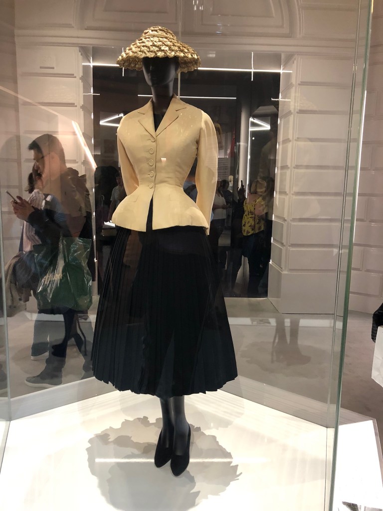
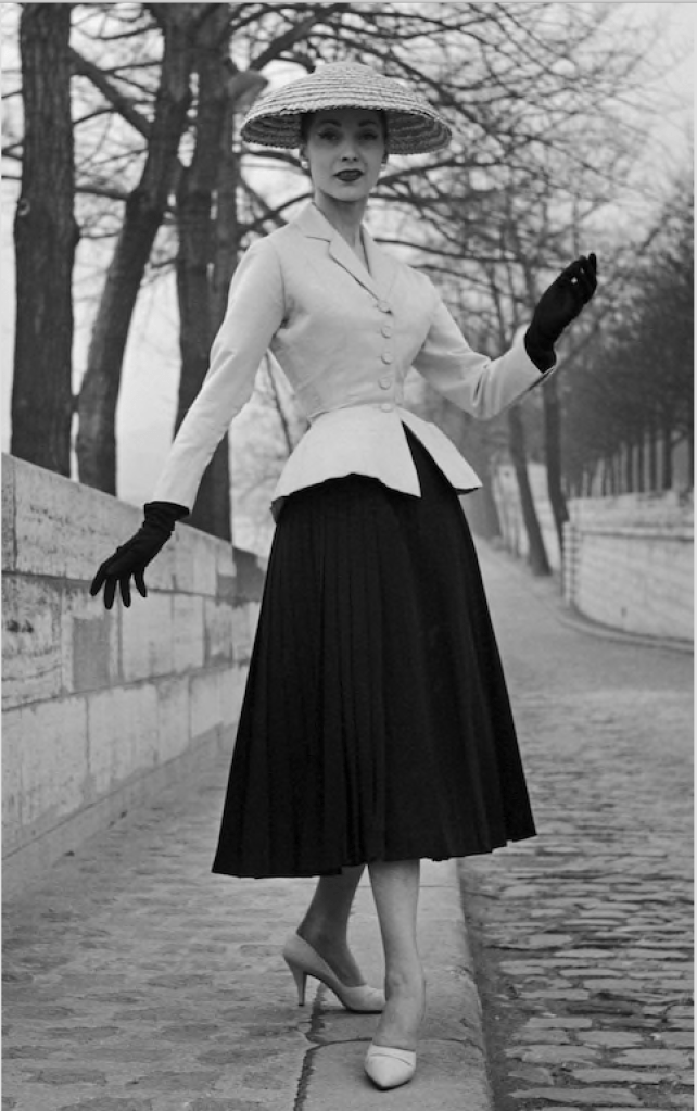
1947 Bar Jacket and Skirt
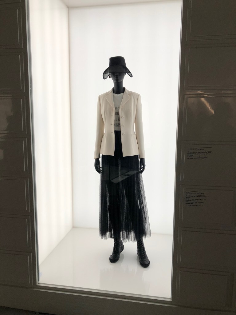
We should all be Feminists T-Shirt (RTW S/S 2017)
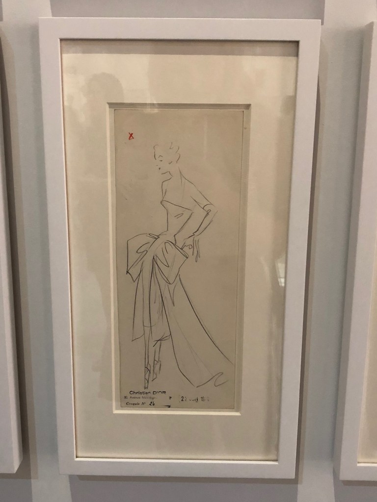
Original Dior Sketches
Haute Couture 1947
Dior Original
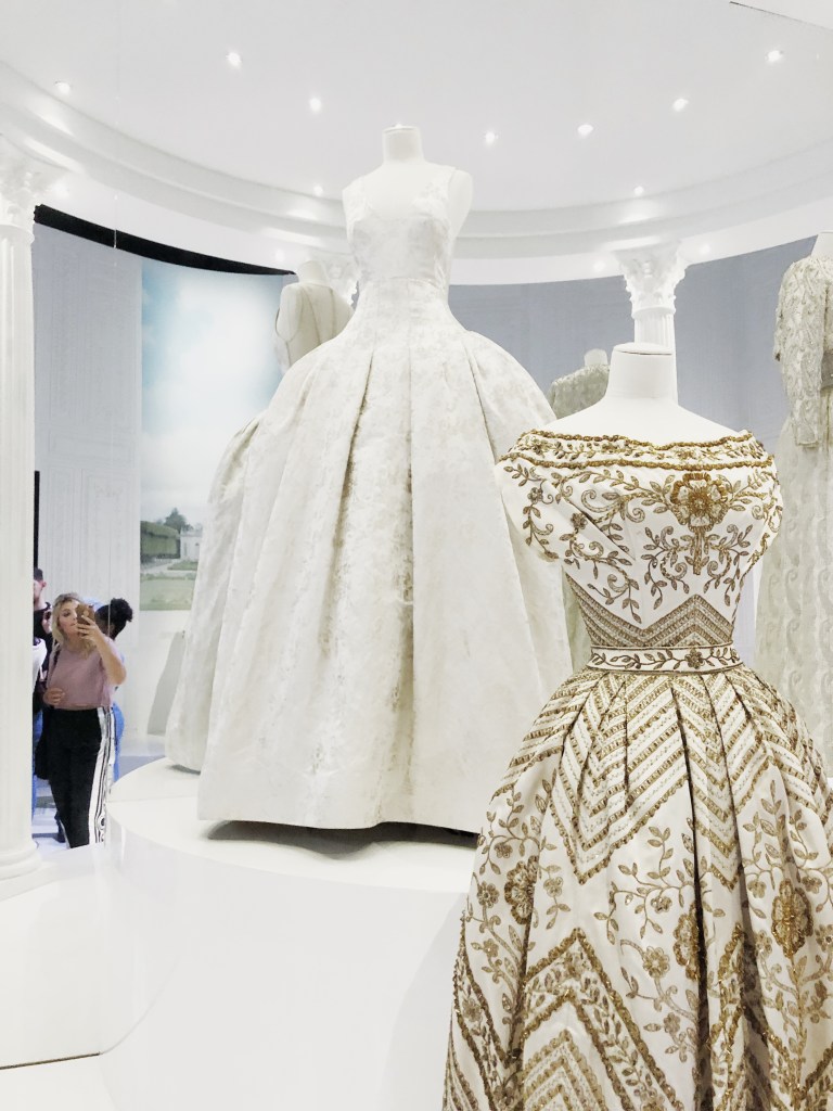
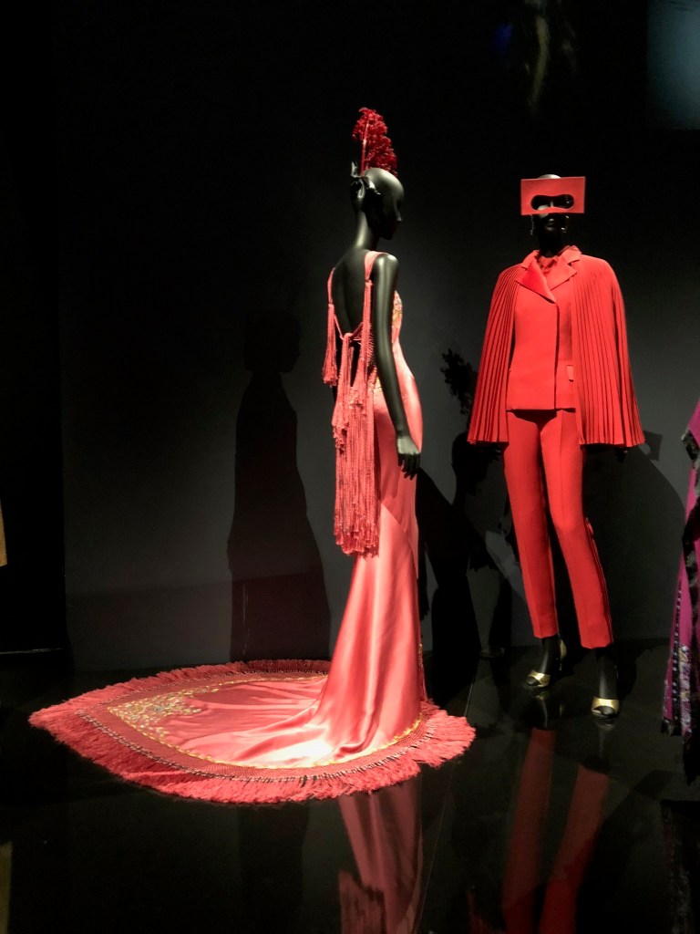
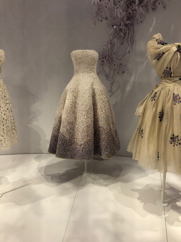
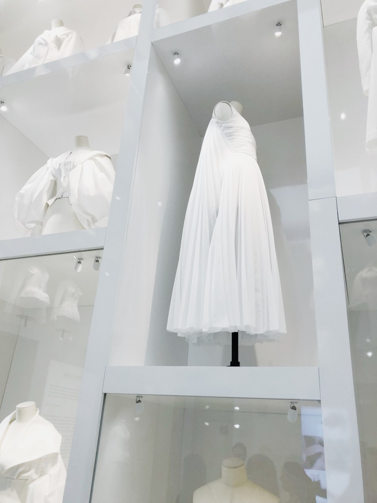
Walking into the Dior exhibition at the V&A was like walking into a dream. The first piece visible was the iconic bar jacket worn by Marie-Thèrése in 1947 (see picture below). I admire how Christian Dior really respected women; he wanted women to feel beautiful and confident in his designs.
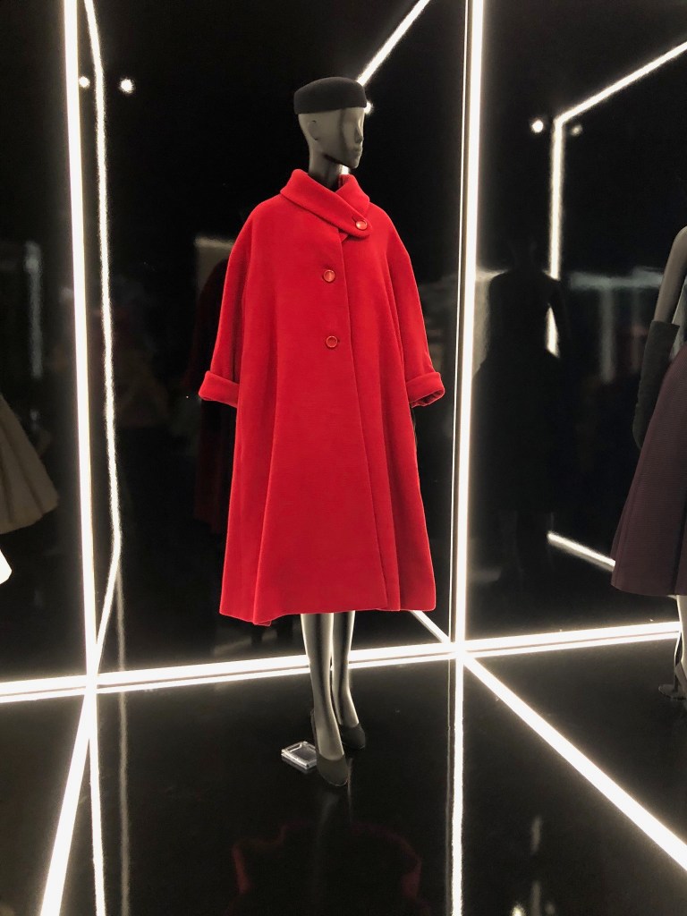
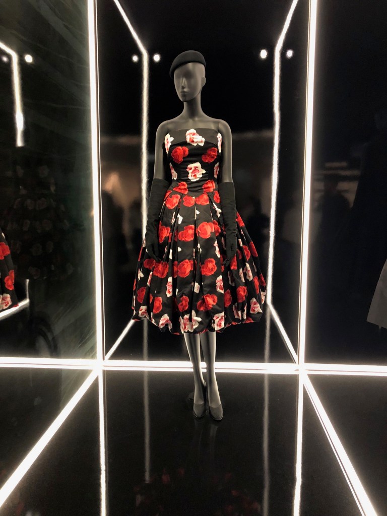
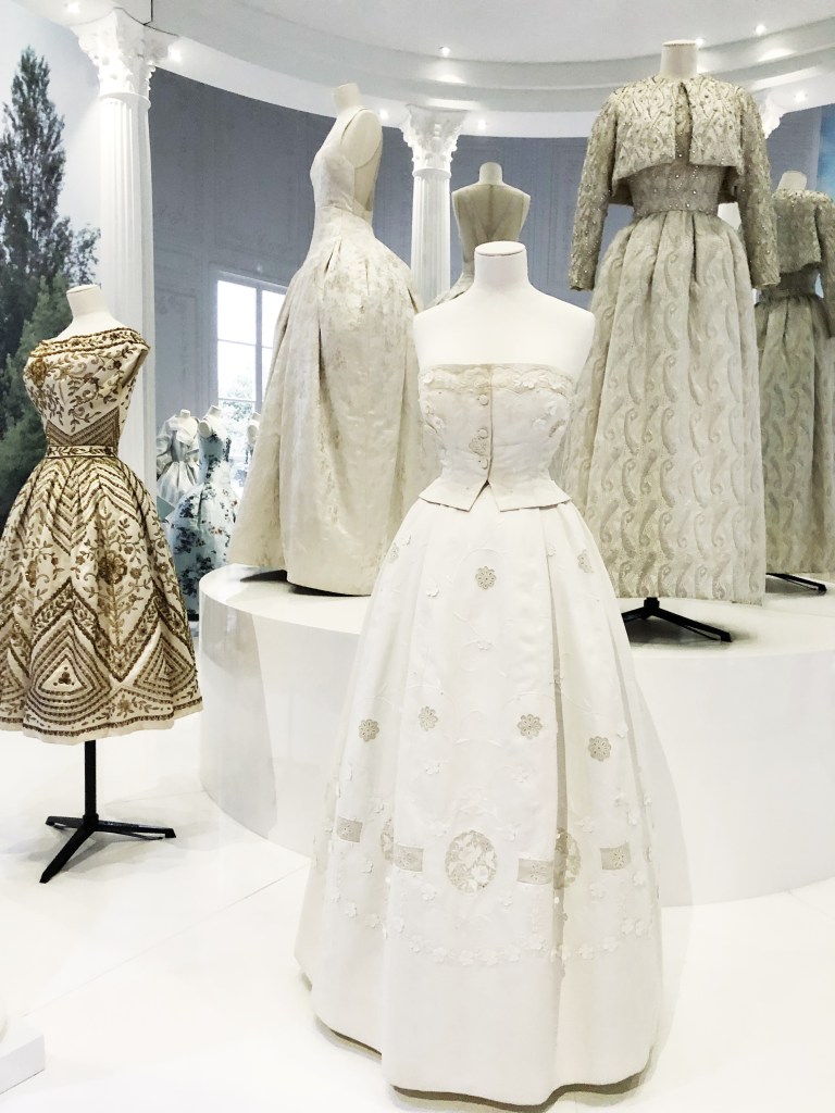
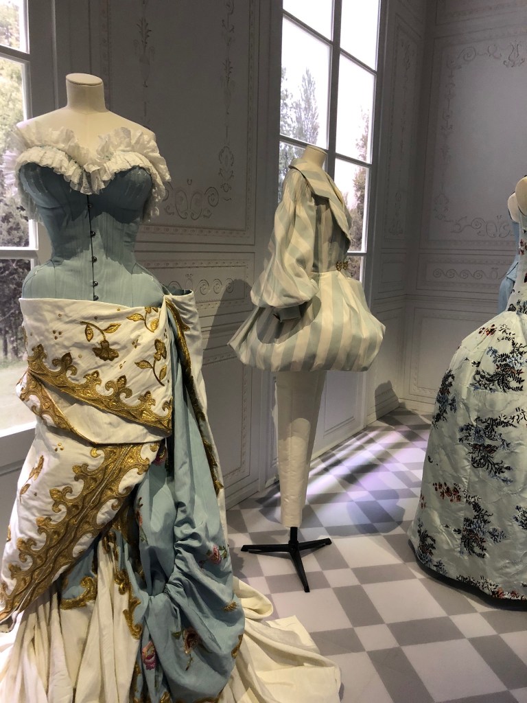
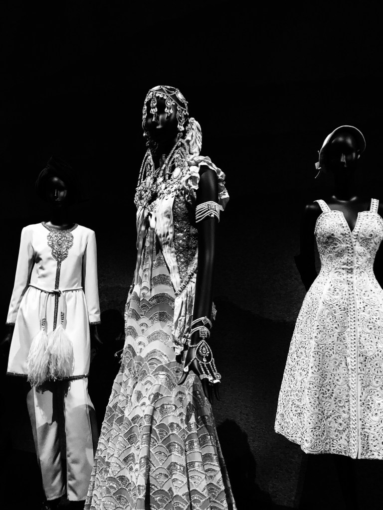
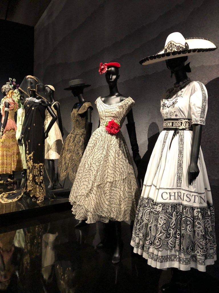
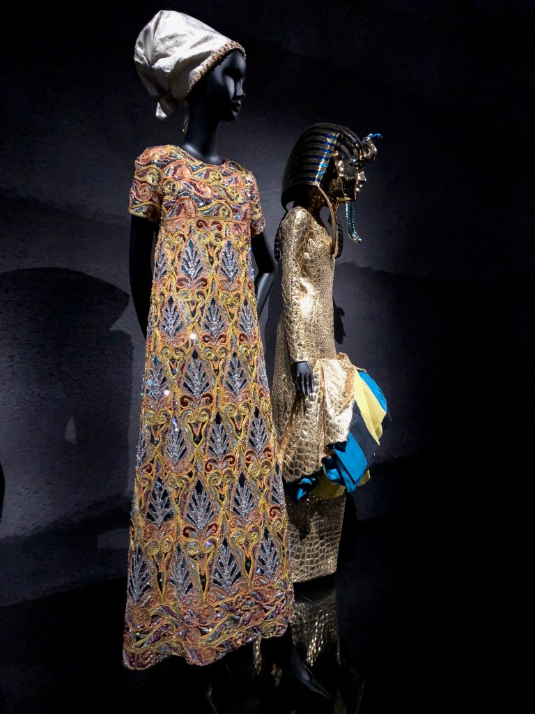
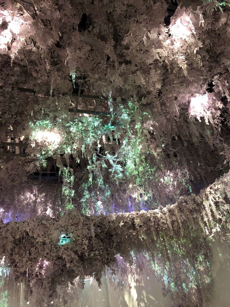
The following three rooms of the exhibition were thematic: a room of historically inspired garments, a room of culturally inspired garments, and a room of garments inspired by flowers. I appreciated how these themes reflected back on Christian Dior himself, even though the rooms included pieces designed by the creative directors who took over after Dior’s passing in 1957. Dior himself was so inspired by history, nature, and culture, and these themes are so pertinent to the brand identity.
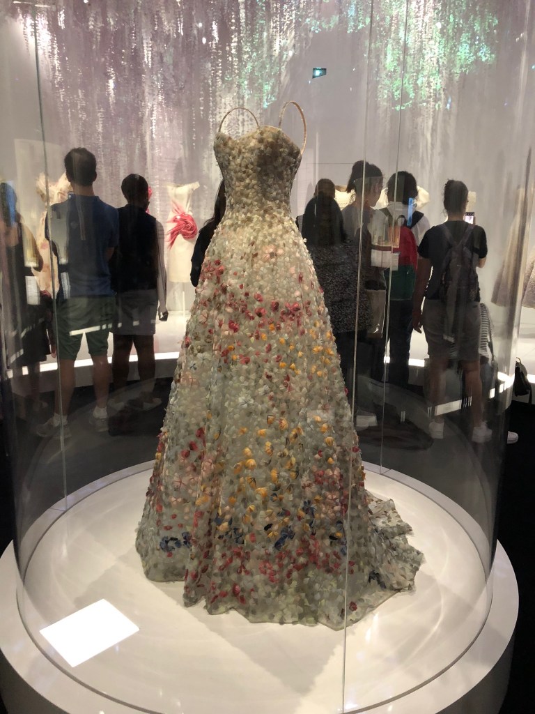
“After Women, flowers are the most divine of creations”
Christian Dior, 1954
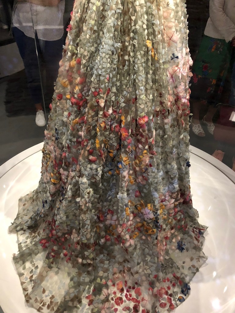
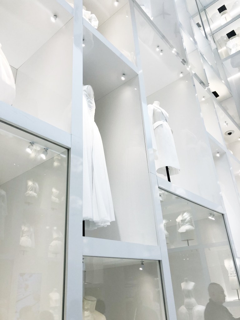
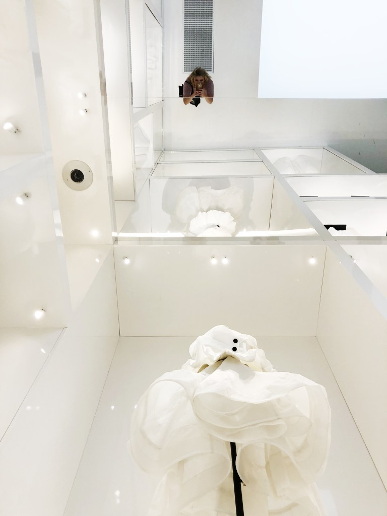
After the flower room came my favorite room, which was full of toiles. I loved how this was curated as an all white/reflective room. I also enjoyed how close the viewers could stand to the garments; I was able to see every single stitch.
This room was the most interesting for me because it shows the process by which a garment is made, and this process is definitely not quick or easy. Educating the public on what it means to be a maker or a creator is something that is so important to me. I have such an appreciation for hand craftsmanship, and I this room shared essential process work.
I also valued the addition of a room that paid homage to all of Dior’s creative directors. I didn’t realize that there were so many, and I enjoyed seeing how each creative director took a different approach and infused the brand with a slightly different aesthetic.
The 6 key Creative Directors:
Christian Dior: 1946-1957
Yves Saint Laurent: 1957-1960
Marc Bohan: 1960-1989
Gianfranco Ferré: 1989-1997
John Galliano: 1997-2011
Raf Simmons: 2012-2015
Maria Grazia Chiuri: 2017-present
After the exhibit, I kept thinking about Maria Grazia Chiuri’s, “We should all be Feminists” T-Shirt design. I felt that this really related to what my Manifesto Group is studying with advertising and media campaigns. This is a type of campaign for an ideology, which I found to be very modern and creative.
The exhibition was well curated, and the selection of pieces was fabulous. I went to the exhibition with Elodie Carrel, and her shared passion for both fashion and creativity made the exhibition even better. We were able to discuss the exhibit afterwords, and she had some interesting ideas about how the exhibition could have integrated more technology to make the information even more accessible.
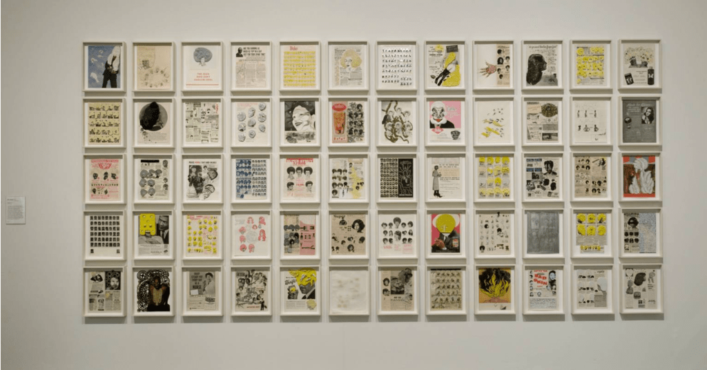
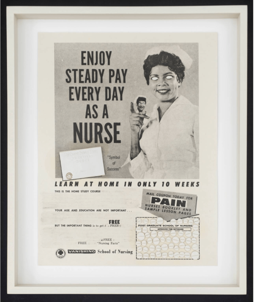
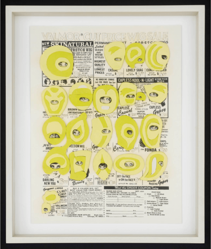
After our field trip to the Tate, I was most inspired by the artist Ellen Gallagher, who manipulated racist and sexist advertisements from the 1930s-1970s.
Photo Taken from Tate Modern Website: DeLuxe by Ellen Gallagher
Gallagher’s work is relevant to what my group is doing for our Manifesto Project (Psychological manipulation in the media). The advertisements are geared at the African American Community, and promote products such as: slimming aids, underwear, feminine hygiene items, skin treatments, and bleach creams. Gallagher then manipulates the original advertisement in a variety of techniques, often disrupting the original meaning. I enjoy the complexity and irony that Gallagher employs. Her work emphasizes and juxtaposes the original messages and ideas of the advertisements.
Also, Gallagher often whites out the eyes and covers faces of the people in the advertisement; this reflects the struggle with identity (gender or race). I found this very relevant to my group’s manifesto because we have often discussed how advertisements take advantage with our sense of self identity.
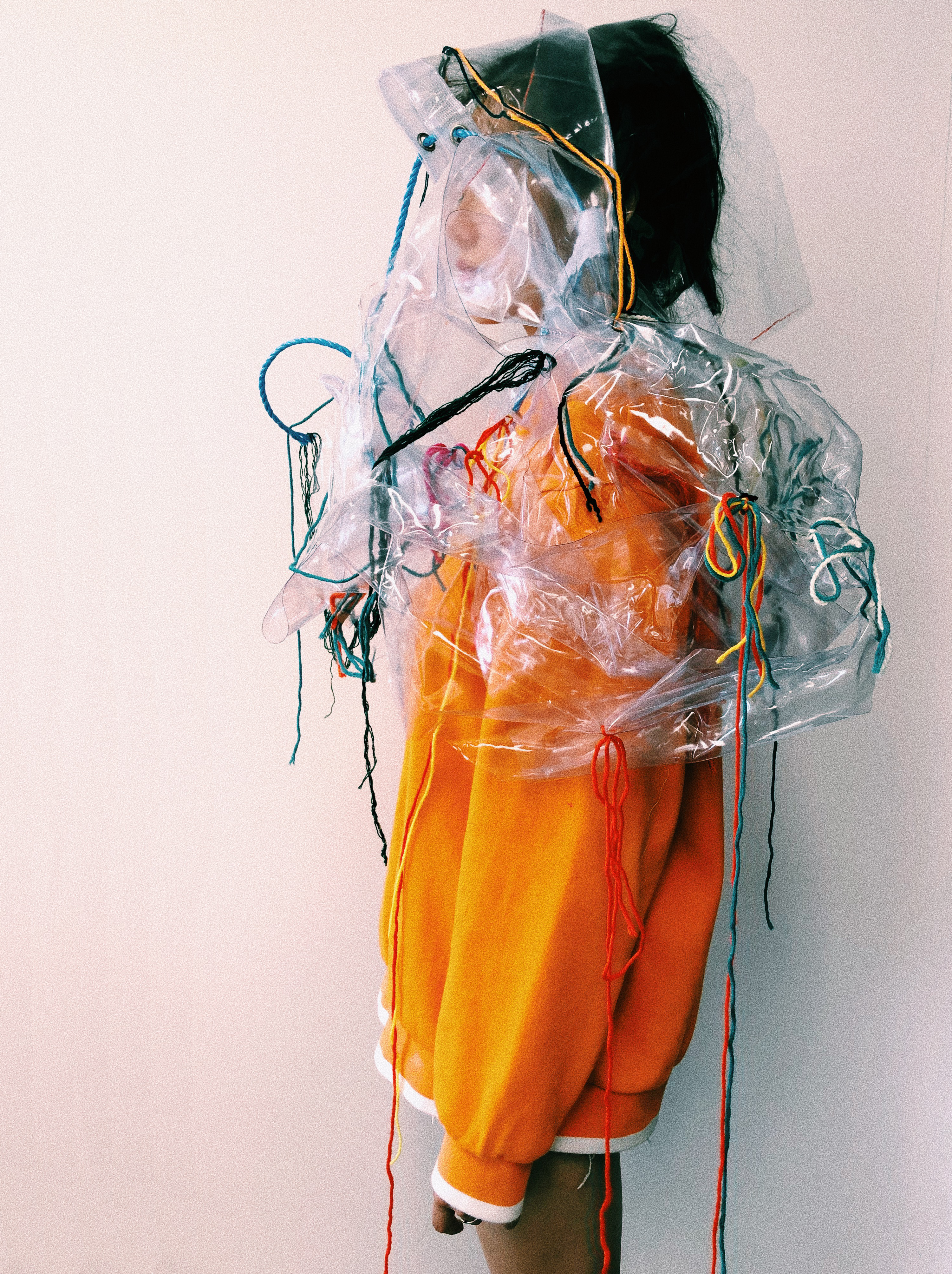
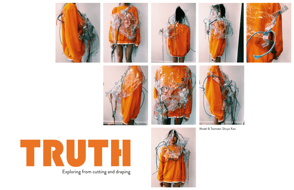
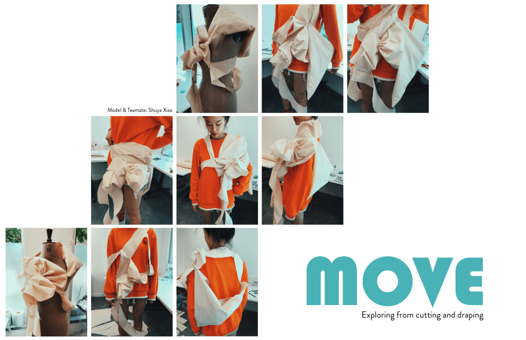
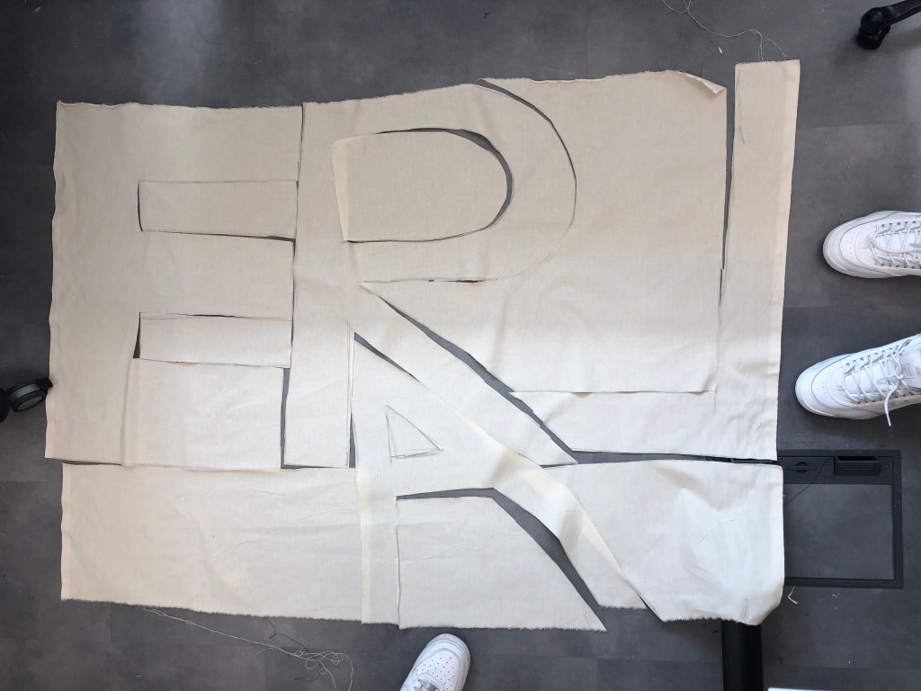
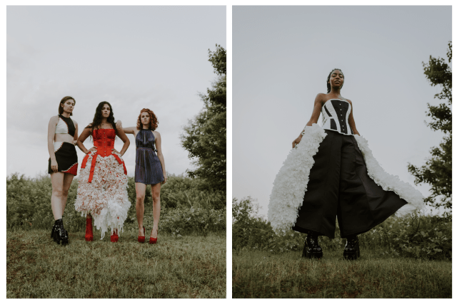
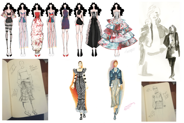
For this project, fashion and textile students were instructed to construct 3 looks, by draping on a human being. We were told to use pattern pieces made from words that related to our manifesto project.
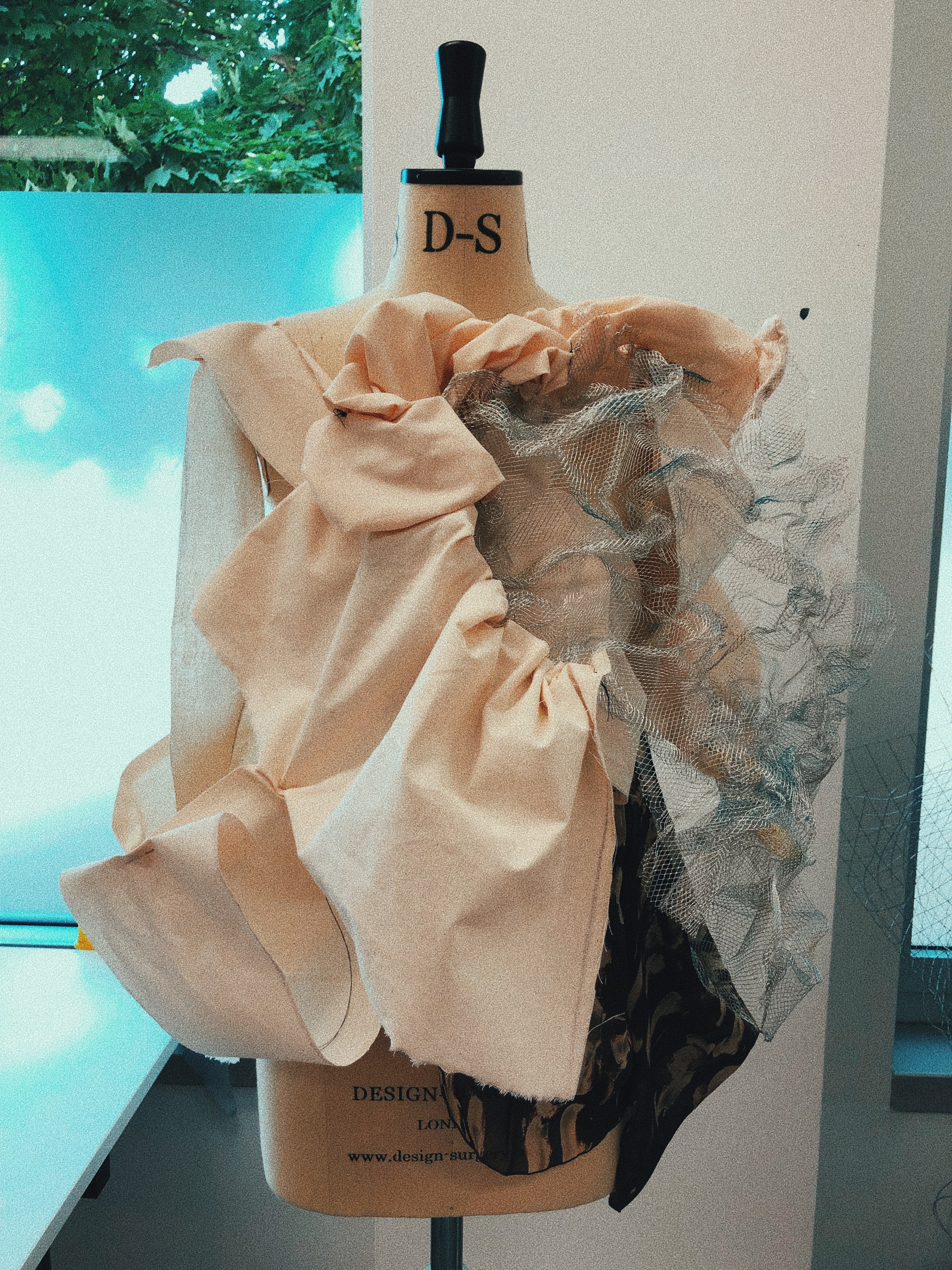
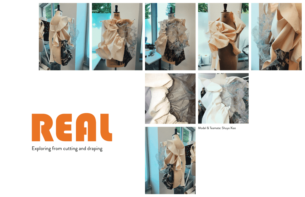
One of the words we selected was truth. We felt that this related closely with group Nine’s idea to use authenticity as a base word for our Manifesto Project. For this piece, we played with transparency to capture the idea that you have to look through some things to get to the truth (we wanted to underlay words, but did not have time). Transparency & Layering might be something interesting to play with in the final project.
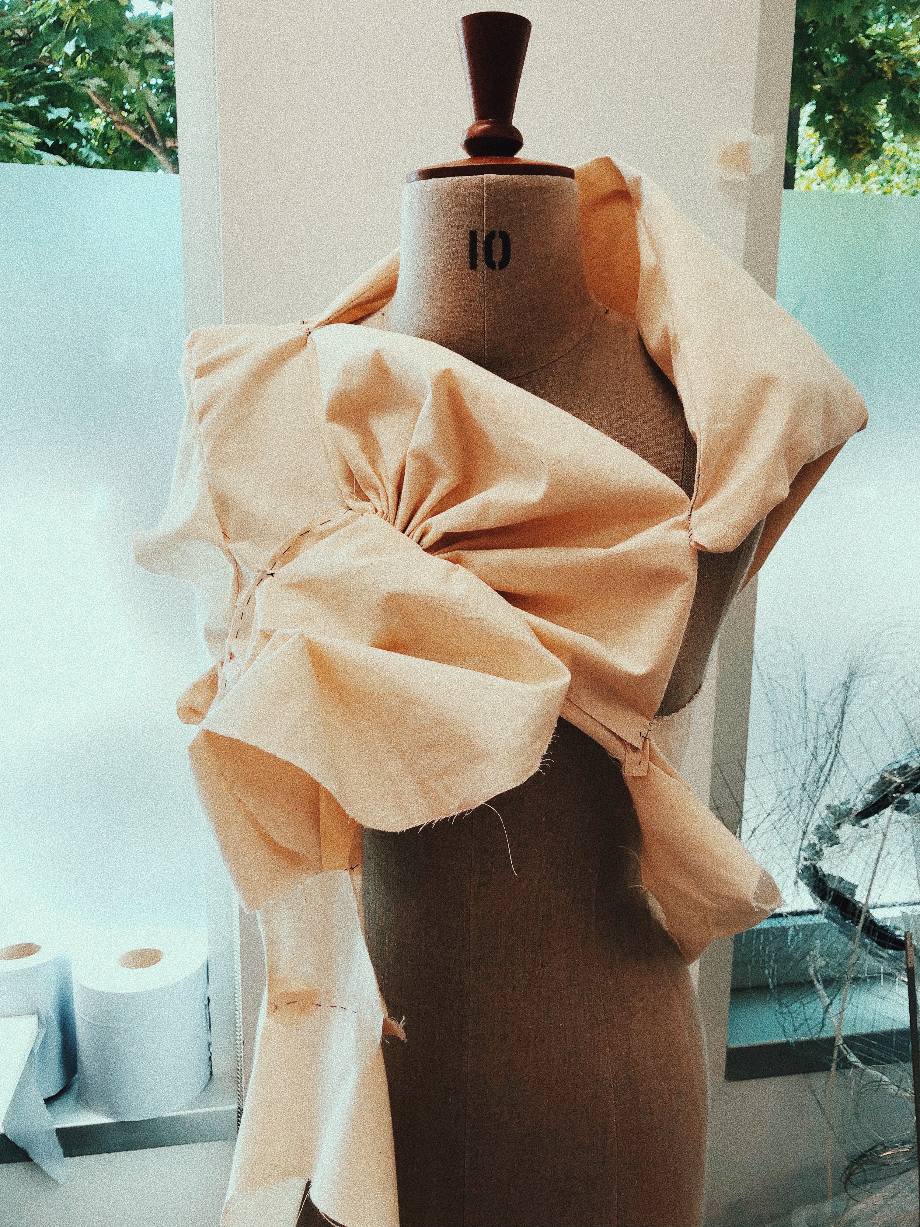
We used the word move, as in a collective movement of many people. We were trying to brainstorm what social and political issues may deal with authenticity, and the words move and movement stuck with us. It has a bit of a literal meaning as well as a figurative meaning.
The final word we chose was real, and we played with transparency in this piece as well. Authentic and Real seemed like fairly close synonyms.
Me and Shuya draping on a human form.
Working with Shuya to drape on an actual human being as we worked was a very different experience for me. I usually drape on a mannequin, and this was a lot more freeing.
Another very new experience for me was cutting patterns out of words and not having a set patterned piece to cut out. It was both terrifying and liberating. I enjoyed the speed at which we were able to create.
A few things you need to know about me: I love making things, I consume excessive amounts of caffeine, my peanut butter obsession is out of control, and I love fashion. I’m super silly and sassy, but I’m really just excited to learn!
Attending the RCA has been an absolute dream for me, and I’m so excited to learn from my amazing new classmates and professors.
I’ve attached my Pecha Kucha in case you missed it!