Final Presentation Notes and Thoughts

In case you missed my video, here it is again!

I felt like my own personal work was not as strongly addressed during the final critique, but a lot of the feedback given was applicable to every group member. For example, Lee and Nathan both pointed out that we shouldn’t have established, “nature” as the definition of authentic. This was a good point, and I felt like my group could have spent more time defining what exactly authenticity is. I did not really even think about that because it just seemed like a fact that I would accept.

I felt like we did not communicate the fact that our response to the manifesto was not to take a stance on whether or not advertising is good or bad, but rather to promote the idea that consumers should be more aware of advertising. I felt like that didn’t come across, and we could have stated that more clearly.

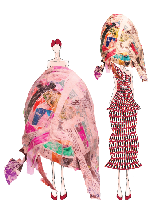
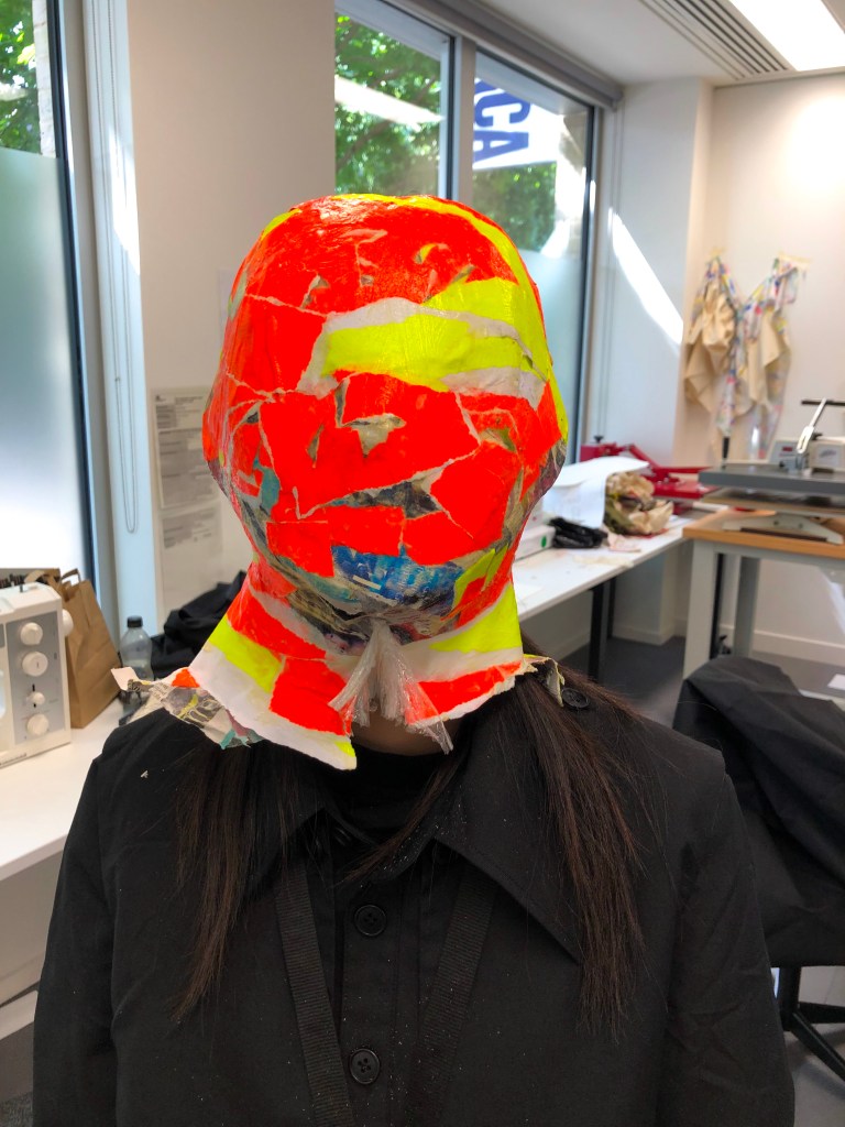
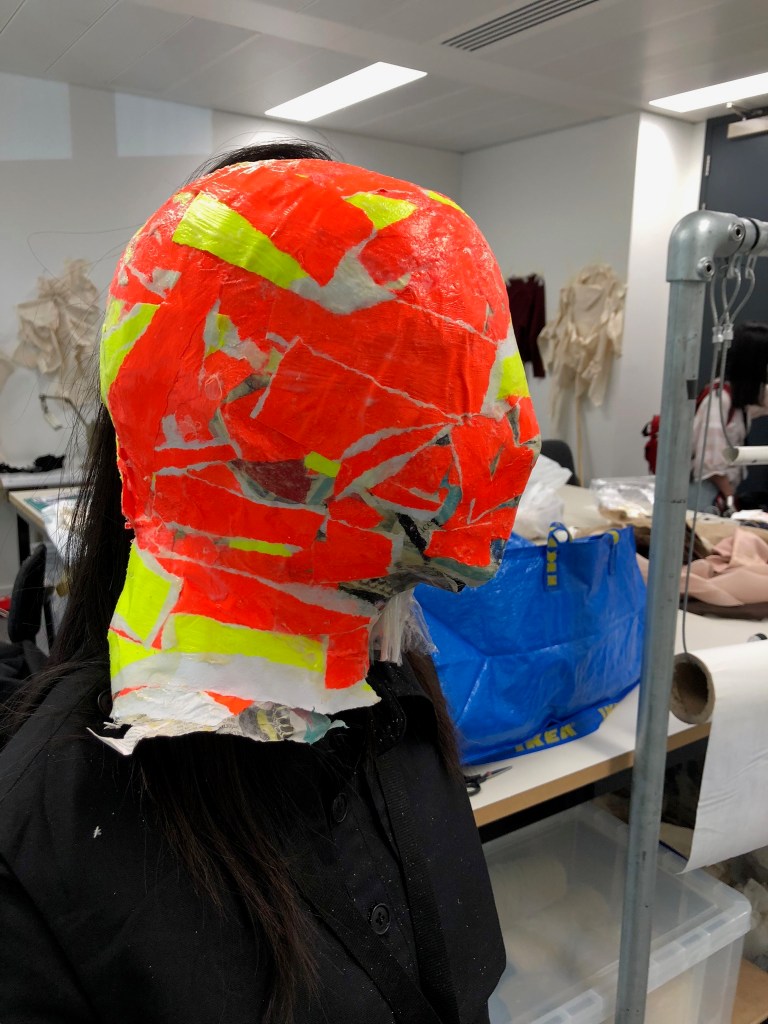
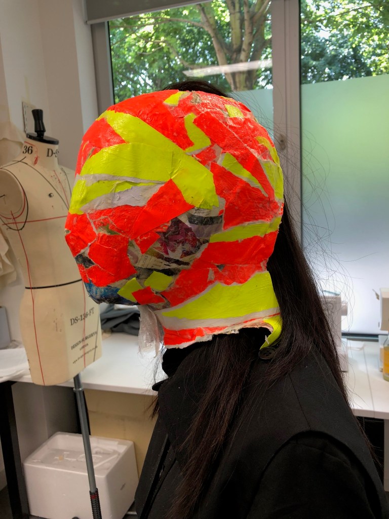
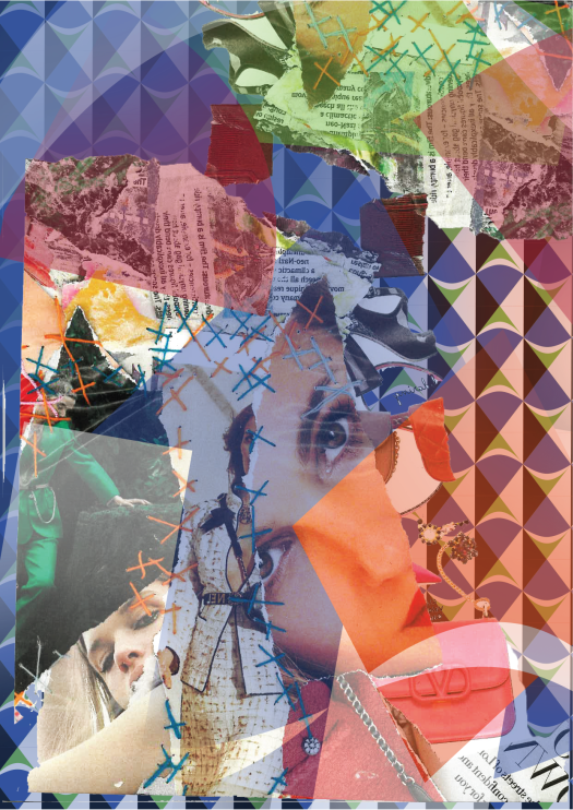
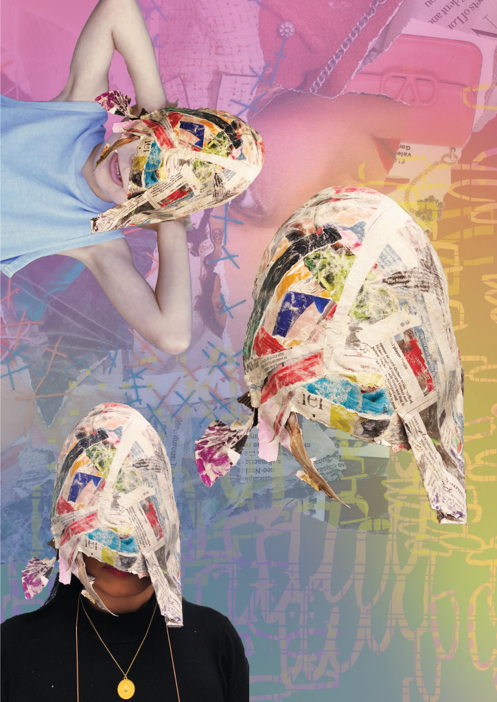
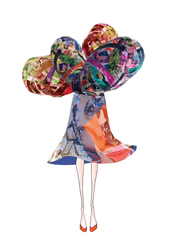
In reference to my own work, I learned so much in this process, and I’m really just irritated that I did not get started sooner. ITS NOT ENOUGH TO JUST RESEARCH OR JUST MAKE, doing both AT THE SAME TIME is what has elevated the quality of my thinking and design skills. Researching and exploring multiple different avenues of experimentation at the same time was so crucial to my process. Had I realized this sooner, I think my work would have been more interesting because I would have been able to get more feedback (and have more time to take videos/cut clips together).

I’m really happy with how much I have learned, and I’m so excited to apply these skills on the next project.

The Best Podcast You Will Ever Hear

My group has worked so well together! If we disagree, we always have an interesting discussion evidencing our points. Everybody worked hard and brought new ideas to the table (pun definitely intended). Also, I think we collaborated very well with each other, and our diverse personalities and backgrounds made our work so interesting.

I think you can see how well we work together in our podcast.

I couldn’t be more grateful for my team members!

Good Words: exegesis

exegesis noun |ˌeksəˈjēsis|

  1. critical explanation or interpretation of a text, especially of scripture: the task of biblical exegesis | a close exegesis of the plot.

Olafur Eliasson: In Real Life

This exhibition was probably one of the best immersive/interactive exhibitions that I have ever been to in my life. Eliasson focuses on nature, interaction, and geometry through a variety of different techniques and mediums. I loved to see Your Uncertain Shadow (2010) in action, because people were collectively moving and smiling. This piece (and most of Eliasson’s work) is truly something that needs to be experienced.

I also enjoyed How do we Live Together? (2019) because the mirrored effect was seamless. The effect was so enigmatic in a way.

My favorite however, was the Big Bang Fountain (2019). There were no photos allowed, so I have attached this video:

Eliasson is so good at involving all the senses in his work. I was completely bamboozled as I watched this piece. In person, you cannot tell that it is water because the room is so dark. It was mysterious and beautiful. Also, the cool air jutting out from the table, and the sound effects added to the sensory experience.

I think Eliasson my be my favorite contemporary artist. It is obvious that all of this works are so well thought out and considered.

Good Words: Sartorial

sartorial |särˈtôrēəl| adjective [attributive] 

  1. relating to tailoring, clothes, or style of dress: sartorial elegance.
  2. of or relating to tailors or their trade: sartorial workmanship.
  3. of or relating to clothing or style or manner of dress: sartorial splendor.

Moving Image

I was really excited to create this short video clip. Integrating a variety of different sounds helped with the overall tone and mood. I wish I had gotten more poses and angles, but it was raining and the mask is very fragile, so that was not possible

If I were to move forward with this, I would definitely make more masks and capture more actions and angles.

Overall, I’m happy with how many different avenues I’ve explored. I wish I had had this mindset earlier in the process, because it has been so freeing.

I’m starting to view fashion in a very different light. I’m interested in exploring fashion from a more, “immersive” angle. I have been reading the V&A’s book on Alexander McQueen, and I think one of the many factors that made him so successful was the fact that his shows were such a sensory experience. For example, his Joan of Arc (1998) collection included moving lights, fire, and music. A lot of his work was a performance. I think including these aspects would make my personal practice evolve and engage more viewers.

Re-Visiting Old Ideas with New Knowledge

Today I started re-collaging over one of the original masks that I didn’t care for at the beginning of my process.

I really regret to say that I threw the scraps of the other mask away after I used it in my attempts at digital collage.

But… today I was thinking about the piece I had seen at the Tate Modern by Romare Bearden and how he has influenced my work. On my digital croquis I was playing with scale (like he and Nick Cave do) and color. I thought it may be interesting to take some of these elements back to the 3D realm. I started collaging over my mask with very loud colors, and it definitely created more visual intrigue.

As I was ripping up my papers, I was thinking about how Bearden took his reality (as a black man living through the Civil Rights Movement), and used collages as a method to re-imagine how life could actually be and communicate his reality or story.

I was listening to the sound of the paper ripping.

I was thinking about Olafur Eliasson’s immersive exhibition that I had seen (how he utilizes all of the senses).

And this idea that media bombardment is not just a thing you look at, it’s a space you’re in. It’s where we live, how we live, it’s what we smell, what we see, and in a way it is part of who we are and how we live.

And this all culminated with the idea of creating a short clip of a person ripping the mask off themselves. It is kind of symbolic in a way of somebody freeing themselves from this media bombardment. In my group we talked a lot about what our, “resolution” is and we decided that we wanted to promote this idea of critical thinking when the public is viewing advertisements.

So I think in the video I want to have my model pick up a newspaper after she rips it off her face, and she will read the newspaper and look content and less serious because she will have this newfound knowledge.

This way, the video clip is me using my materials and my subject to re-imagine how people could live and be. (perhaps my model will relax and slouch a little when she is reading the paper).

Note to self: think about the how the audio will change at this point in the video.

Work is Getting Better/Visual Research

I’m still exploring the idea of identity and media bombardment as I create collages. I’m liking them and also regretting having torn apart and trashed my original masks.

This whole assignment is giving me crippling anxiety. I am such a craft/product person, and it is very foreign for me to spend so much time researching. I have found the time valuable, as I have researched so many different artists and concepts, but not being able to quantify all of my work with a well-made product is driving me crazy.

I do, however, feel like my visual research skills have developed immensely.

Here are some pieces I’ve made. I don’t know how, “realistic” they are, but I think they address my concepts in a more figurative way than the original masks did. I also think there is more room for interpretation (which could be good or bad).

Tate Modern Trip 2: Materials and Objects

I was attracted to this exhibition because there were a few pieces which used collage as a method of creating. The technique of collage was first called paper collé in French (glued paper). It originated a century ago.

The artists in the exhibition (Man Ray and Joan Miró) embraced the surrealist idea that unexpected combinations can have a certain power to them.

I was particularly inspired by Romare Bearden’s work, ‘Pittsburgh Memory’ (1964). He used collage as a method to respond to the Civil Rights Movement in the United States. With theis medium Beardden could, “invent new scenes using existing images from magazines, creating alternative representations of African American experience to those offered by photojournalism and Advertising” (‘Materials and Objects’, Tate Modern, 2019).

Pittsburgh Memory by Romare Bearden (1964)

I was very attracted to the scale of this piece. Usually collages seem to be a fairly standard size, but when enlarged the impact is so much more strong.

Also, I liked how Bearden took what was already there and completely subverted whatever the original meaning was to share his own messages and ideas.

I regretted not seeing this exhibition sooner, because it gave me so many ideas and inspirations around the medium I had been working with. I am thinking about ripping up my masks and using them to collage (maybe scanning them?) In Illustrator I could play with scale, color, and placement more. This may make my print explorations more cohesive and interesting.

Tate Modern Trip 2: “Start Display”

I was looking for inspiration on color and patterns during this trip. I was waiting to get into the Olafur Eliasson exhibition for a few hours, so I decided to meander around the galleries.

The first Gallery I looked at was the “Start Display” because it addresses color. I found Matisse’s work (The Snail) very interesting because it heavily focused on color placement.

Henri Matisse, 1953, Photo taken from the Tate Modern Website

I also enjoyed Frahrelnissa Zeid’s abstract painting. She used swirling and crossing lines to created a kaleidoscopic effect. I think the shape, movement, and pattern are very relative to what I’m doing. This is most definitely visually bombarding and intrusive.

Fahrelnissa Zeid; 1950s; Photo taken from the Tate Modern Website

The final piece in the gallery that inspired me was Peter Sedgley’s work (Color Cycle 3). I found his work very hypnotic and somewhat jarring. The exploration of light used in conjunction with color was effective and beautiful.

Peter Sedgeley, 1970, Color Cycle 3

Ways to Captivate Viewers:

  • Pattern
  • Scale
  • Light
  • Color Placement (in relation to other colors)
  • Color Choice (complements)
Design a site like this with WordPress.com
Get started