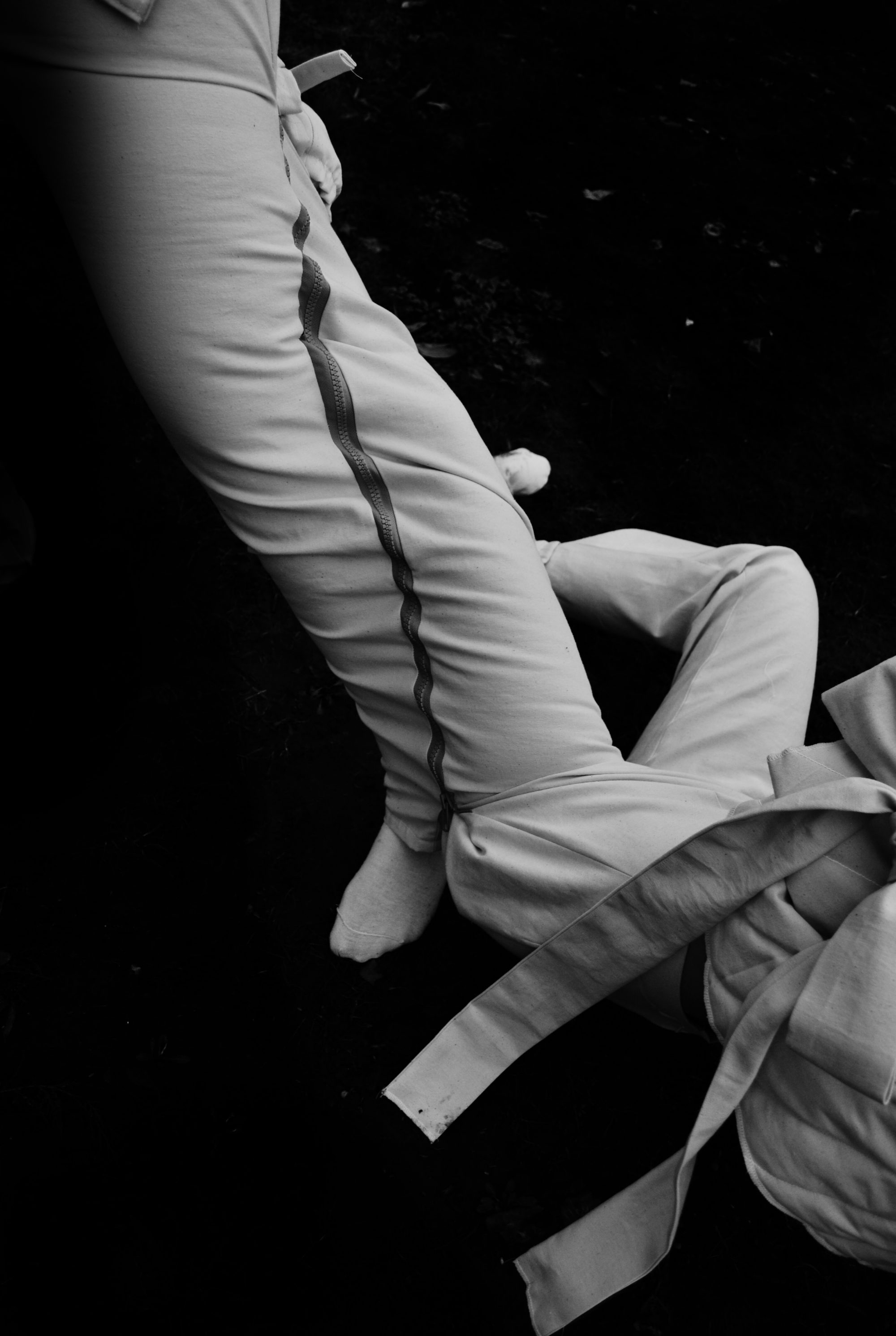
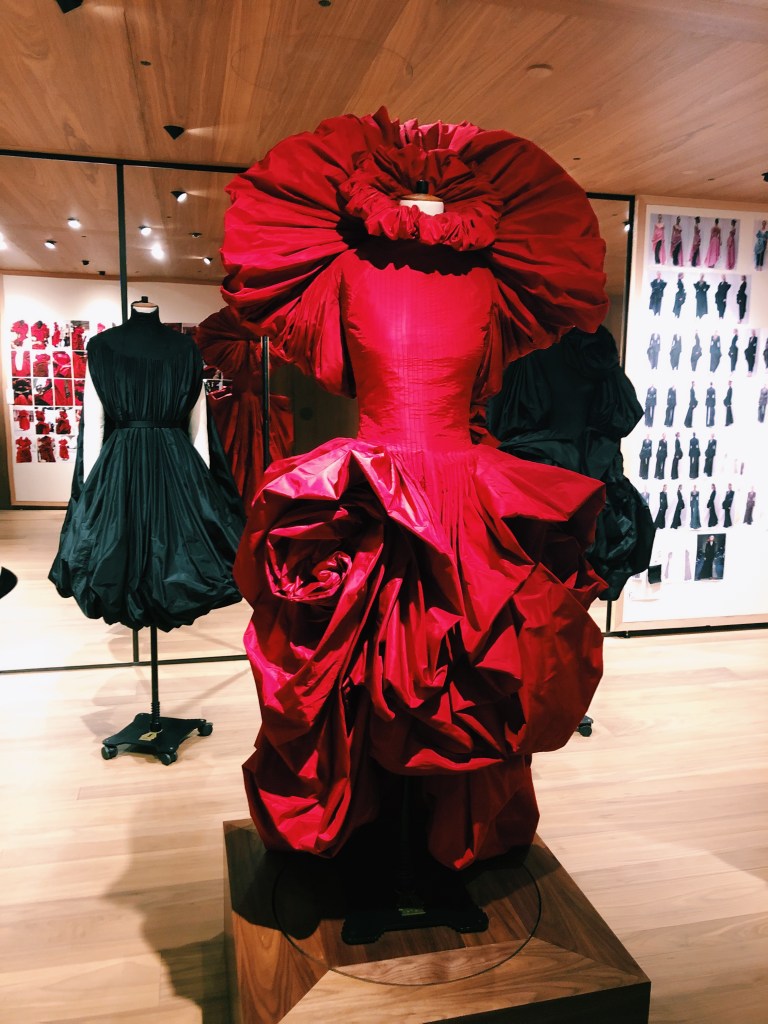
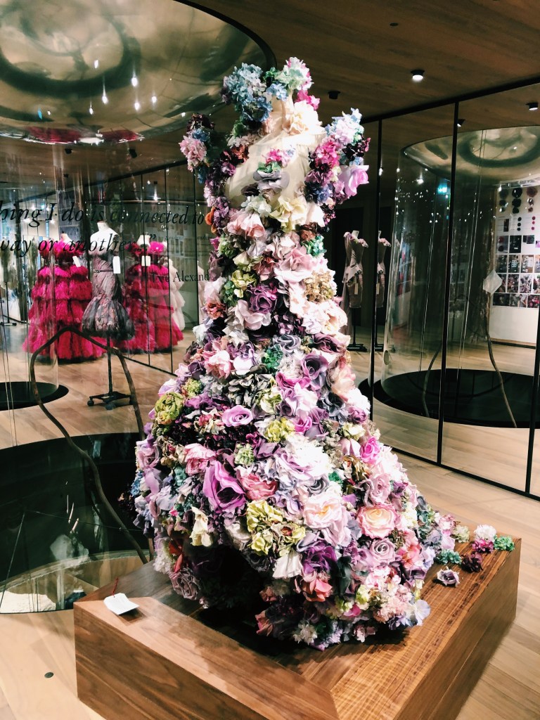
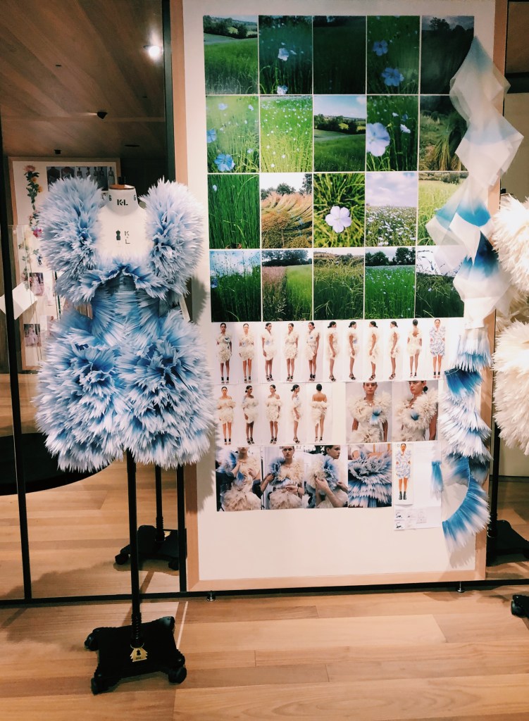
I’m writing my contemporary practitioner essay on both Sarah Burton and Alexander McQueen’s work at the brand, so this exhibition could not have come at a more perfect time.
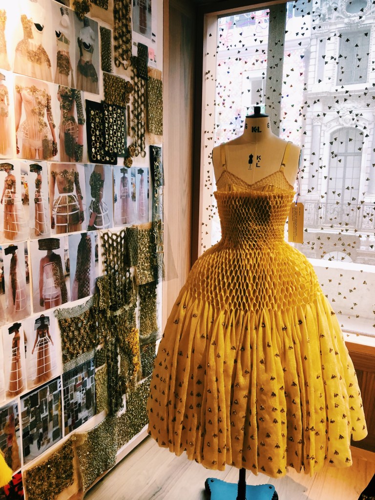
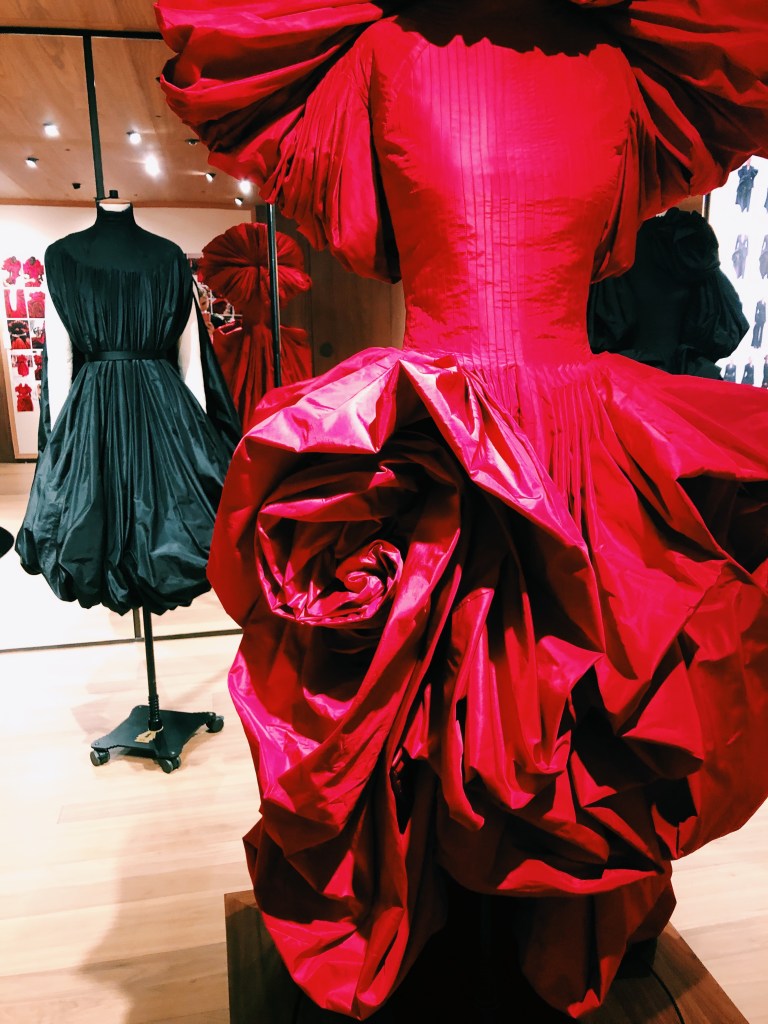
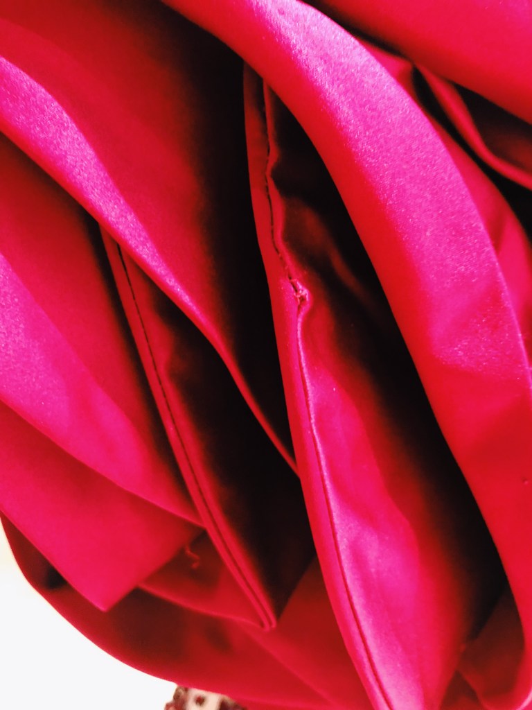
During this exhibition, I was trying to be very sensitive to material and whether or not it has a structural function. I was looking at how the smocking and draping can be used to create large and interesting shapes.
I admire how Burton was so open about process in this exhibition. She had walls of process work and a video of workers in the atelier showing how a garment is constructed. In the fashion industry people are so secretive about methods, and this was honestly refreshing.
In a way, this also “humanized” the brand for me. Seeing the garments so close up was helpful, I was even able to see the hand stitching! It reminded me of my previous post about high quality things having evidence of human craftwork.
On a completely separate note, the exhibition made me think a lot about nature, as the subject of the exhibition was roses. In relation to my work, it seems that fashion (specifically corsetry) is aimed at controlling what is “natural”. I think this is a theme I could expand upon in my experimentation. I’m interested in exploring nature and the human body in their basic forms as well as enhanced or manipulated forms. This will be the subject of tomorrow’s experiments: Control over what is Natural.
Photos taken from portfolio website of Evy Jokhova (see Citation)
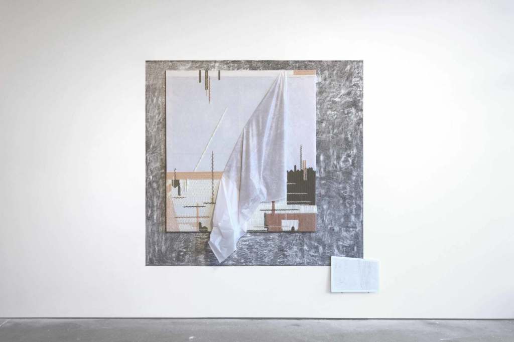
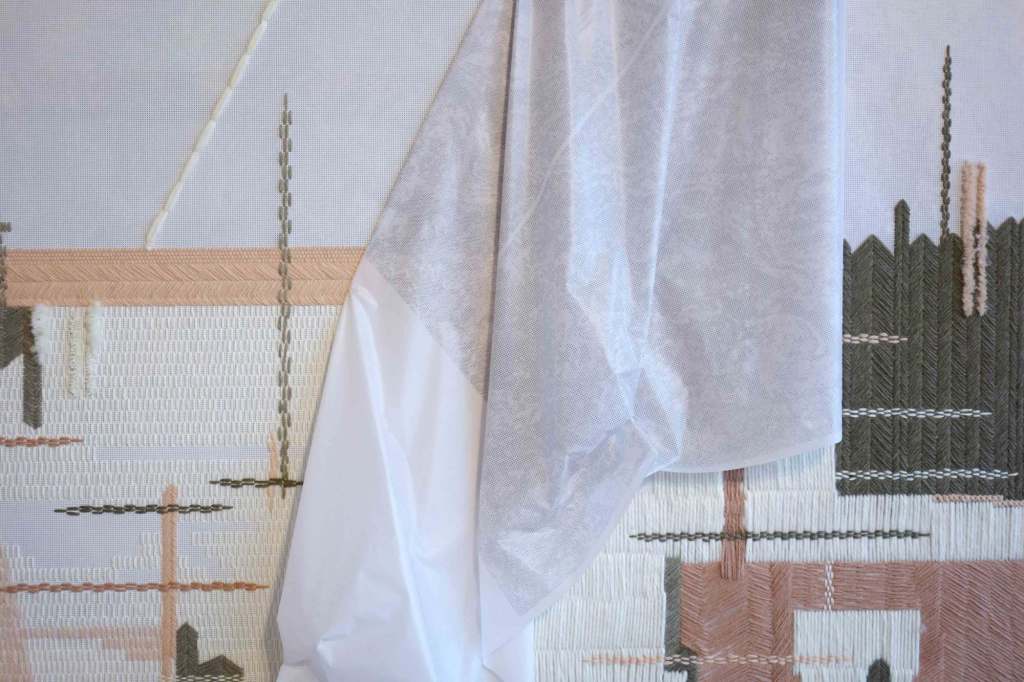
During the Speed of Thought exhibition, one piece in particular caught my eye: ‘From Memory’ by Evy Jokhova. As I said in the previous post, I was intrigued that an artist might use stitching as a way to conceptualize his or her ideas. In my practice, working with materials seems to be a very pivotal and integral part of the way I learn… so infusing initial sketches with this practice is something I want to experiment more with in the future (definitely not on this scale though…).
This piece is, “a recreation from memory of a tapestry Evy’s mother spent a 1/2 of their entire family savings on in 1991 in Soviet Russia shortly before the Soviet Union collapsed and the Ruble completely devalued.” What struck me about this piece was the contrast of the materials used. The white backing is a banner mesh, which seems very rigid and almost shiny, while the yarn used is a very fuzzy wool. I had to resist the urge to run my fingers across the herringbone and running stitches when I viewed it in the gallery.
This piece was obviously labor intensive- anybody who stitches would know that this practice takes an incredible amount of thought, labor, and effort. It seems as if the artist is recalling her memories through her stitching process, which is often cathartic. Viewing this process reminded me that in my midterm review I wanted to investigate other ways that humans face restriction, and one of which was how people can be bound by their memories or time.
This is something I would like to do an experiment with- likely more toward week 3/4 as I want to research memory and repetitive and/or cathartic practices further.
My initial thought is to have pre-stitched patterns, that a viewer may only get a minute or two to look at before having to replicate the design themselves. I could record their errors, and how long it takes them to execute the task. I could photograph their physical positioning and ask them how they feel during and after the process.
I’d like to discuss this idea in a tutorial.
Also, I need to remember to research diseases that effect the memory (Alzheimers, Amnesia, Dementia)
Francesca, I agree with you that this type of display was perfect for the work being presented by Architype, and it definitely caught my eye! For me, the most interesting aspect of this exhibition was the range of mediums and methods used to create “sketches”. It was obvious to me that creatives use a variety of methods to visualize their thoughts. For example, Julian approached sketching from a very painterly and geometric/pattern cutting perspective. His work seems to put a lot of emphasis on the whole body and how it moves in space. And the piece by Evy Jokhova (‘From Memory’) showed how a fiber artist might sketch through embroidery stitches, which happen to be very intricate and detailed.
I don’t know about you, but seeing how so many different scientists and artists conceptualize their ideas through these mediums made me think about how I might approach sketching in the future… I’ve always found sketching with a pen and paper is convenient in a gallery setting (and helpful), but it may behoove both of us to try other, more three dimensional approaches?
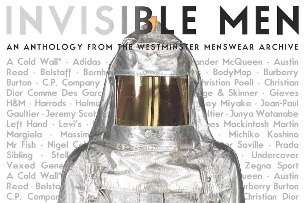
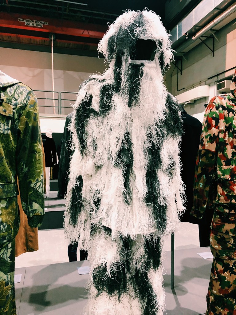
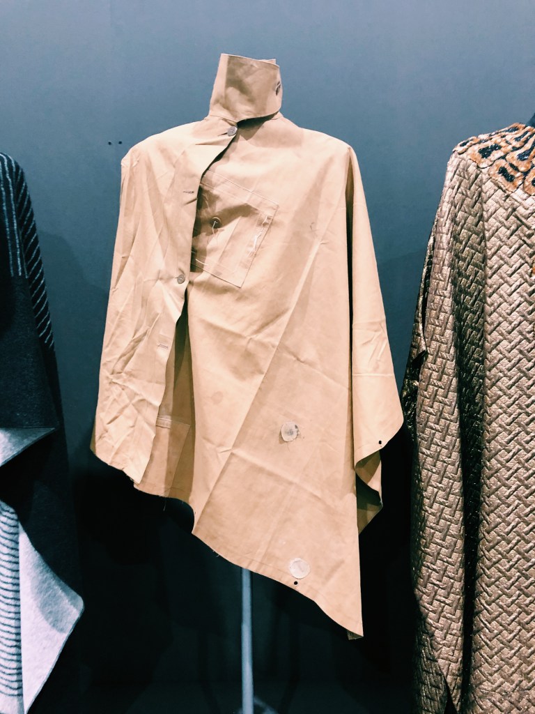
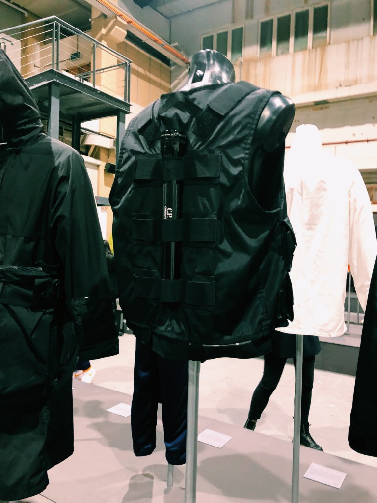
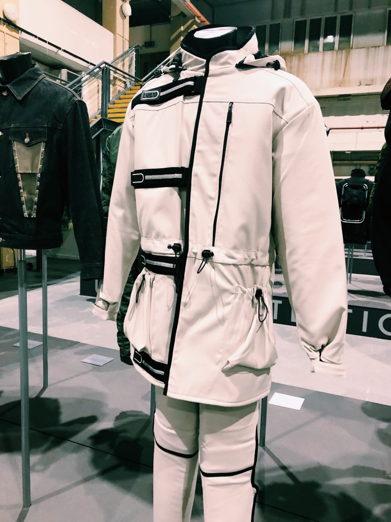
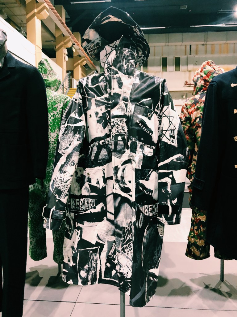
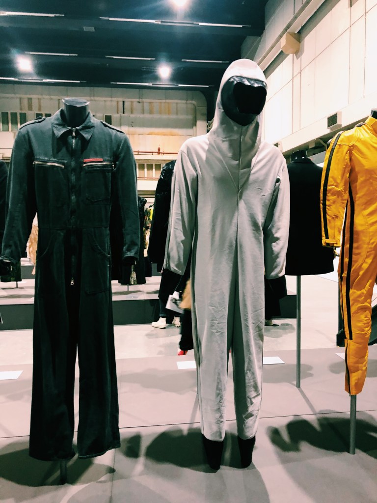
Overall, the purpose of the exhibition was to pair designer garments alongside military, functional, and utilitarian outfits. This was done because these types of garments have dominated menswear design as a source of inspiration throughout time. Some of the original garments subverted the original inspiration, while others replicated the sources. The original meaning and function has been lost from iteration to iteration. In the pamphlet, this approach to menswear design is described as almost, “fetishistic”.
I found this exhibition very enlightening because there is a stark contrast between menswear and womenswear when it comes to functionality. All of the garments had a “purpose” some of which included (but were not limited to):
protection from heat
protection from cold
protection from biological, chemical, nuclear, and radiological sources
protection from animals
protection from human beings
camouflage
protection from water
protection from electricity
protection from being stabbed or shot or tazed
functional carrying of objects on the body
disguising the face
In contrast, meany womenswear garments don’t even have pockets!
I started to think about how utilitarian or functional garments might be different if they were created for a modern woman’s needs. Some of these needs may include:
wanting to be hands free
wanting to blend in/stand out
wanting to have “eyes in the back of your head” so you can watch and protect yourself more easily
maybe having a weapon for self defense built in
having a better range of motion
more comfortable shoes
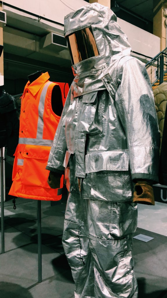
Fire Suit
Ghillie Suit (2016)
Weather Protection
Taser Training Suit
capes – synonymous with the ideas of concealment, disguise, and invisibility; acts as a garment that hides the body; has made a resurgence recently because the garment is genderless
Overalls – cover up what is worn underneath allowing the user to hide identity; functional use to protect clothes; used in many professions that are considered “mens work”
Black Jacket – subtle differences that are almost undetectable to the untrained eye; respectability and formality
Camouflage – making objects hard to see (crypsis) or disguising them as something else (mimesis); motion dazzle confuses the observer with a striking pattern making the object harder to locate; Disruptive Pattern Material (DPM)
Armour – status of protection and bravery
Urban Protection– Moreno Ferrari/ how to make daily life better for “modern men”
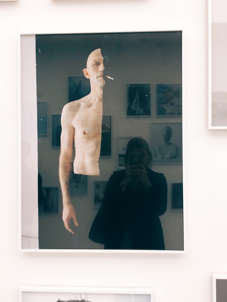
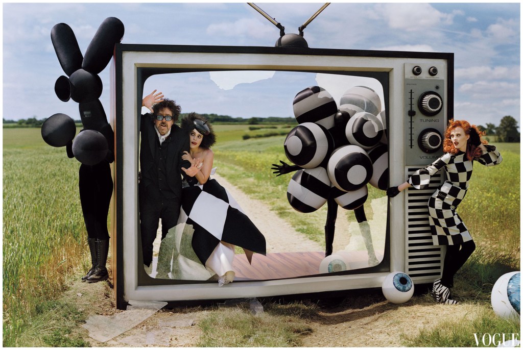
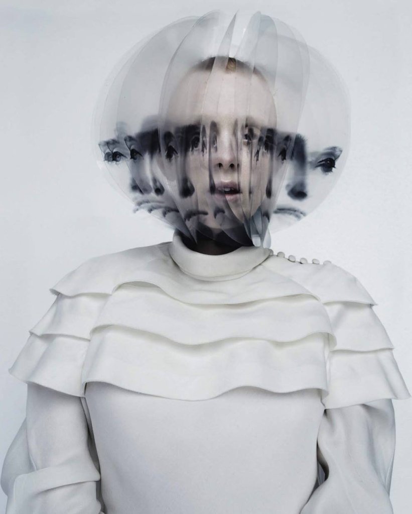
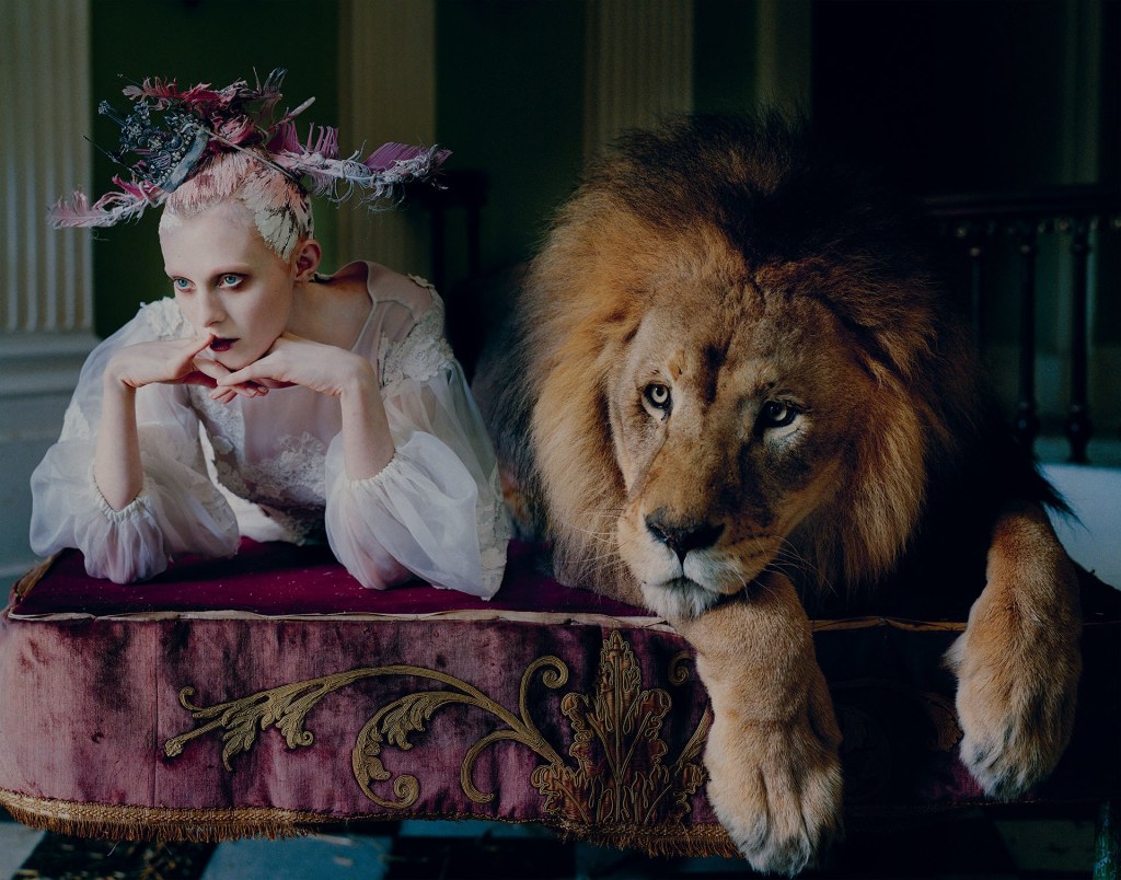
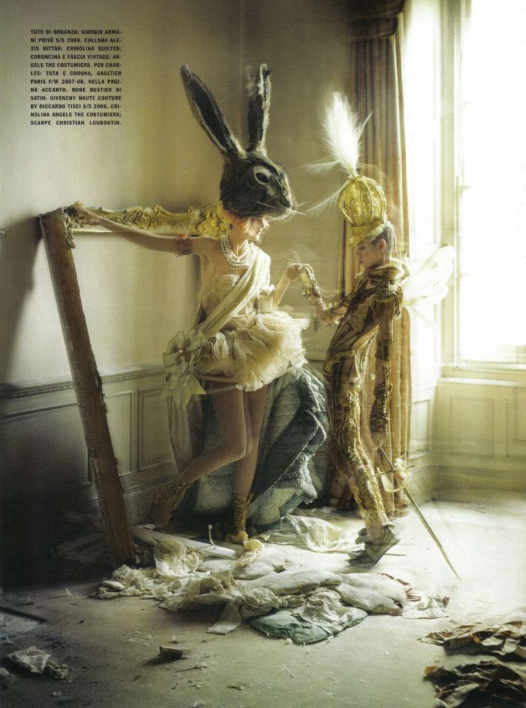
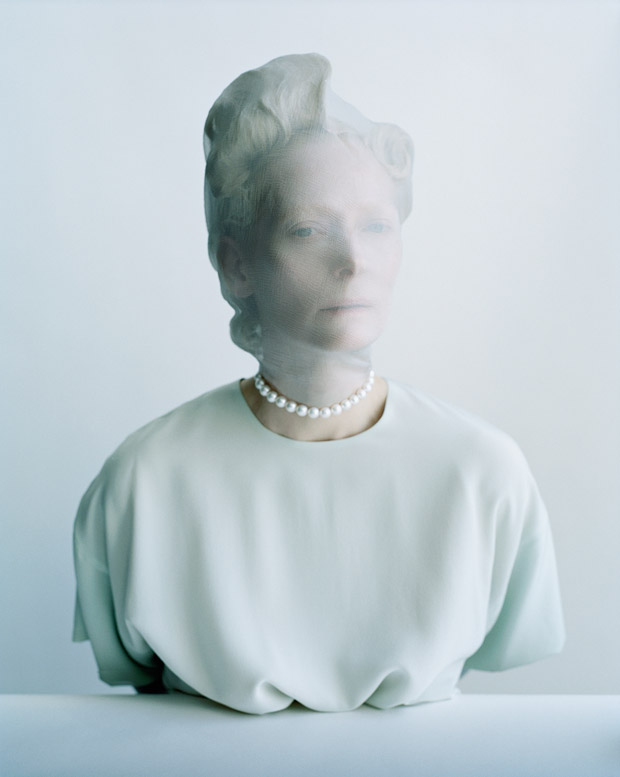
I absolutely loved the Tim Walker exhibit at the V&A. The way he abstracts such concrete items or ideas and takes them to a surrealist level is so lovely (and what I am striving to do in my work). I also loved his images that played with/distorted the human form. (see below)
Citation:
Tim Walker: Wonderful Things, V&A. 2019.
Surrealism
Distortion of the Human form (Iris Van Herpen)
Surrealism
Distortion of the Human Form
Tilda Swinton; Human Distortion
Humans almost look like puppets or animals
Tim Walker 2014- Photo of Alexander McQueen 2009 “The Horn of Plenty”
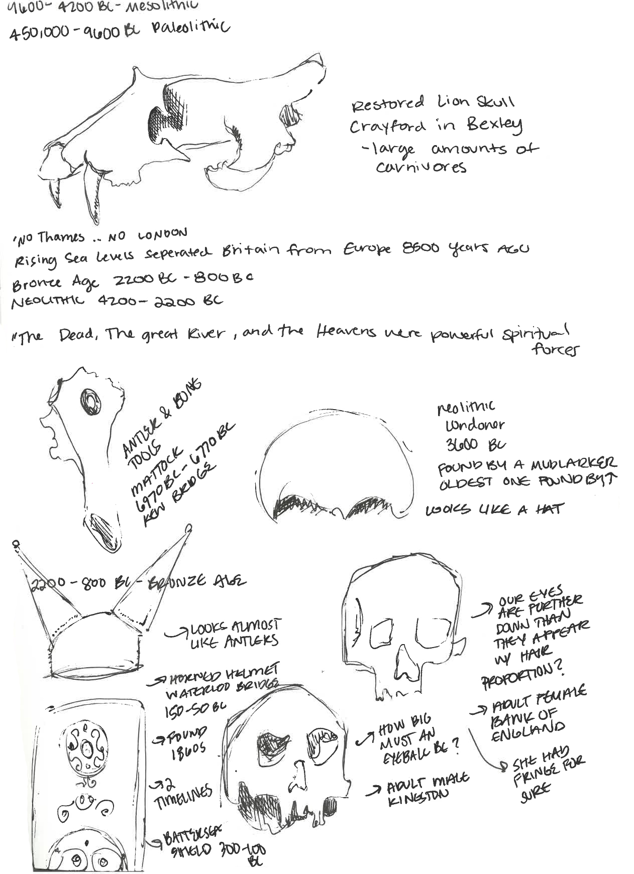
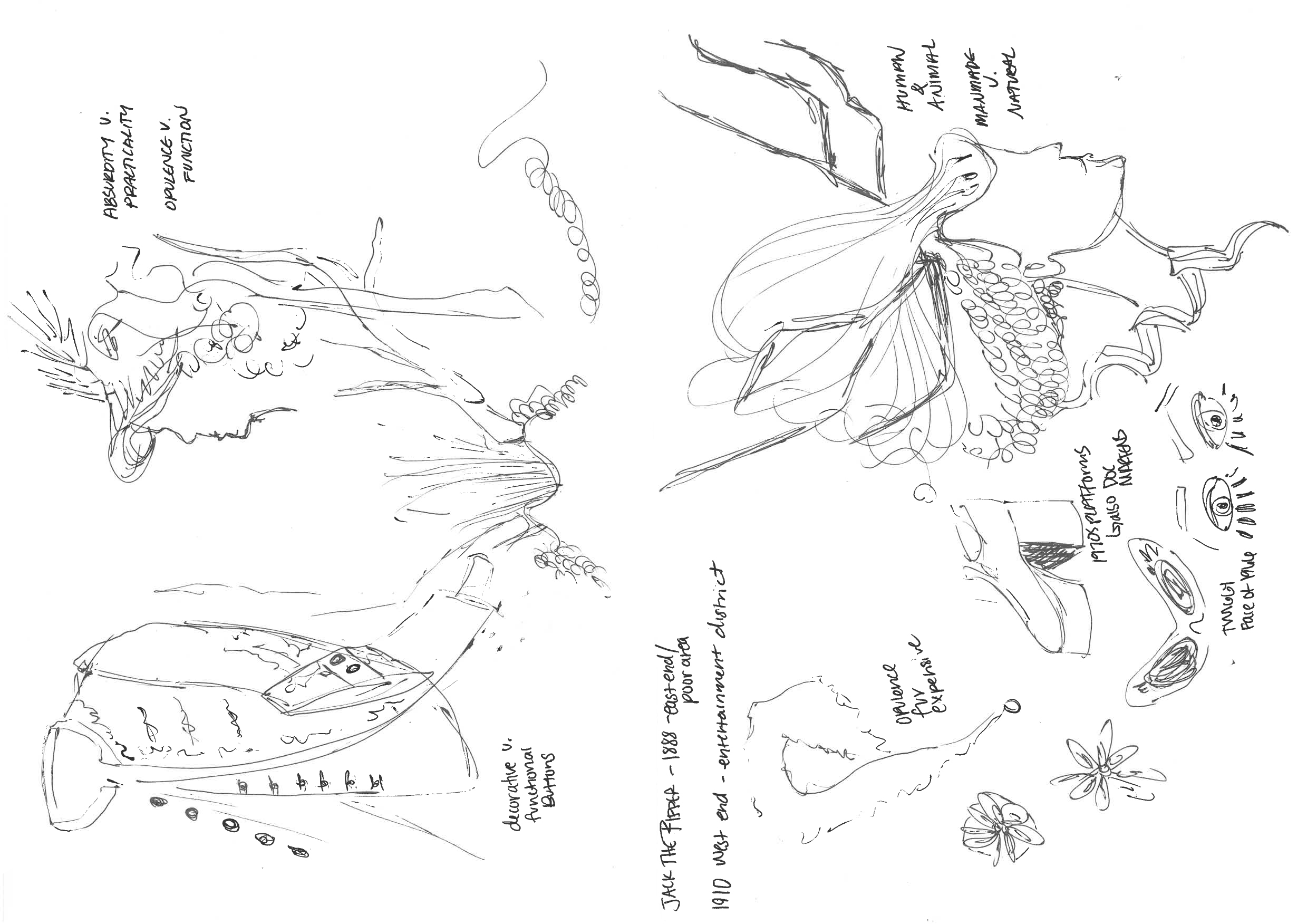
The beginning of the exhibition at the Museum of London is a display which includes landscapes and skeletal remains. I was very attracted to the bones; I kept thinking about what the human or animal may have looked like with all of the muscles and flesh intact. I also was very attracted to the things which adorned the body (mainly armor on that point).
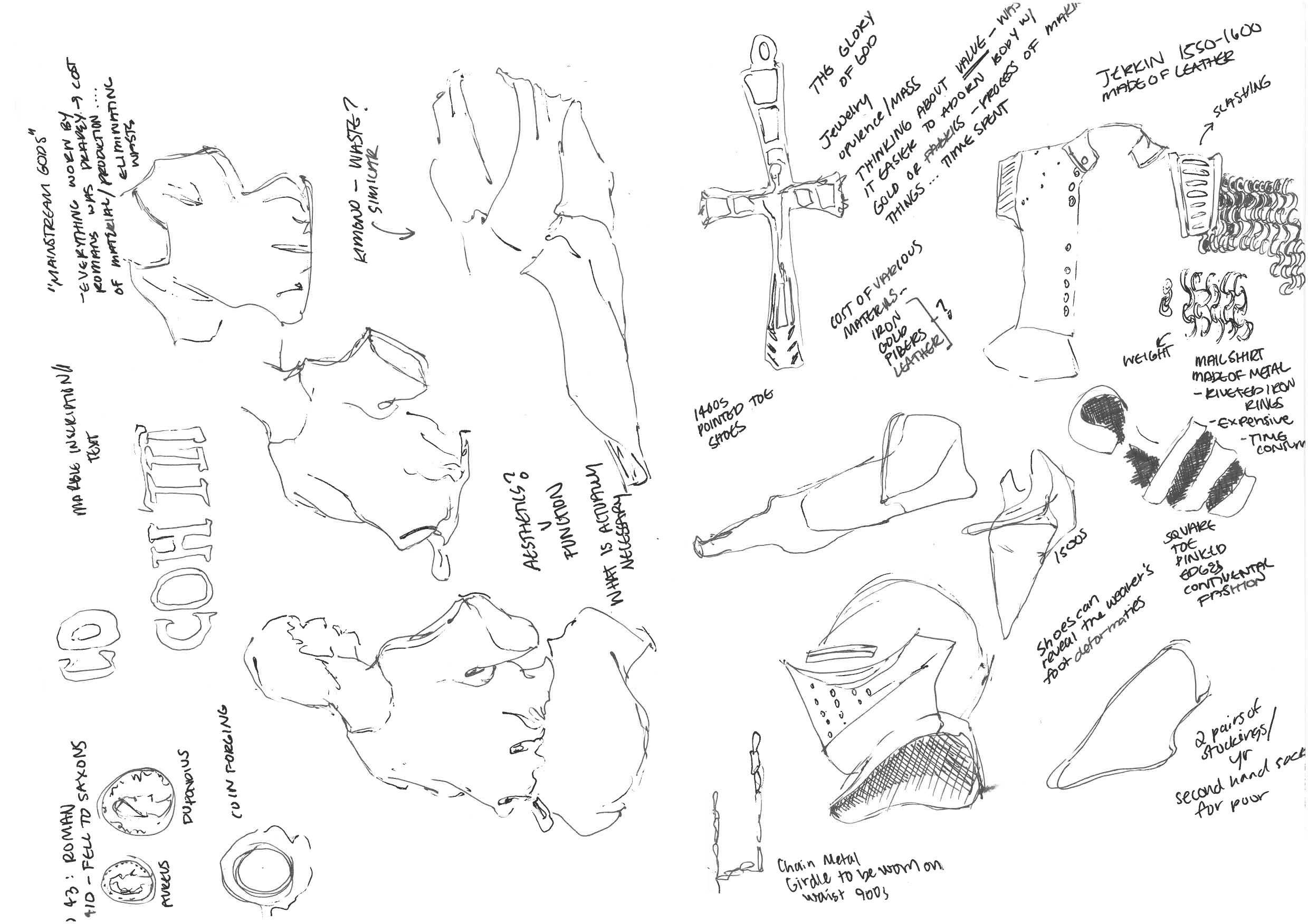
Moving into the Roman/middle age part of the exhibition, I was attracted to the cloth and the raw materials used. The roman garments were all so drapey, and it seemed appropriate for the aspect of functionality. There weren’t many aesthetic considerations at this point when it came to textiles. However, the jewels and metals seemed much more artistic.
In the middle age exhibit, I began thinking more about materiality, necessity, and function.
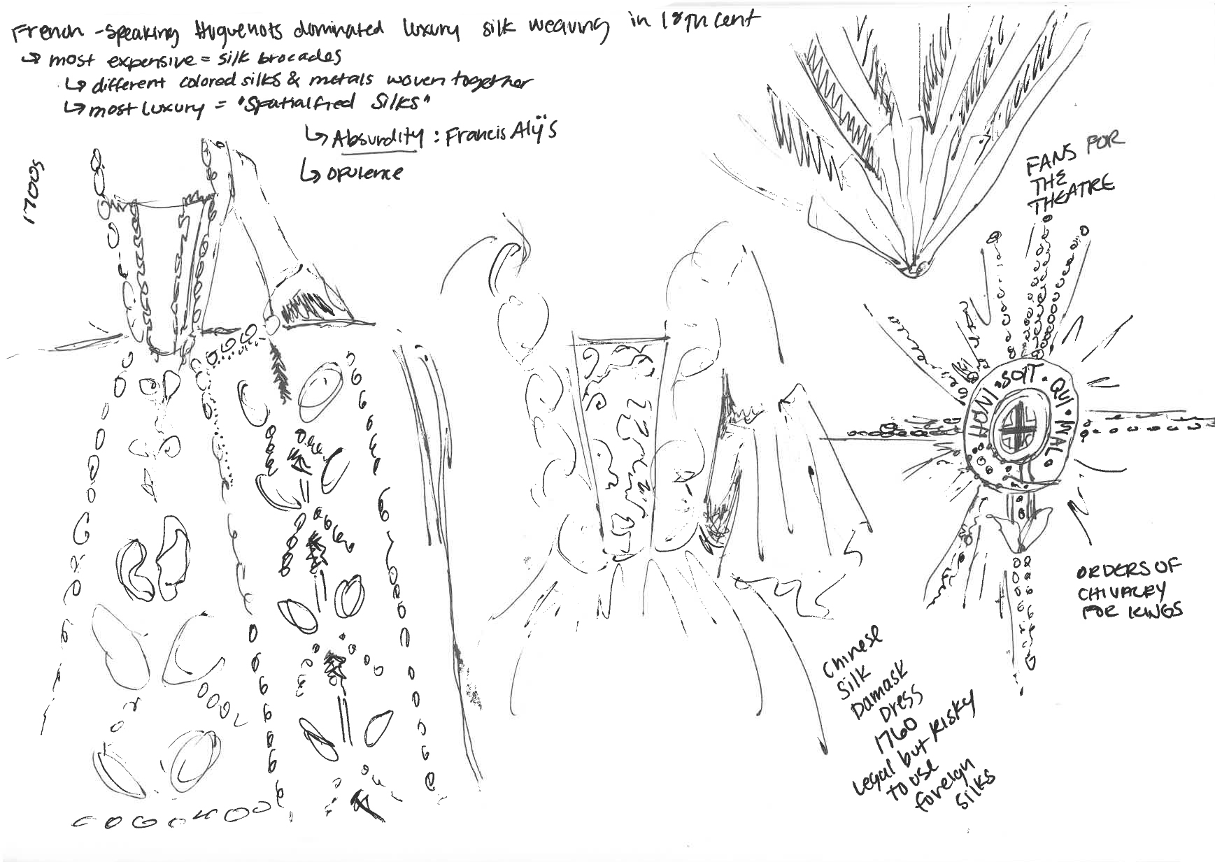
After the plague and great fire exhibition, London seemed to become a place of total opulence (and I loved the whole 18th century exhibition). It was almost the total opposite of the middle age and roman exhibition (where things were created for necessity over functionality). Everything was exquisite- I was very attracted to the 18th century dress with a pannier. I also loved the fans, jewels, and gloves. Themes crossing my mind were:
Aesthetics v. Function (panniers and decorative buttons)
Absurdity v. practicality (remember artist Francis Alÿs)
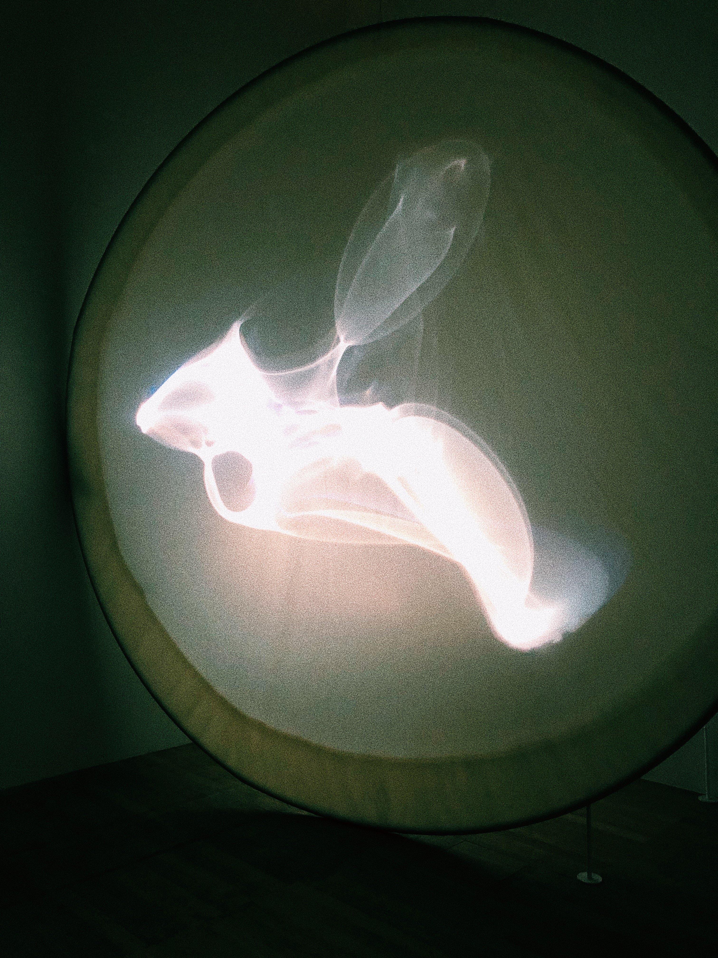
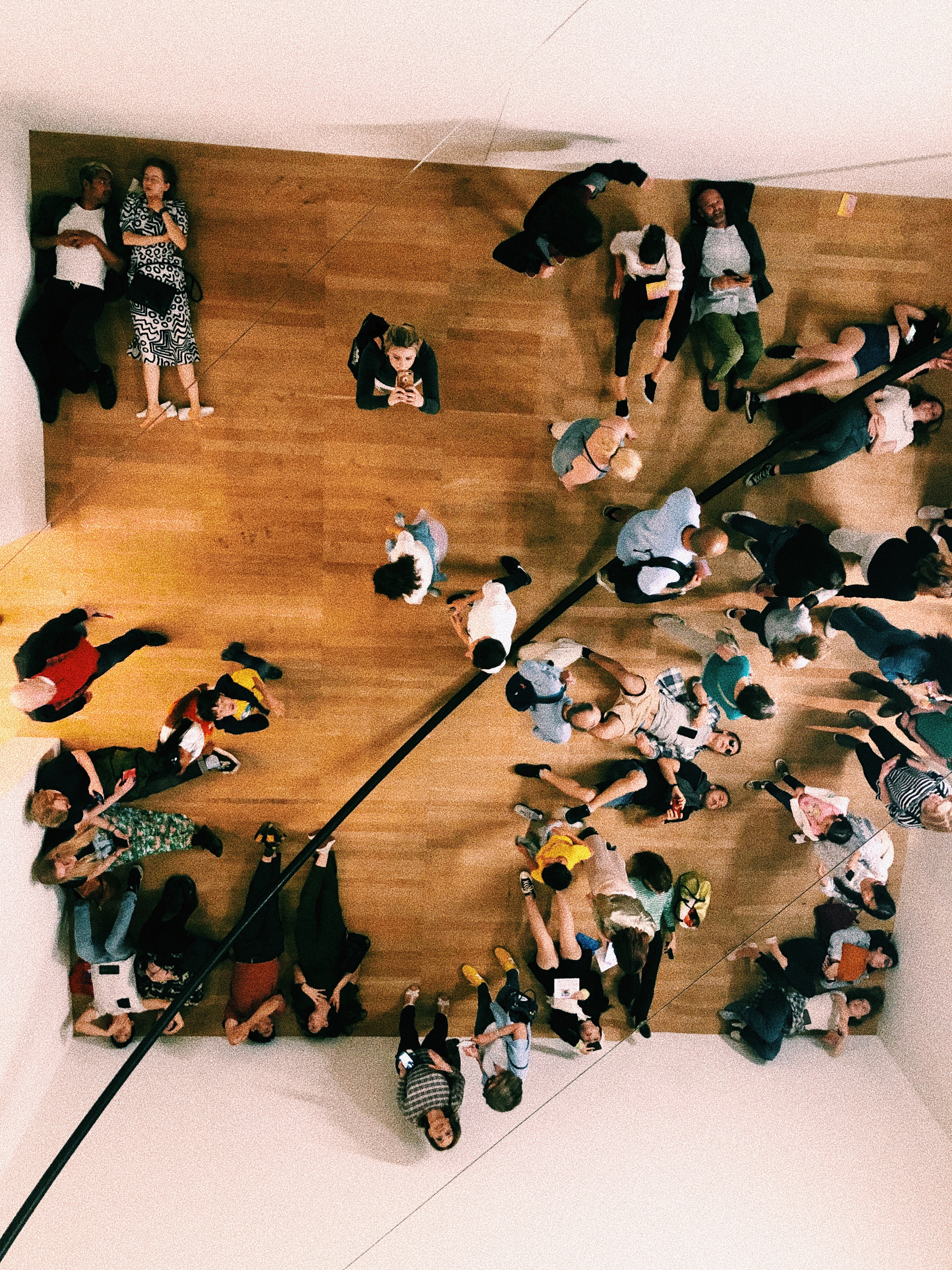
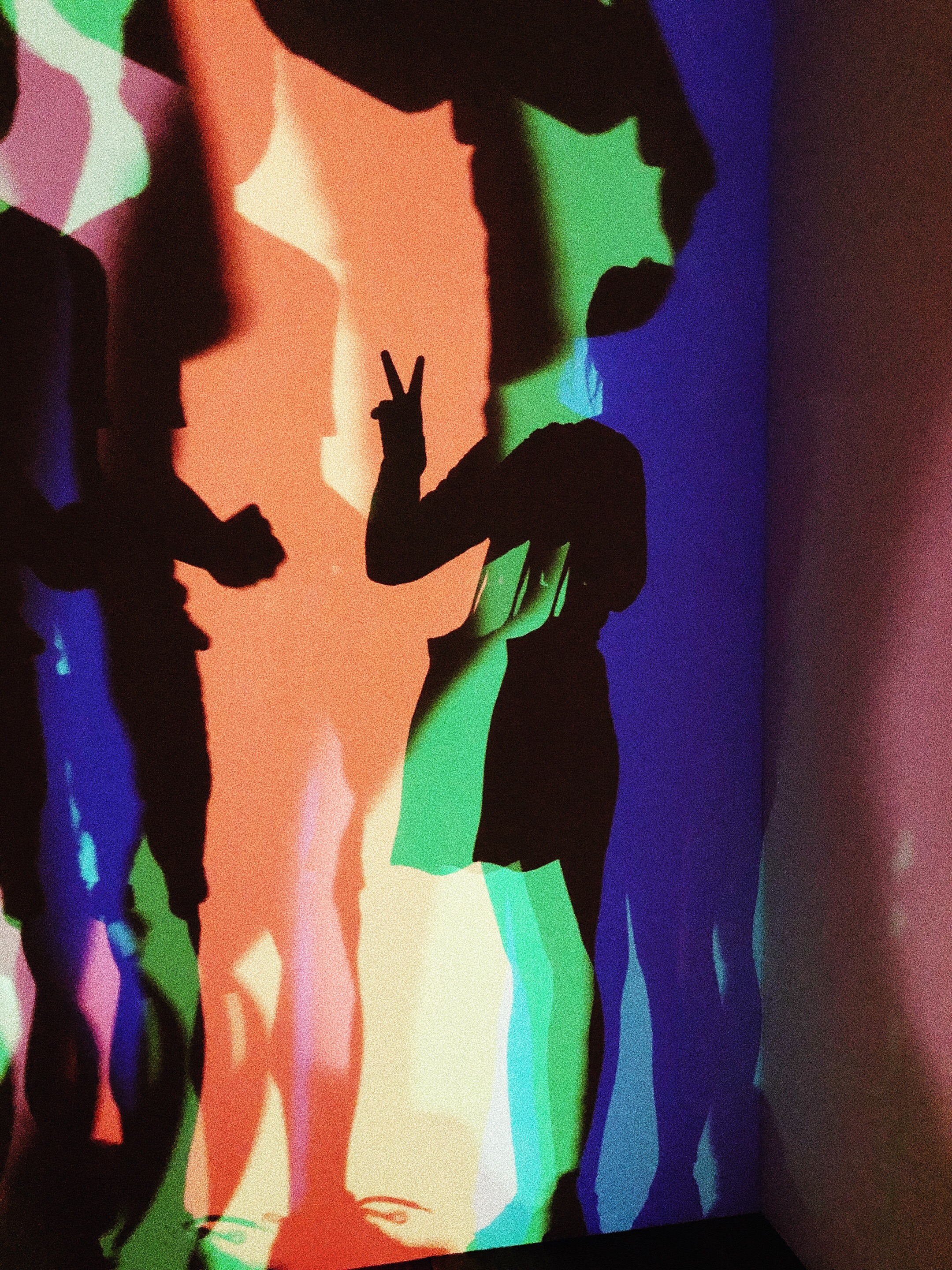
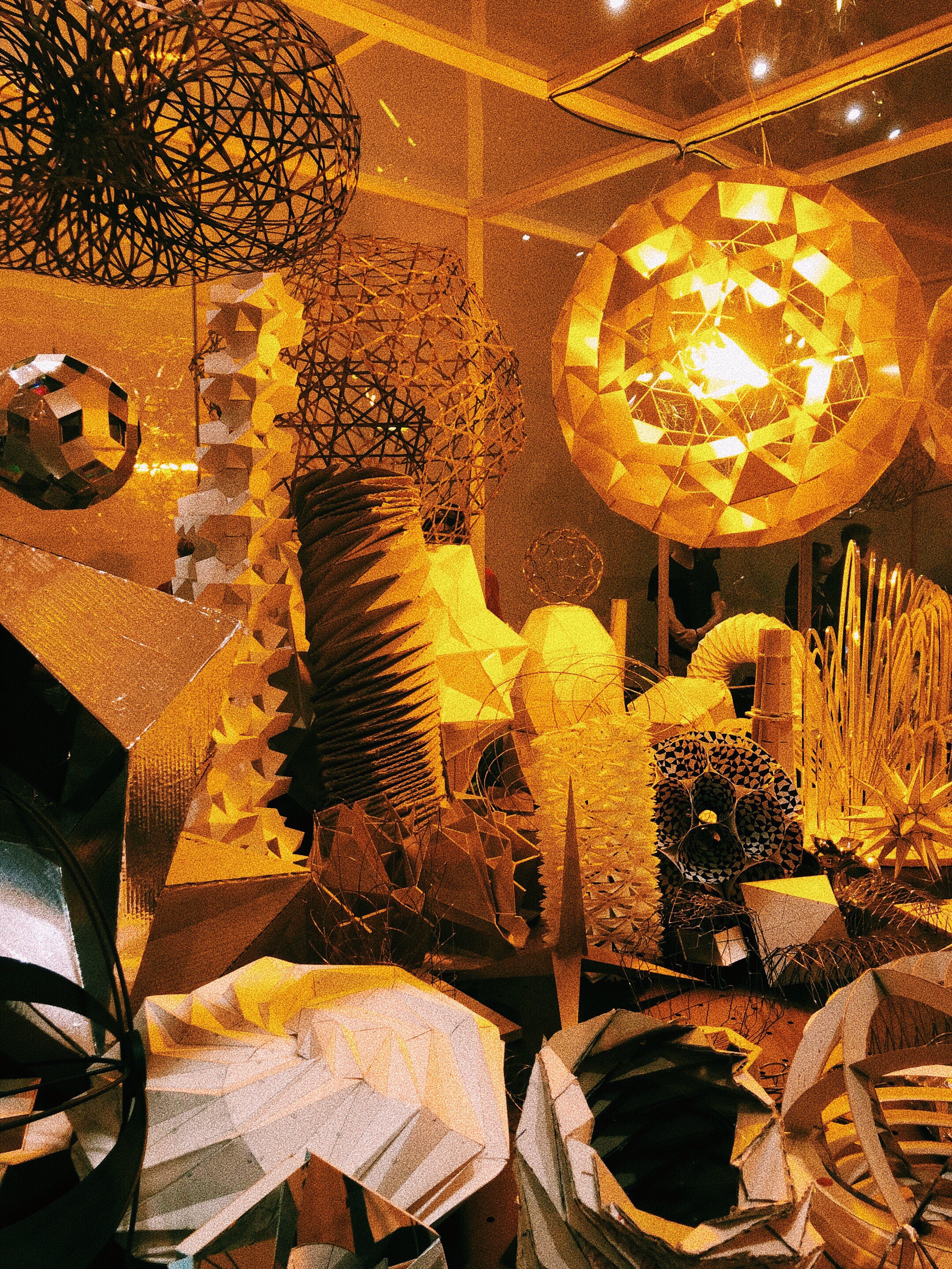
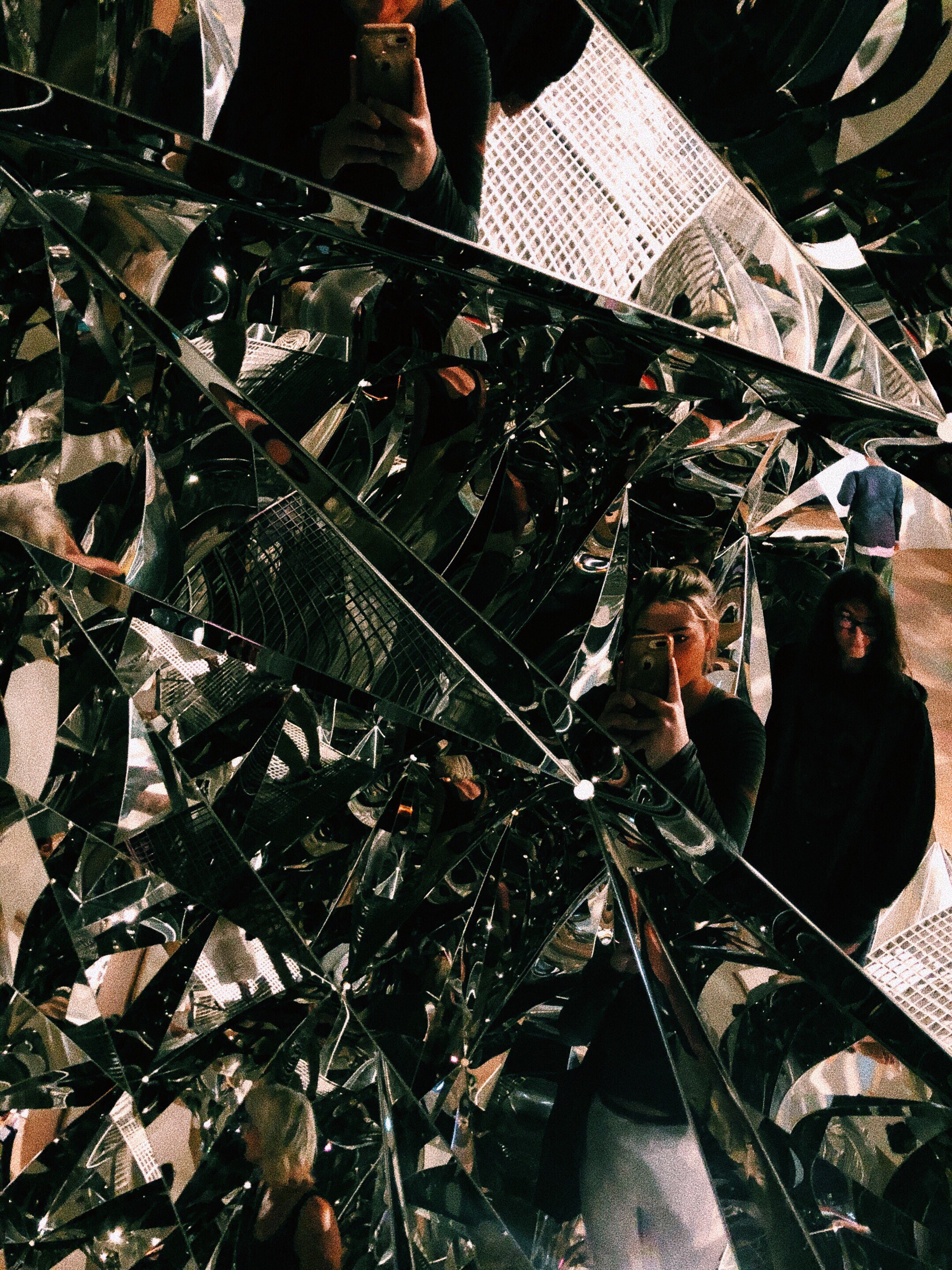
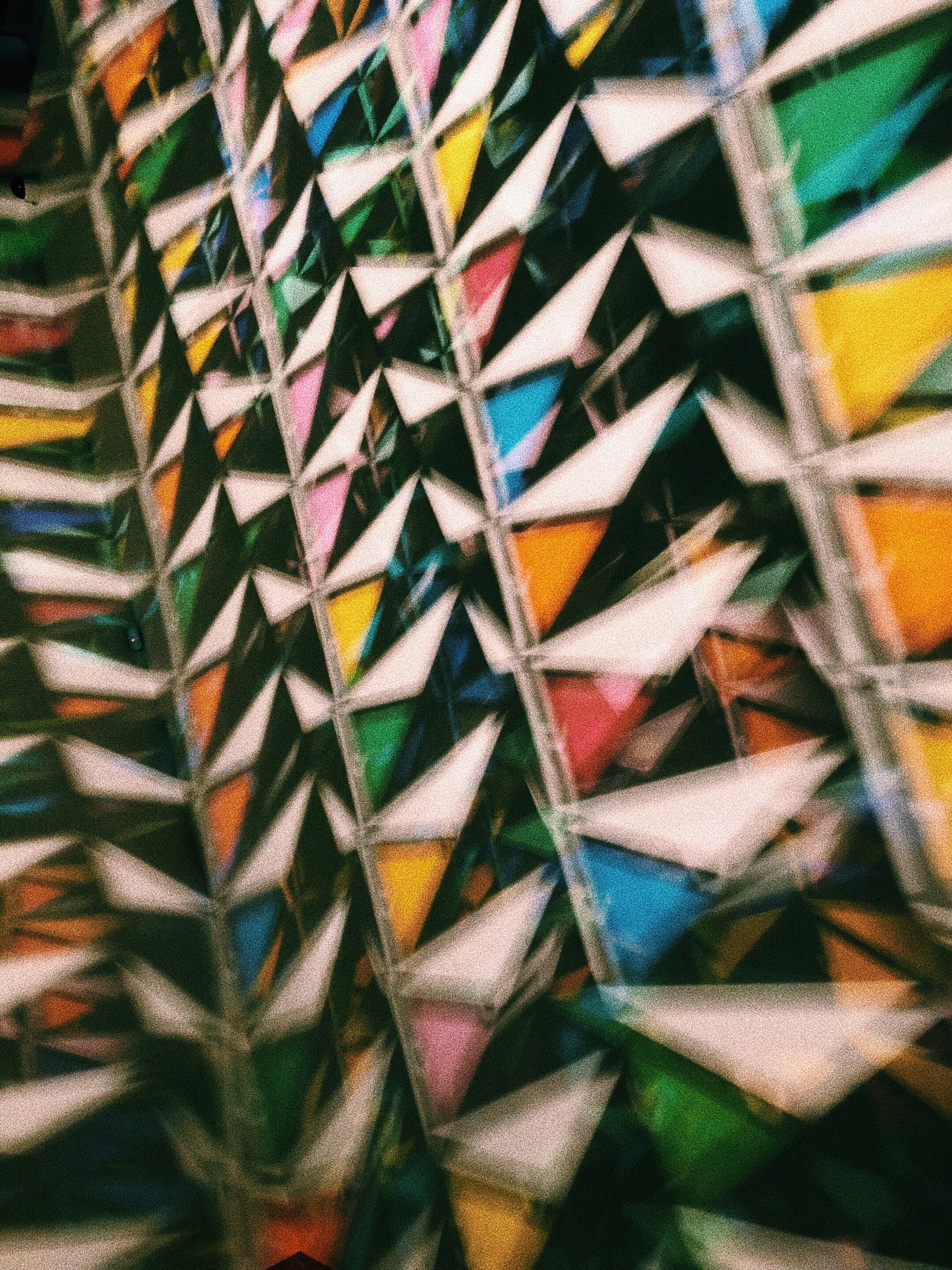
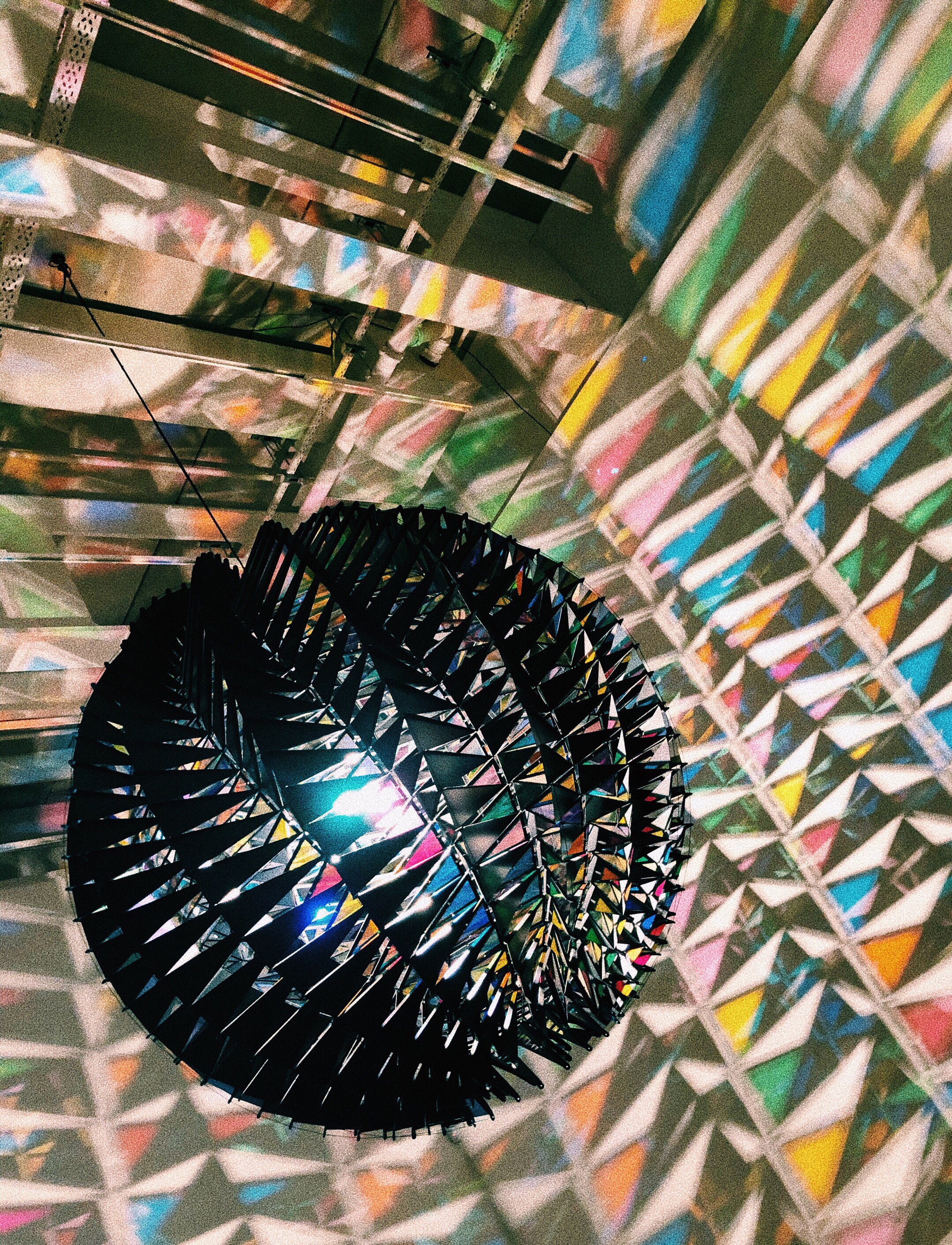
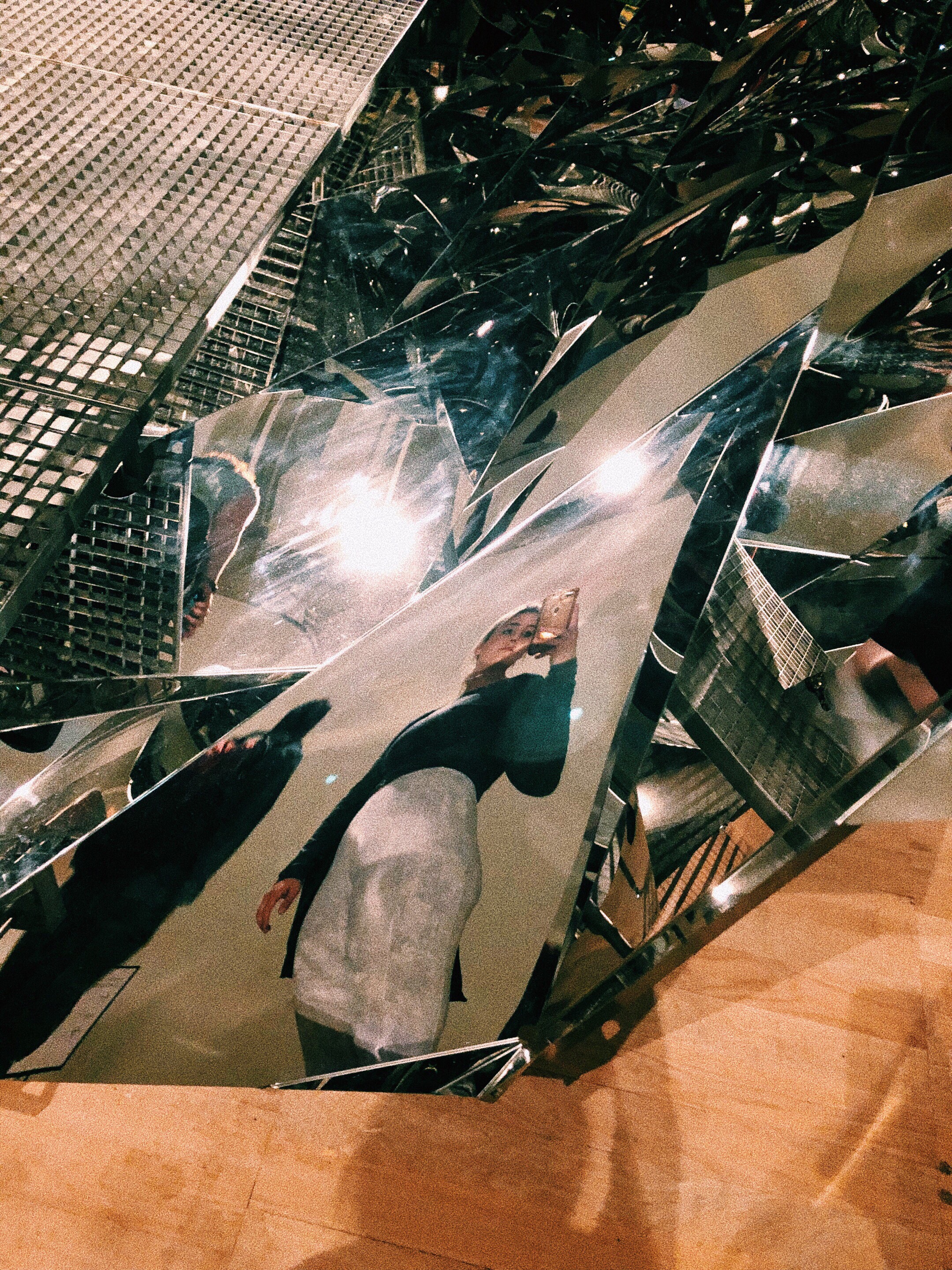
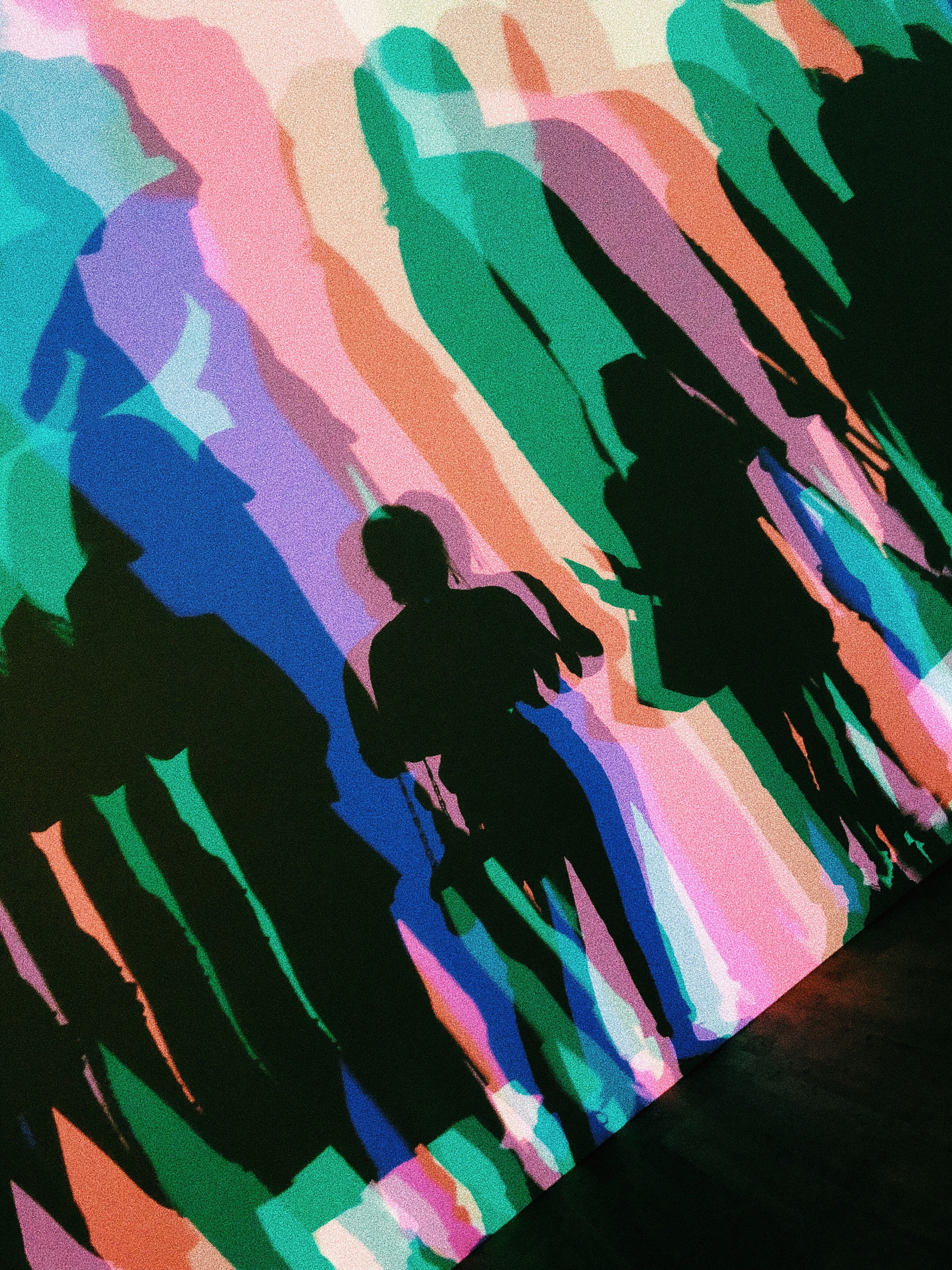
This exhibition was probably one of the best immersive/interactive exhibitions that I have ever been to in my life. Eliasson focuses on nature, interaction, and geometry through a variety of different techniques and mediums. I loved to see Your Uncertain Shadow (2010) in action, because people were collectively moving and smiling. This piece (and most of Eliasson’s work) is truly something that needs to be experienced.
I also enjoyed How do we Live Together? (2019) because the mirrored effect was seamless. The effect was so enigmatic in a way.
Eine Beschreibung einer Reflexion, oder aber eine angenehme Übung zu deren Eigenschaften (1995)
How do we live together; 2019
Your uncertain shadow (colour); 2010
Part of a process board
Model Room 2003
Your Spiral View
How do we all live together; 2019
The Glacier Series 1999
Your Planetary Window; 2019
In Real Life; 2019
In Real Life; 2019
Your Spiral View; 2002
Your Uncertain Shadow; 2010
My favorite however, was the Big Bang Fountain (2019). There were no photos allowed, so I have attached this video:
Eliasson is so good at involving all the senses in his work. I was completely bamboozled as I watched this piece. In person, you cannot tell that it is water because the room is so dark. It was mysterious and beautiful. Also, the cool air jutting out from the table, and the sound effects added to the sensory experience.
I think Eliasson my be my favorite contemporary artist. It is obvious that all of this works are so well thought out and considered.
I was attracted to this exhibition because there were a few pieces which used collage as a method of creating. The technique of collage was first called paper collé in French (glued paper). It originated a century ago.
The artists in the exhibition (Man Ray and Joan Miró) embraced the surrealist idea that unexpected combinations can have a certain power to them.
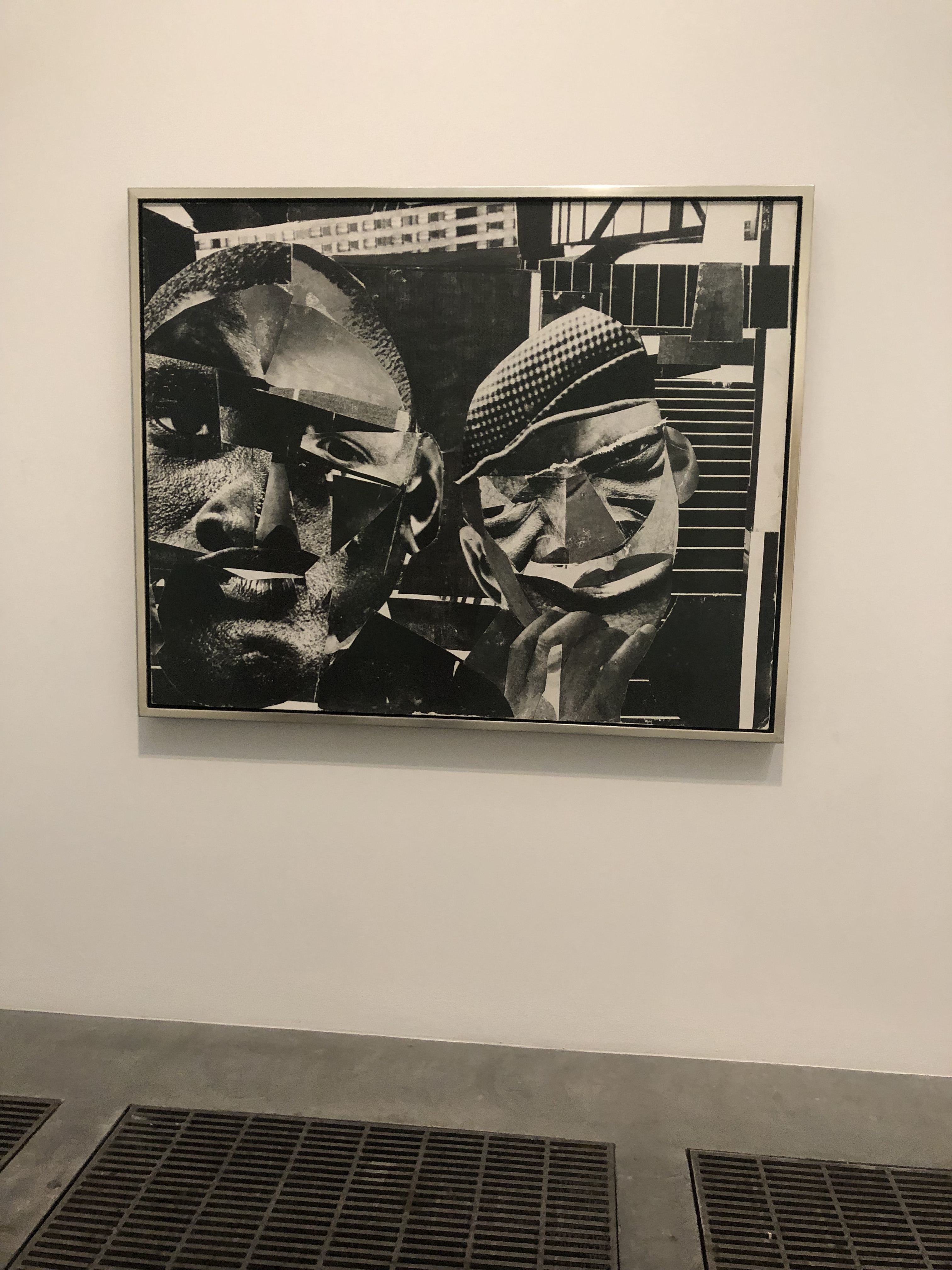
I was particularly inspired by Romare Bearden’s work, ‘Pittsburgh Memory’ (1964). He used collage as a method to respond to the Civil Rights Movement in the United States. With theis medium Beardden could, “invent new scenes using existing images from magazines, creating alternative representations of African American experience to those offered by photojournalism and Advertising” (‘Materials and Objects’, Tate Modern, 2019).
Pittsburgh Memory by Romare Bearden (1964)
I was very attracted to the scale of this piece. Usually collages seem to be a fairly standard size, but when enlarged the impact is so much more strong.
Also, I liked how Bearden took what was already there and completely subverted whatever the original meaning was to share his own messages and ideas.
I regretted not seeing this exhibition sooner, because it gave me so many ideas and inspirations around the medium I had been working with. I am thinking about ripping up my masks and using them to collage (maybe scanning them?) In Illustrator I could play with scale, color, and placement more. This may make my print explorations more cohesive and interesting.
I was looking for inspiration on color and patterns during this trip. I was waiting to get into the Olafur Eliasson exhibition for a few hours, so I decided to meander around the galleries.
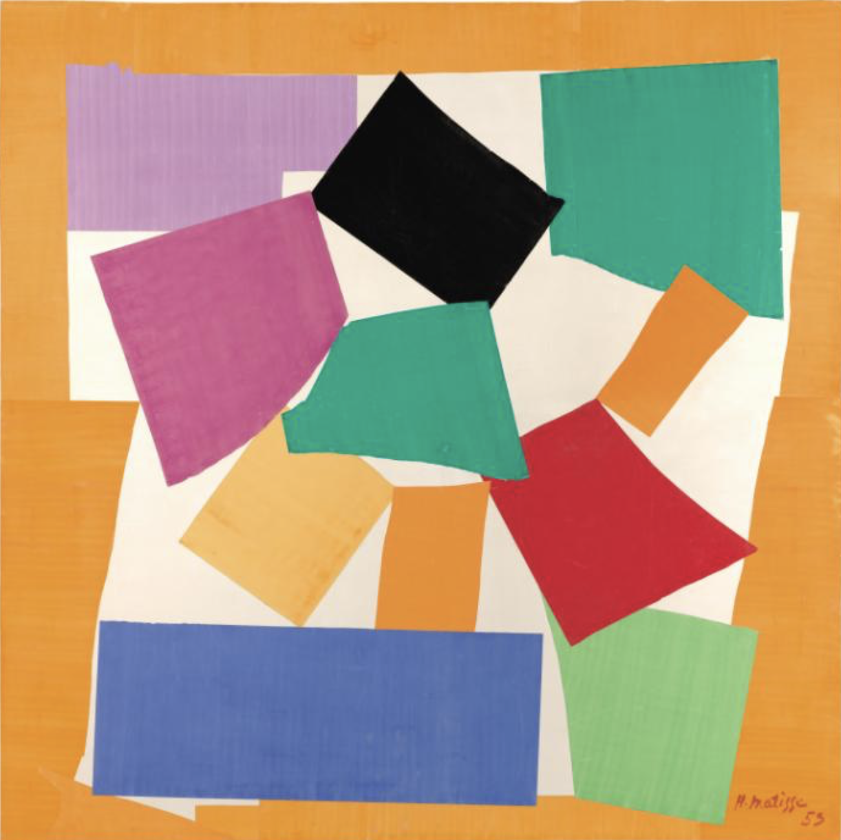
The first Gallery I looked at was the “Start Display” because it addresses color. I found Matisse’s work (The Snail) very interesting because it heavily focused on color placement.
Henri Matisse, 1953, Photo taken from the Tate Modern Website
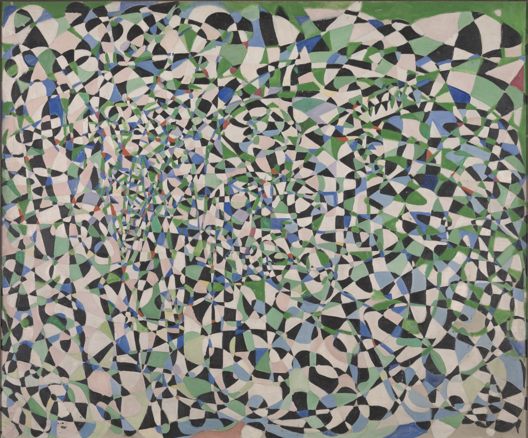
I also enjoyed Frahrelnissa Zeid’s abstract painting. She used swirling and crossing lines to created a kaleidoscopic effect. I think the shape, movement, and pattern are very relative to what I’m doing. This is most definitely visually bombarding and intrusive.
Fahrelnissa Zeid; 1950s; Photo taken from the Tate Modern Website
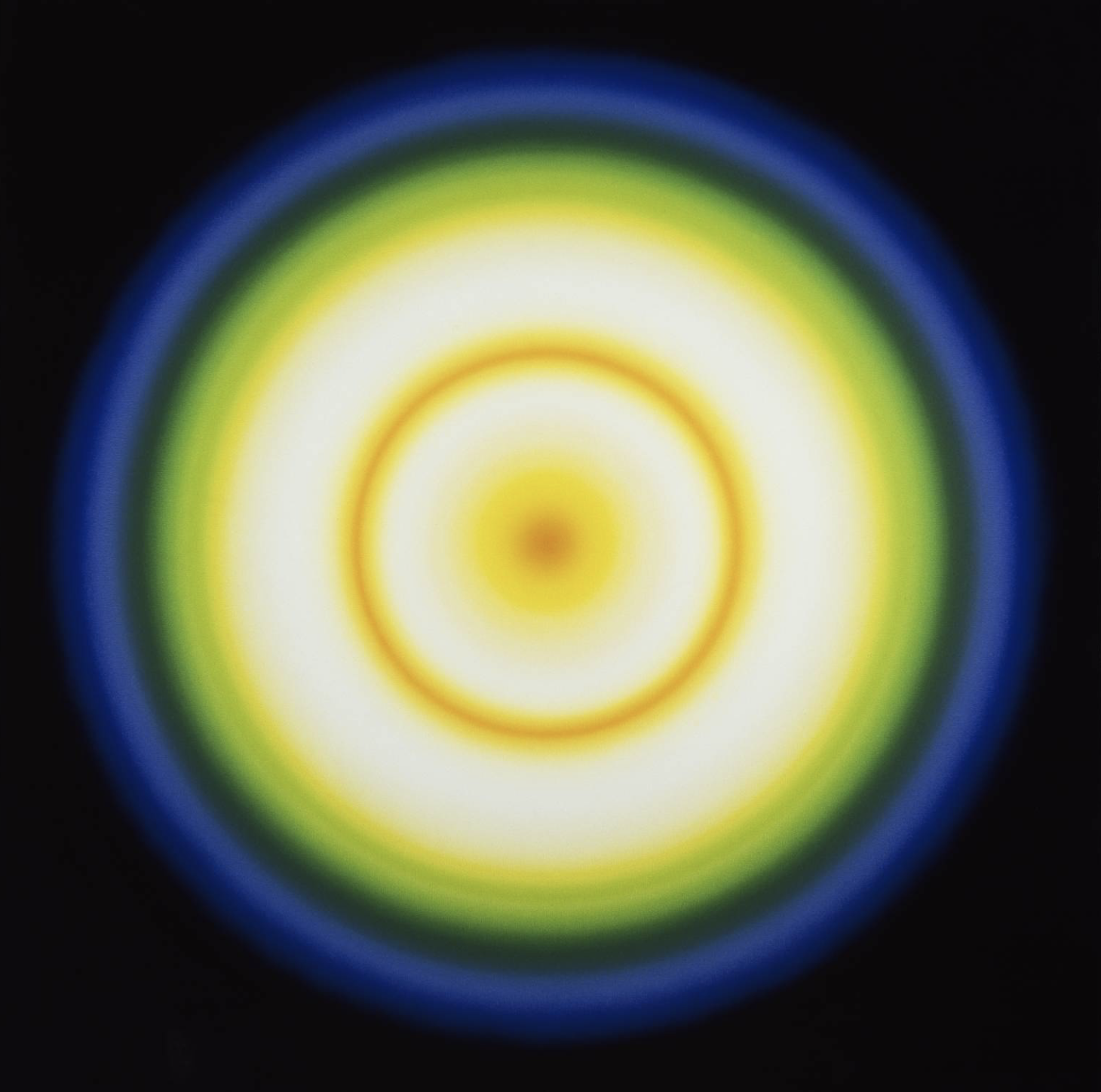
The final piece in the gallery that inspired me was Peter Sedgley’s work (Color Cycle 3). I found his work very hypnotic and somewhat jarring. The exploration of light used in conjunction with color was effective and beautiful.
“I think of my work as ephemeral architecture, dedicated to the beauty of the female body”
Christian Dior, 1957
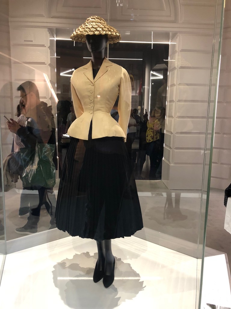
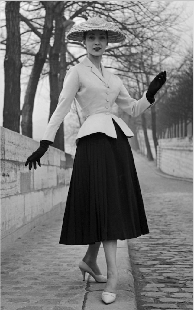
1947 Bar Jacket and Skirt
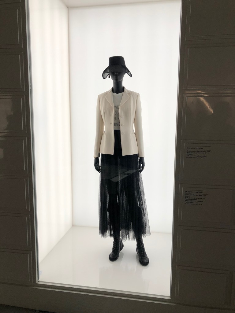
We should all be Feminists T-Shirt (RTW S/S 2017)
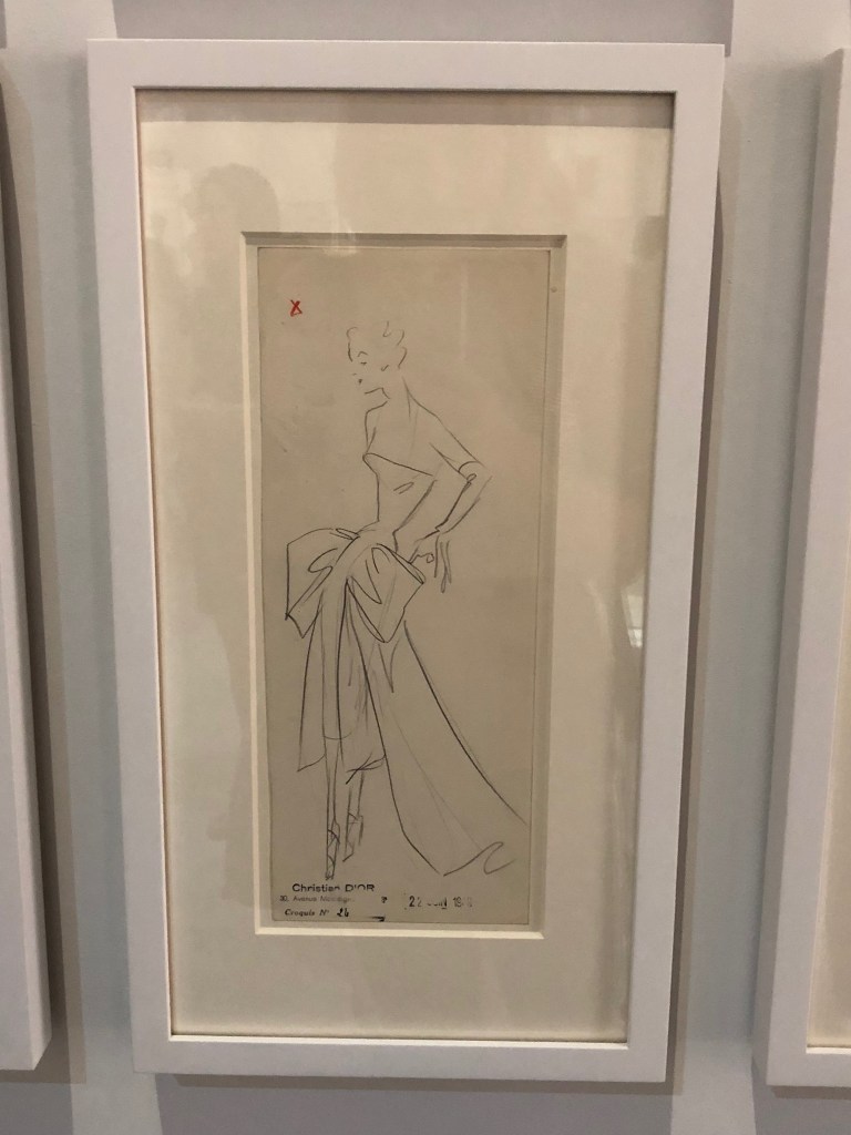
Original Dior Sketches
Haute Couture 1947
Dior Original
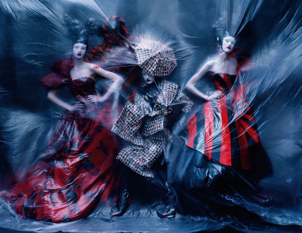
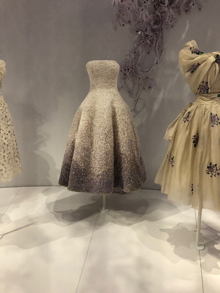
Walking into the Dior exhibition at the V&A was like walking into a dream. The first piece visible was the iconic bar jacket worn by Marie-Thèrése in 1947 (see picture below). I admire how Christian Dior really respected women; he wanted women to feel beautiful and confident in his designs.
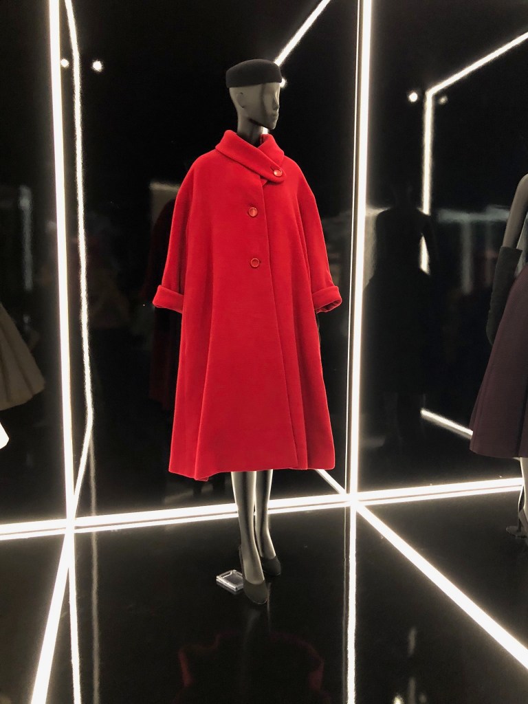
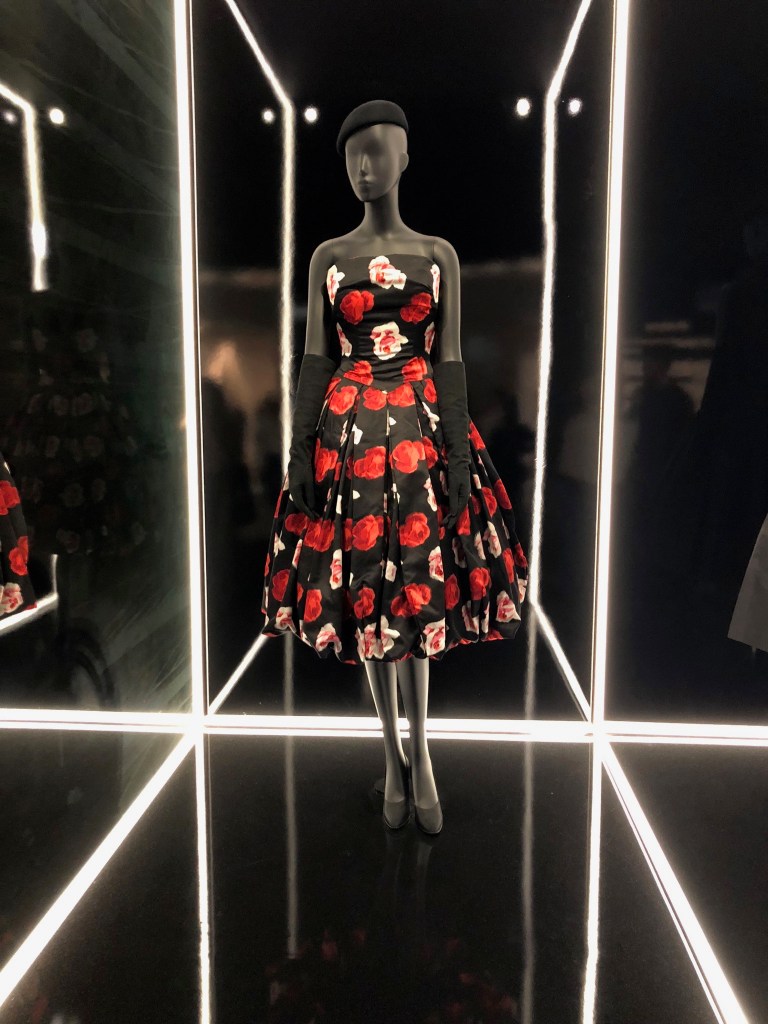
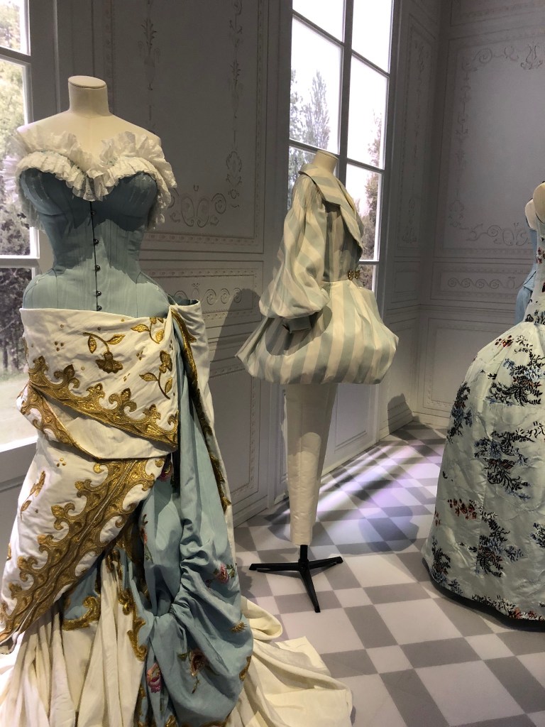
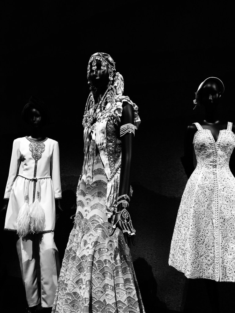
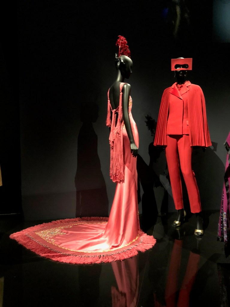
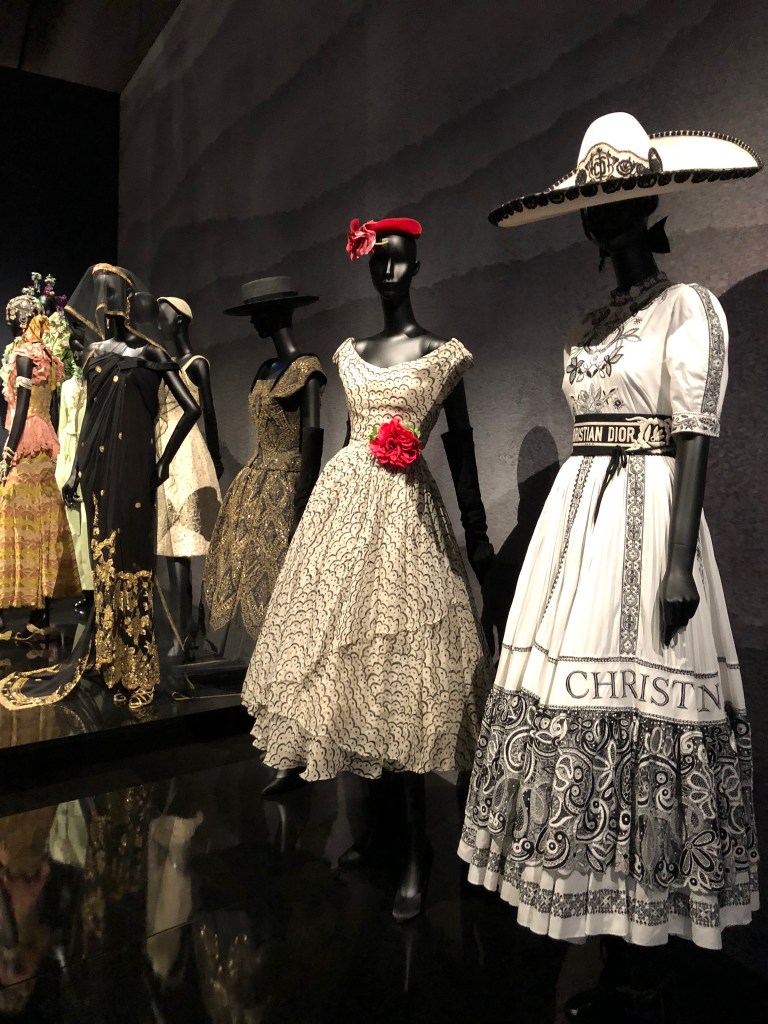
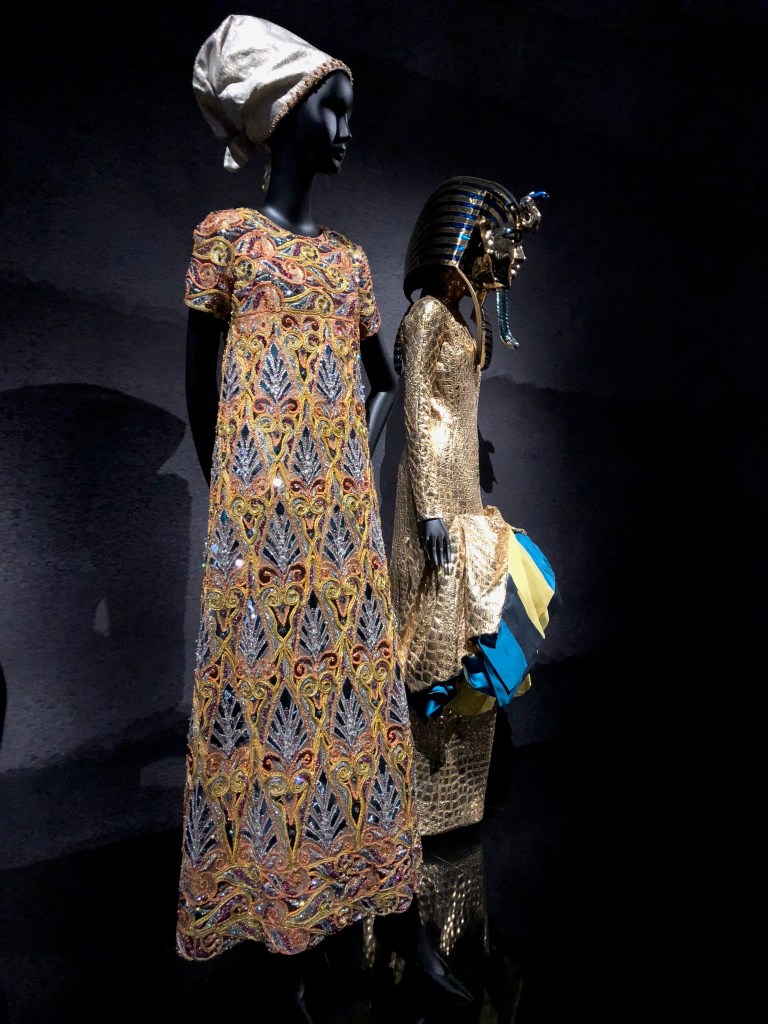
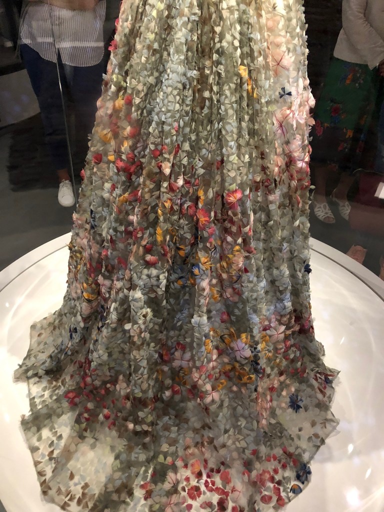
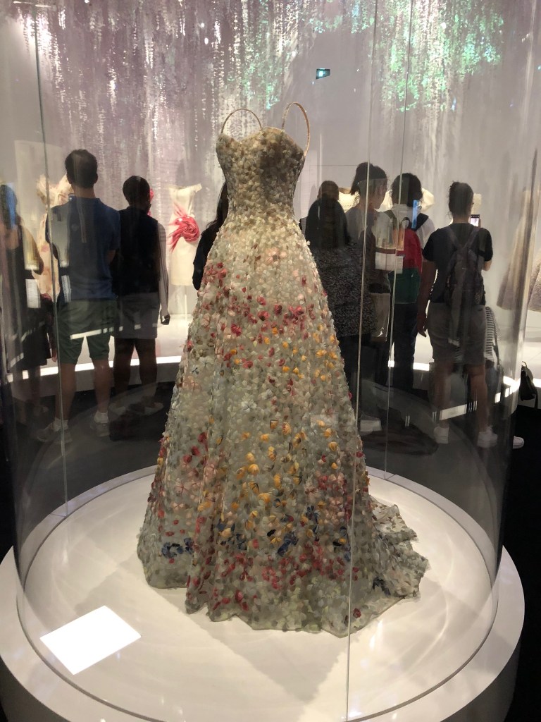
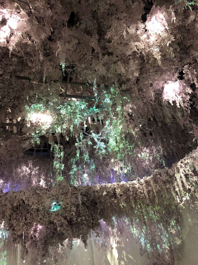
The following three rooms of the exhibition were thematic: a room of historically inspired garments, a room of culturally inspired garments, and a room of garments inspired by flowers. I appreciated how these themes reflected back on Christian Dior himself, even though the rooms included pieces designed by the creative directors who took over after Dior’s passing in 1957. Dior himself was so inspired by history, nature, and culture, and these themes are so pertinent to the brand identity.
“After Women, flowers are the most divine of creations”
Christian Dior, 1954
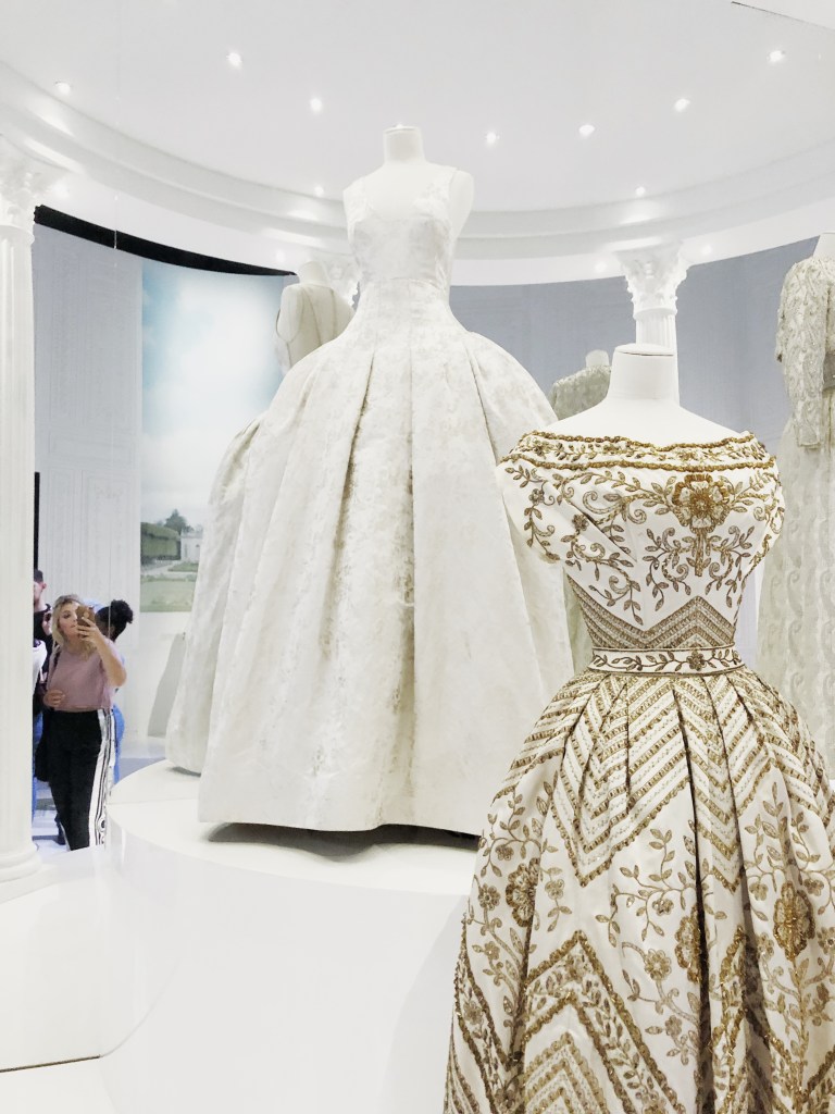
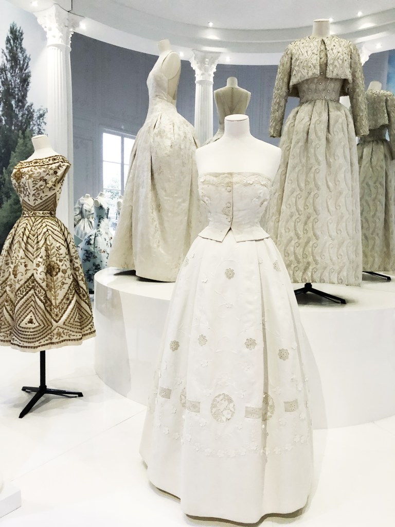
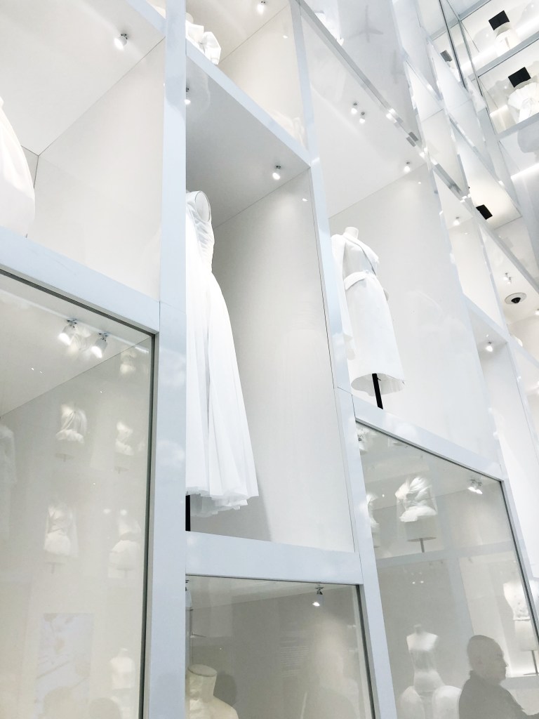
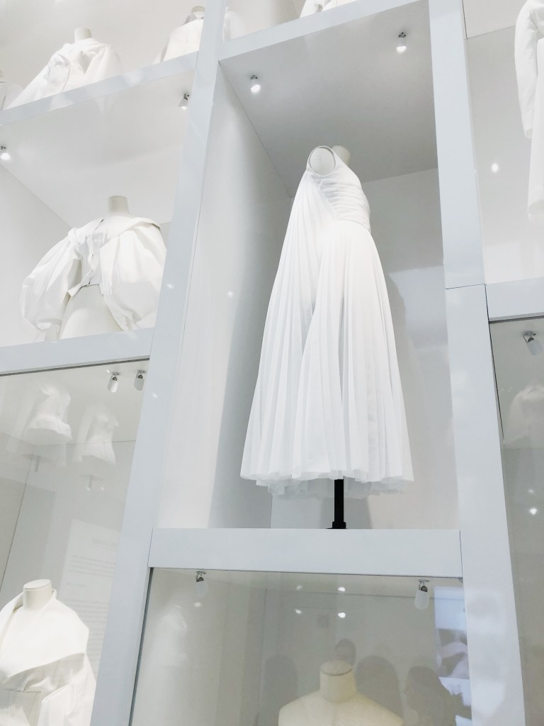
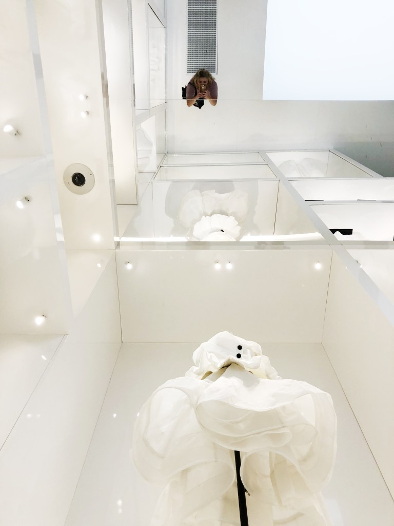
After the flower room came my favorite room, which was full of toiles. I loved how this was curated as an all white/reflective room. I also enjoyed how close the viewers could stand to the garments; I was able to see every single stitch.
This room was the most interesting for me because it shows the process by which a garment is made, and this process is definitely not quick or easy. Educating the public on what it means to be a maker or a creator is something that is so important to me. I have such an appreciation for hand craftsmanship, and I this room shared essential process work.
I also valued the addition of a room that paid homage to all of Dior’s creative directors. I didn’t realize that there were so many, and I enjoyed seeing how each creative director took a different approach and infused the brand with a slightly different aesthetic.
The 6 key Creative Directors:
Christian Dior: 1946-1957
Yves Saint Laurent: 1957-1960
Marc Bohan: 1960-1989
Gianfranco Ferré: 1989-1997
John Galliano: 1997-2011
Raf Simmons: 2012-2015
Maria Grazia Chiuri: 2017-present
After the exhibit, I kept thinking about Maria Grazia Chiuri’s, “We should all be Feminists” T-Shirt design. I felt that this really related to what my Manifesto Group is studying with advertising and media campaigns. This is a type of campaign for an ideology, which I found to be very modern and creative.
The exhibition was well curated, and the selection of pieces was fabulous. I went to the exhibition with Elodie Carrel, and her shared passion for both fashion and creativity made the exhibition even better. We were able to discuss the exhibit afterwords, and she had some interesting ideas about how the exhibition could have integrated more technology to make the information even more accessible.