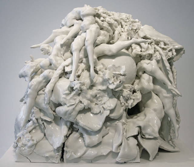
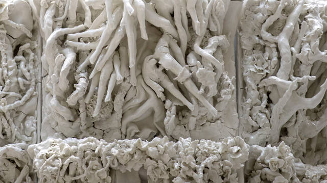
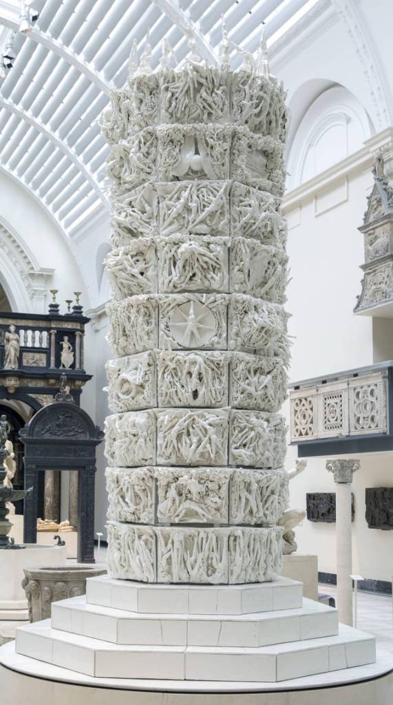
I love this piece because of the intricacy and scale. I also think it is so interesting that Rachel Kneebone is almost returning to renaissance art, but her work feels new in a sense. I appreciate the skill and talent it must take to make a sculpture this detailed on this scale.
This piece is in Room 50a
Rachel Kneebone creates porcelain sculptures that strive to represent the human body in all its complexity. She is concerned with what it means to inhabit a body, its physical limitations and cognitive possibilities. Inspired by themes of transformation and renewal, Kneebone’s complex sculptures are born of intense emotions. She expresses movement and fluidity in a medium usually associated with stillness and calm.
Visibly exploiting the material properties of porcelain, Kneebone deliberately allows her work to rupture and crack, prompting the viewer to contemplate the relationship between strength and vulnerability.
Prints & Drawings Study Room, level C, case Y, shelf 70, box D
I have a lot of problems with this poster.
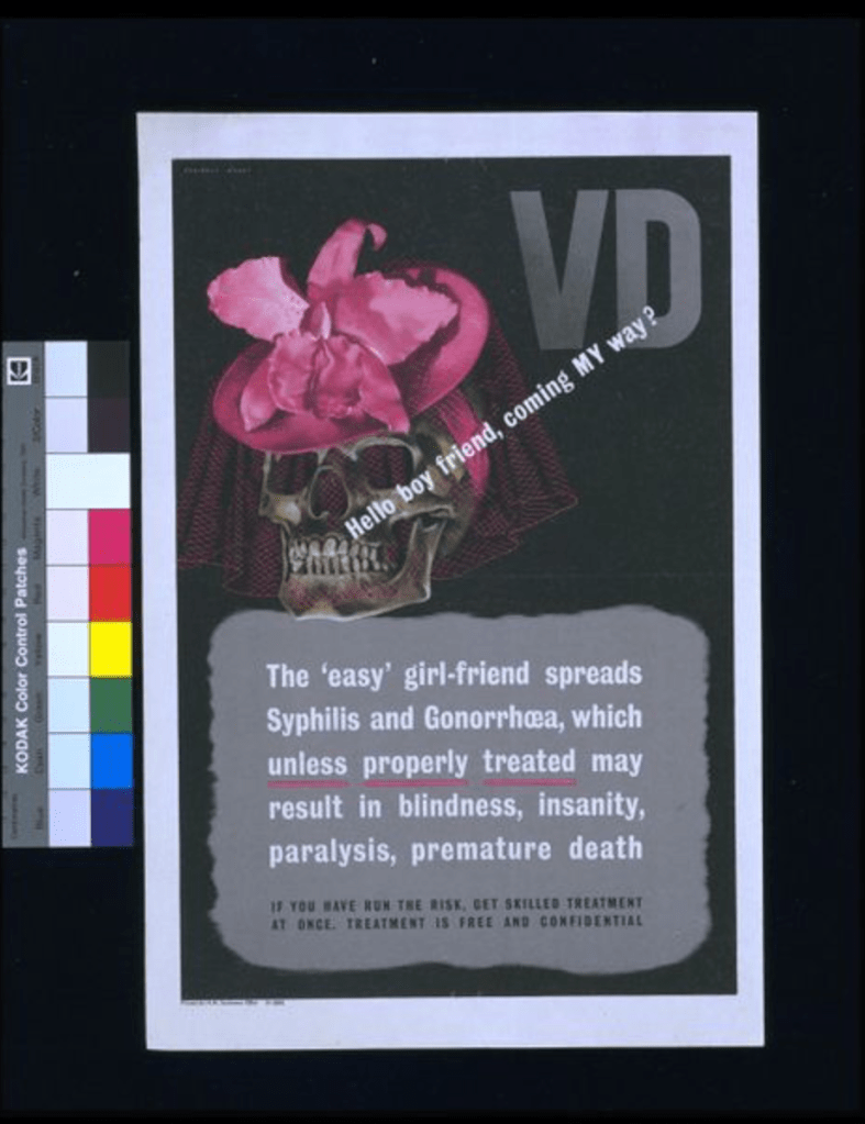
First of all, why are women always casted as the evil temptresses (a female is literally being represented by a scull)?
Second, the blame is completely shifted onto women?
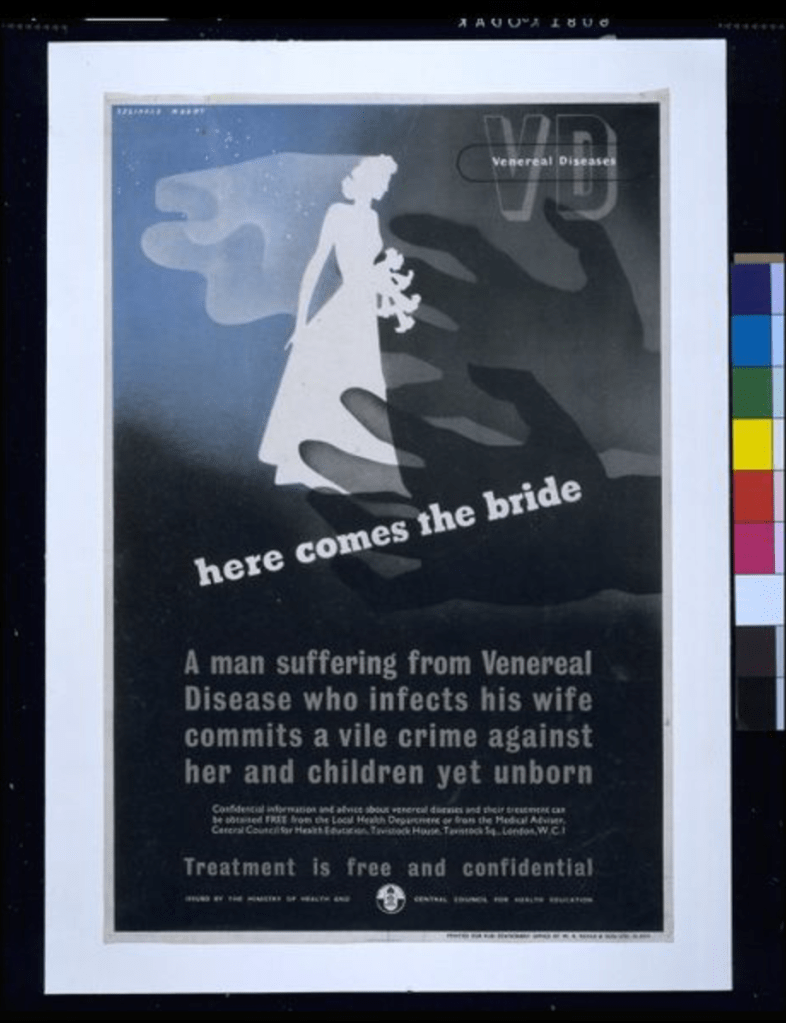
There is obviously a bias that it is okay for men to be promiscuous but not for women. Even in the second poster it assumes that brides are all supposed to be, “perfect virgins” and a man can still sleep around.
Both of these posters assume that all sexual relationships are heterosexual
The second poster assumes that the point of every marriage is to procreate
“The British Ministry of Health’s campaign against the spread of venereal disease (VD) during the Second World War of 1939-1945 warned men in the armed forces of the risks involved in casual sex, particularly when undertaken with promiscuous (‘easy’) women or prostitutes. ‘VD. The “easy” girlfriend’ is a grim reminder of the ever-presence of syphilis in what seems a macabre trio of death (symbolised by the skull), exotic sexual encounter (in the fleshy , sexual orchid) and feminine attraction (the pink veil).” The British Ministry of Health’s campaign against the spread of venereal disease (VD) during World War II warned men in the armed forces of the risks involved in casual sex, particularly when undertaken with promiscuous (‘easy’) women or prostitutes. ‘Here Comes the Bride’ reminds the male viewer of his social – and personal – responsibilities, and places the woman in the role of innocent virgin bride, in stark contrast with its companion poster, ‘VD, the easy girlfriend’ (E.2914-1995).
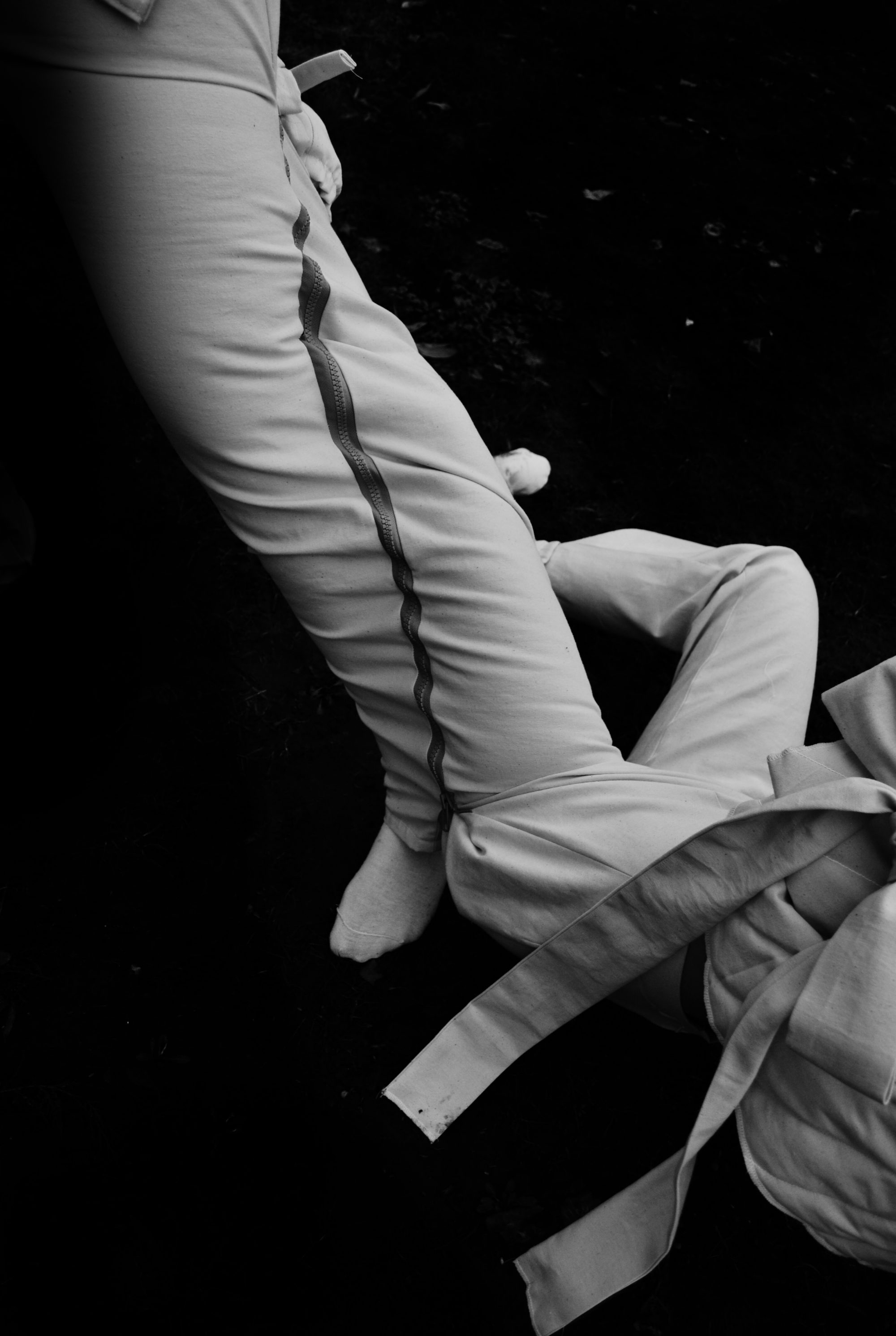
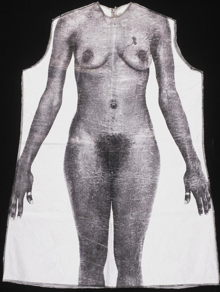
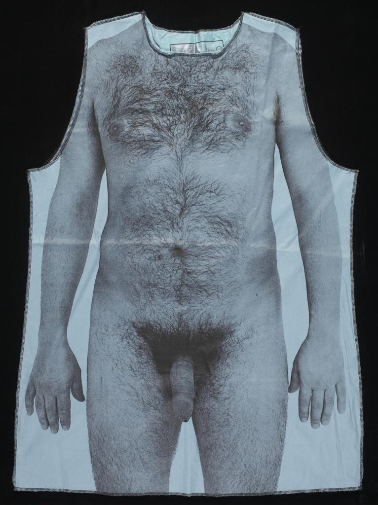
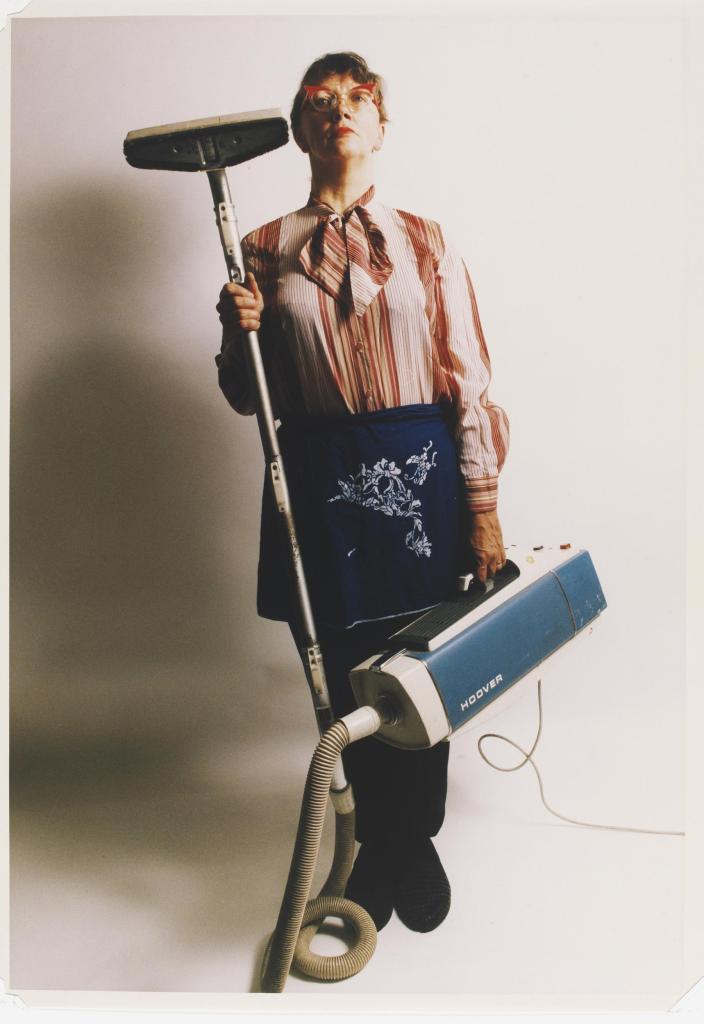
“This is one of several printed gowns made by Yin Lam as part of her contribution to Masquerade (1998), a project commissioned and staged by the London Printworks Trust (LPT), based in Brixton, south London. LPT is a community-based workshop which provides facilities to artists to work with print and fabric; it also has a dedicated outreach programme. Masquerade was an interactive exhibition which involved the setting up of a boutique in Brixton market. A number of artists, including Yin Lam, were commissioned to produce garments for the boutique. Passers-by were invited in to try on the clothes and have themselves photographed against specially-designed backdrops. The garments were often outrageous or provocative, designed not only to transform a sense of self, but also to break taboos and to question stereotypes.
Yin Lam chose to modify a number of surgical gowns (some green cloth, others white paper) by screenprinting them with images of naked bodies, male and female, black, white and Asian. These were produced as T-shirt sizes, knee-length gowns and full-length gowns. At the time she made these, she was already suffering from lupus, the disease which caused her early death, and had spent much time in hospital. Using the gowns was a way of addressing the changes she was experiencing in her own body, as well as offering others the opportunity to try living in someone else’s ‘skin’. They also suggest a frankness and openness about physical realities, and a deliberate rejection of conventional ideals of ‘the nude’ and the air-brushed perfection of the bodies which feature in advertising. Each of the bodies she chose to photograph and reproduce were those of professional models, but as well as those she described in the catalogue as ‘slim’ or ‘curvaceous’ or ‘athletic’, she also chose others who were overweight or had scars.”
Yin Lam’s work reminds me a lot of Jo Spence’s. Both deal with disease and body image in quite clever ways. Both works also deal with societal expectations and what is considered to be “beautiful” and, “normal”.
Yin Lam and Jo Spence seem to be deeply emotionally disturbed or discontent. Both were sick and had to deal with their realities and the fact that their bodies would be forever changed. Though the mediums are different, I see similarities in the use of medical visuals as well. Lam uses medical gowns and Spence uses her surgery scars.
Both of these garments are unfortunately in storage.
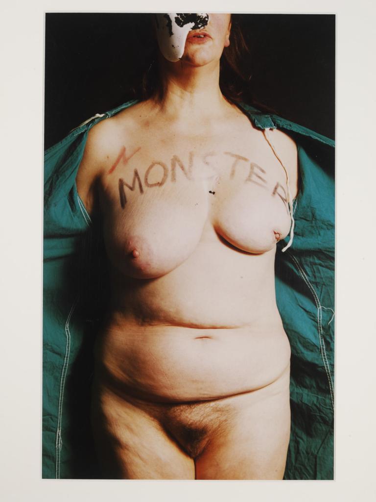
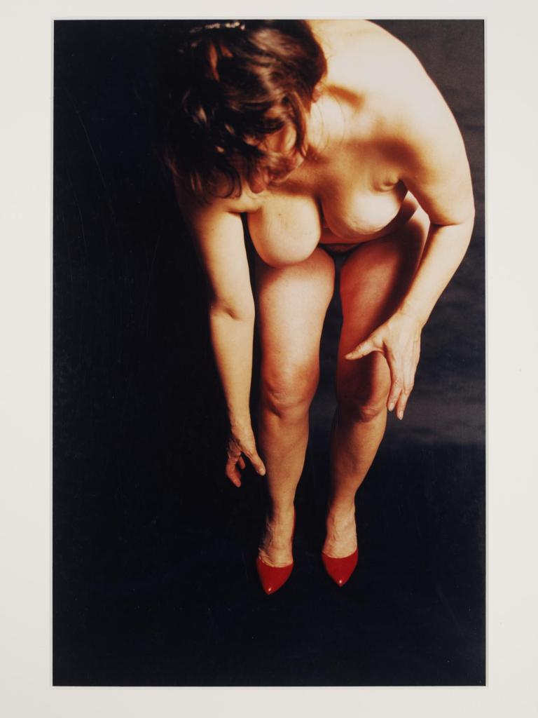
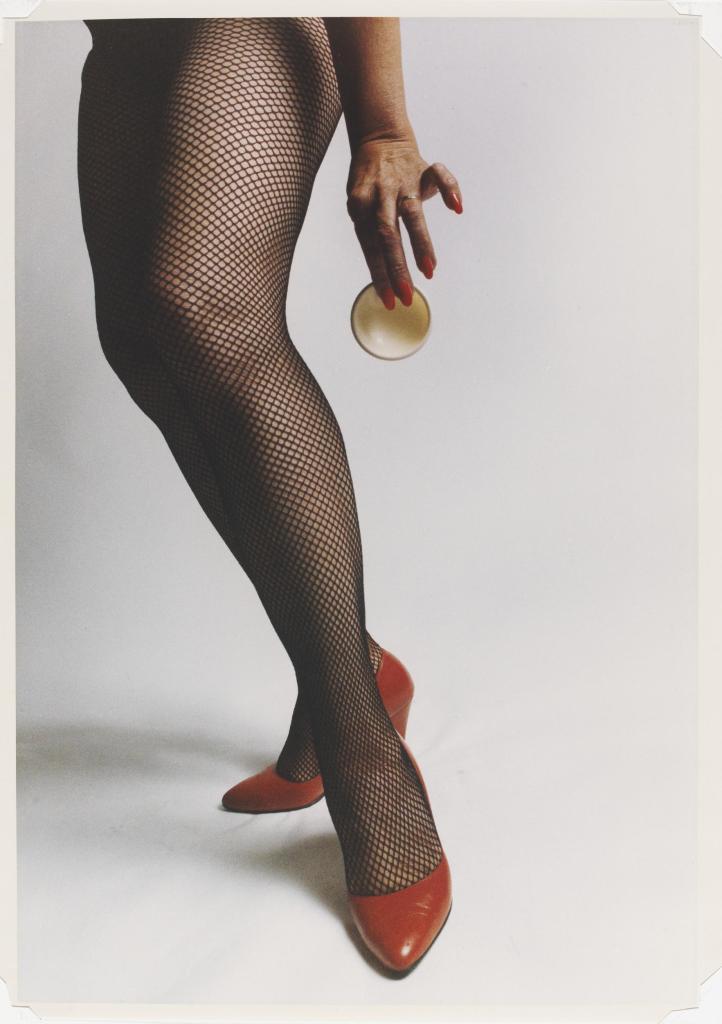
Jo Spence is a female, feminist artist who was diagnosed with breast cancer in 1982.
She made a series of self-portraits documenting her battle with the disease until she passed from leukemia a decade later. The photographs expressed her physical and emotional state. Her doctor and collaborator Tim Sheard explained, ‘Spence is representing the honest emotions felt living in an unruly body that cannot conform to the pressures of female perfection expected and idealised in Western society.’
Working with artist and psychoanalyst Rosy Martin, Spence developed a co-counselling practice they called ‘Phototherapy’, which aimed to resolve emotional issues, anxieties or past traumatic experiences through role play and photographic portraiture.
The Following Photos are from her collections, “Narratives of Dis-Ease” and “Libido Uprising“
I want to explore her work this week because I am interested in the human form and how it is or can be changed or altered. In the past I’ve also been quite interested in body altering techniques as well (corsetry/surgery).
Moreover, my mother suffered from breast cancer, and I saw first hand the psychological effects that it can have on a woman’s relationship with her body. I’m interested in exploring these kind of mind/body relationships
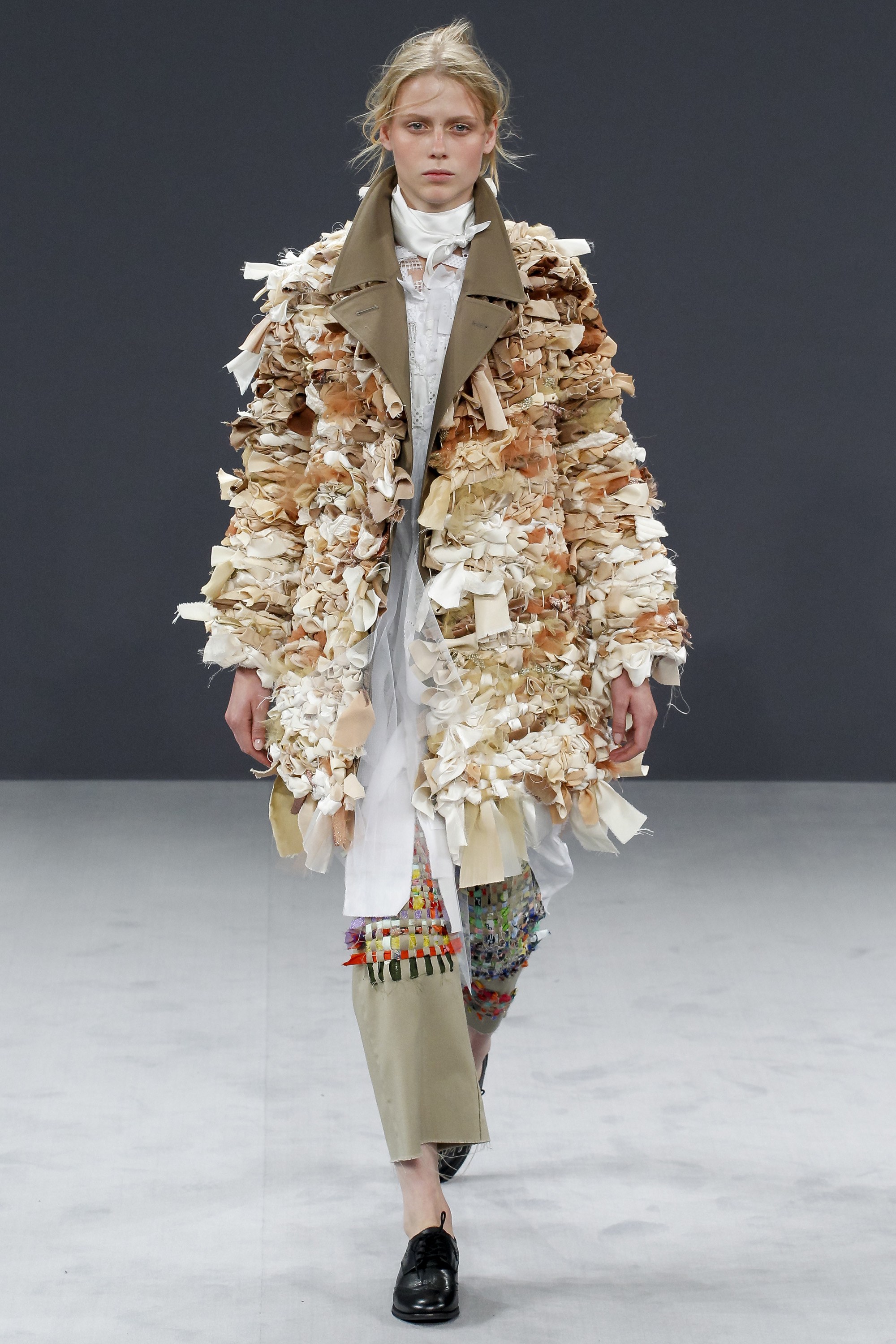
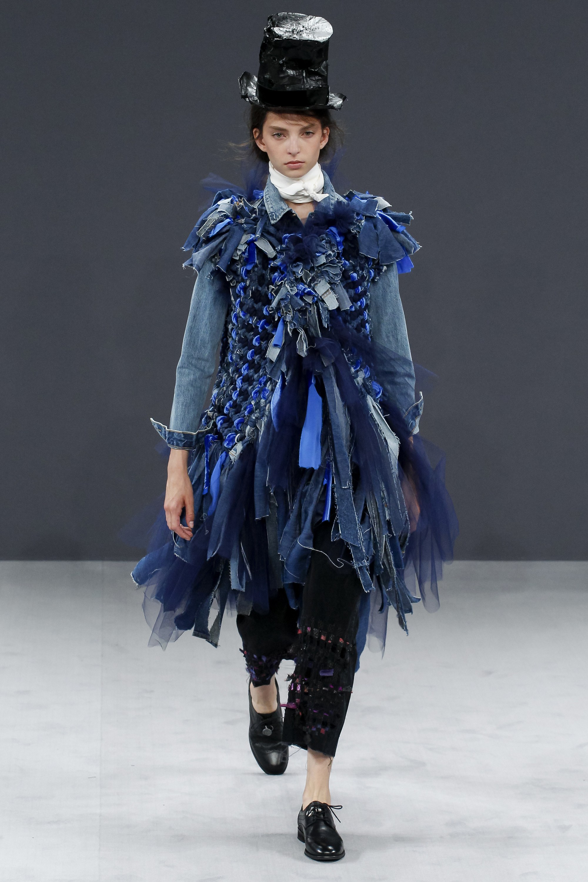
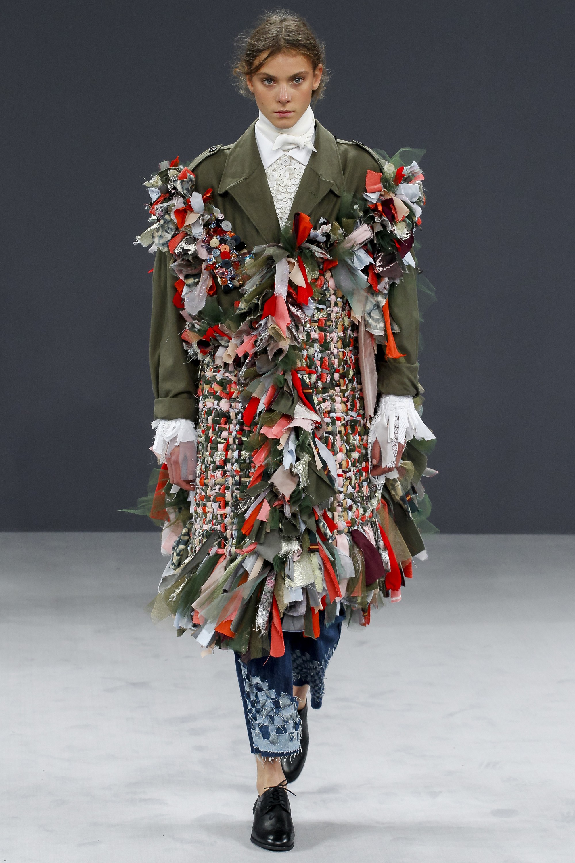
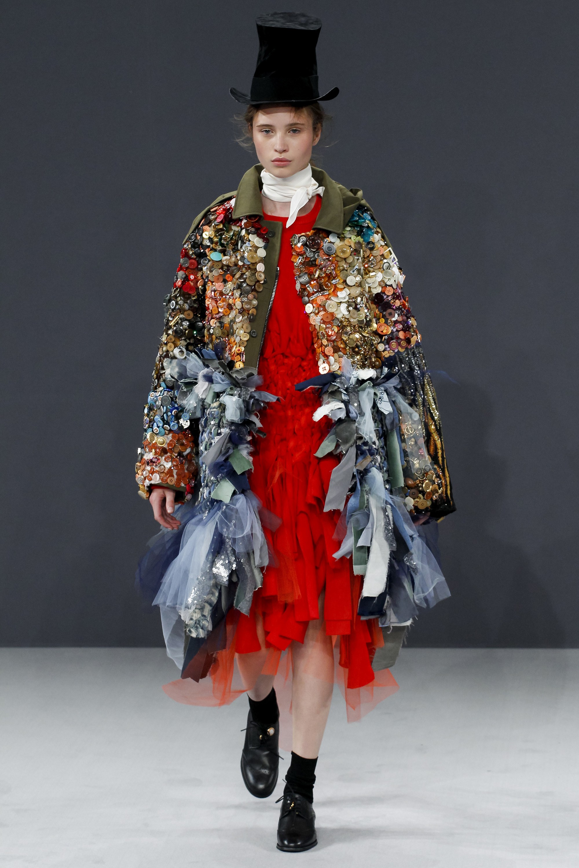
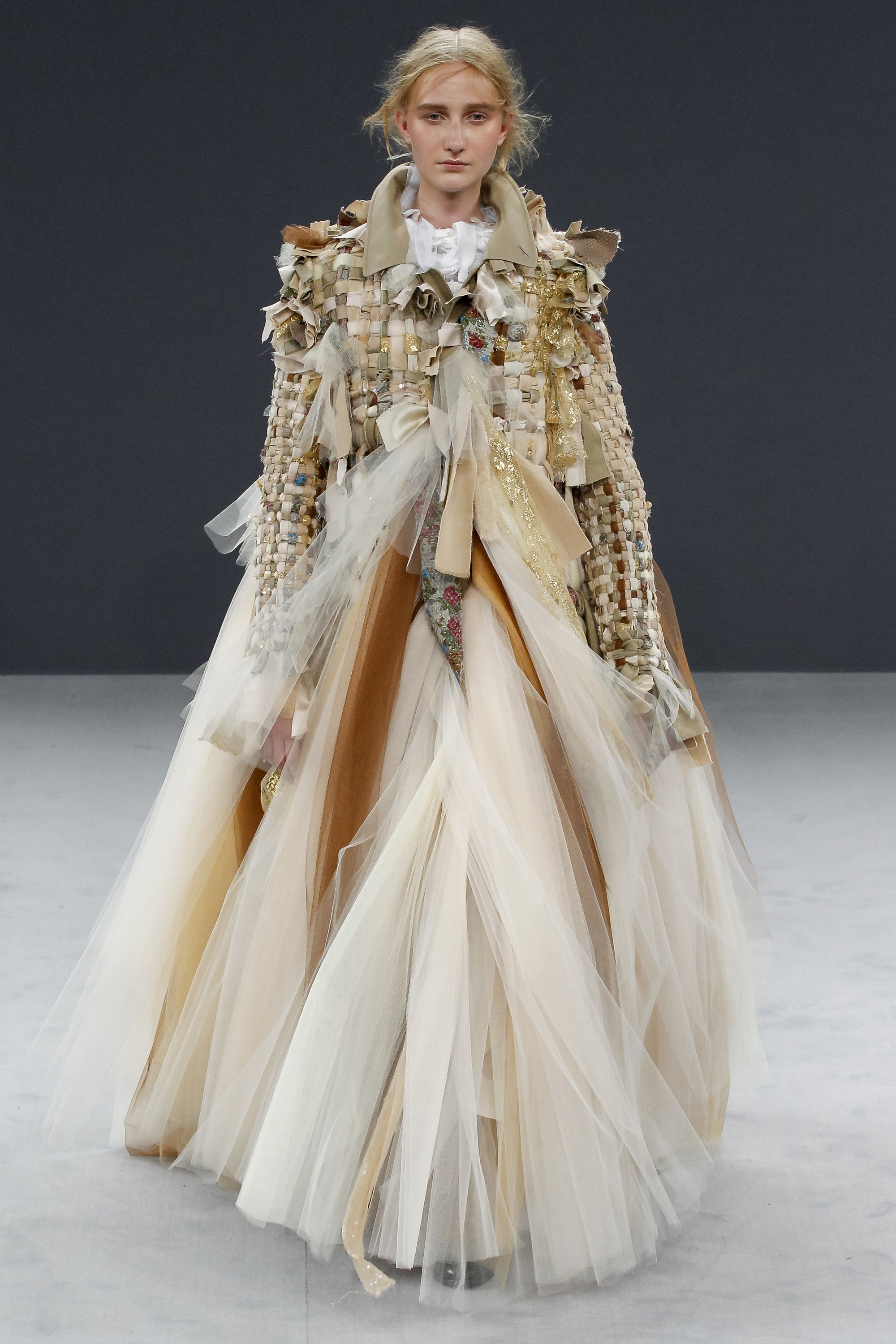
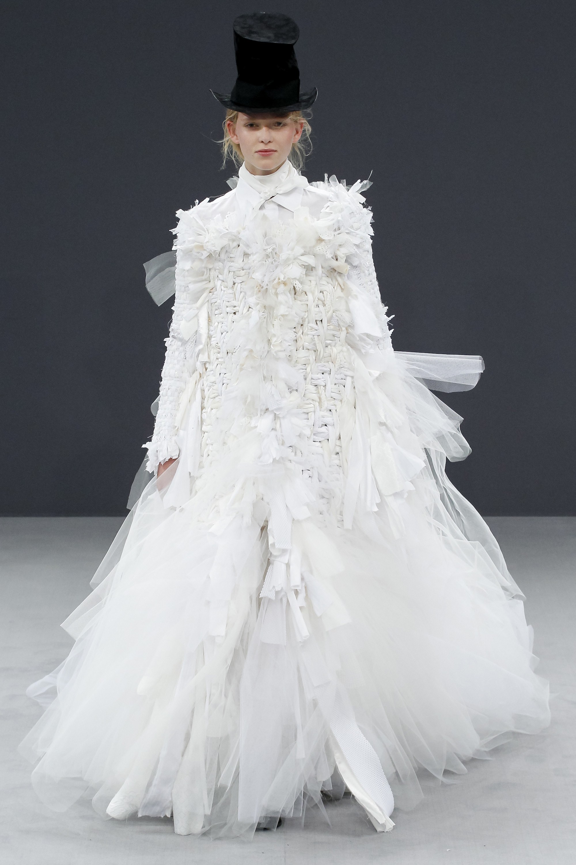
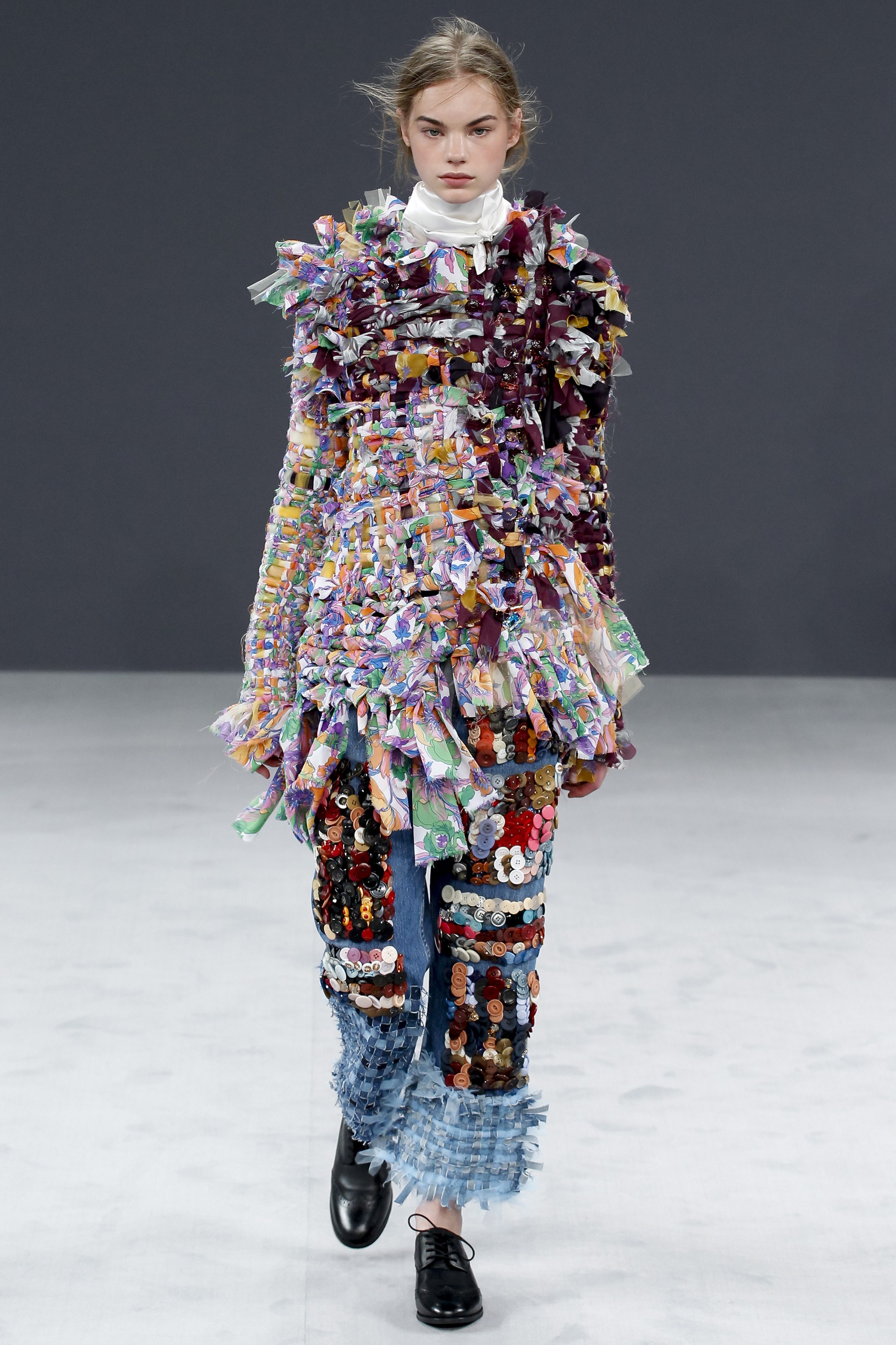
I was very interested in this collection by Victor and Rolfe, because couture design and “up cycling” seem like very distant ideas, but they executed it in such an lovely way. They basically tore apart old designs and used old pieces to create a new collection. I thought that the weaving techniques were interesting and could be related to the idea of cultural exchange.
I’m Struggling with how I could possibly push this technique further. I did some samples earlier, and while they are very visually intriguing… they don’t push anything too new.
I will keep this in the back of my mind as a technique, but I am a bit more excited about using large scale ropes or encased water.
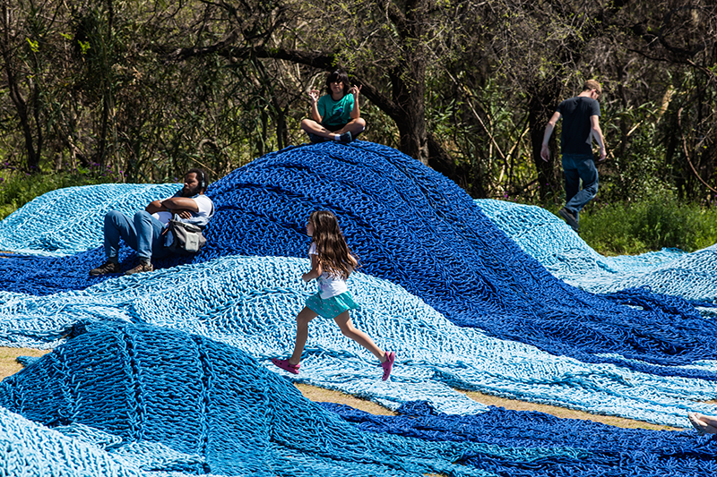
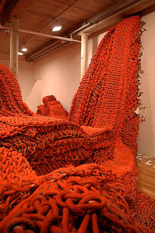
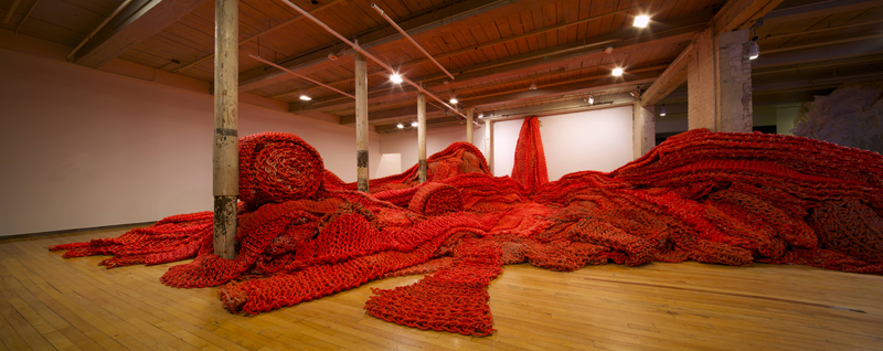
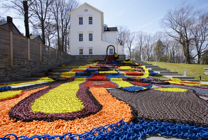
I wonder if I could do some large scale rope weavings.
I’ve taken a break from researching to create some material tests. My partner and I are interested in cultural exchange (and possibly observing how people greet each other) but we can’t seem to push that idea any further at the moment. We are taking a little break from discussing our topic to research and create some tests.
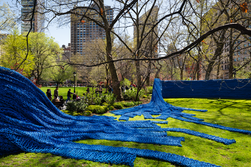
Texture wise, I was very interested in using rope, as I saw some cool looking fishing ropes at Borough Market.
An artist who uses fishing ropes in her work is Orly Genger. Orly is an American textile artist who uses knots and ropes on a very large scale. Her work is typically interactive installation work.
I would love to see this type of material (and scale) applied to fashion.
I think that in art, an artist’s attitude is the most important element. If an artwork is to touch someone, it must be the result of not only technique, but also the artist’s thinking and struggle in life. And the repeated struggles in life create artwork, no matter in what form.
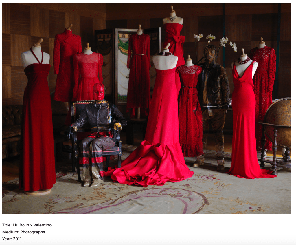
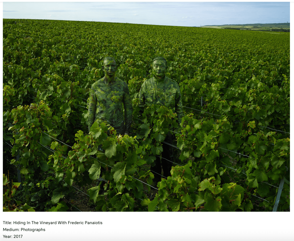
Lui Bolin
Bolin is a Chinese artist who studied sculpture at the Central Academy of Fine Arts in Beijing.
Liu Bolin explores the relationship between the individual and society by ‘disappearing’ into environments. Usually these sites are areas under intense criticism and debate.
Bolin adopts a protesting, yet reflecting method with his work. He questions issues like family planning, elections, food safety, law, and propaganda.
He has also addressed the issue of people being laid off from their jobs during times of economic crisis. He makes workers invisible in the place they have spend their entire life working.
So he asks himself:
“Why will I make myself invisible. What will making myself invisible here cause people to think?“
Things to Consider: Text integration; group participation; sustainability; education
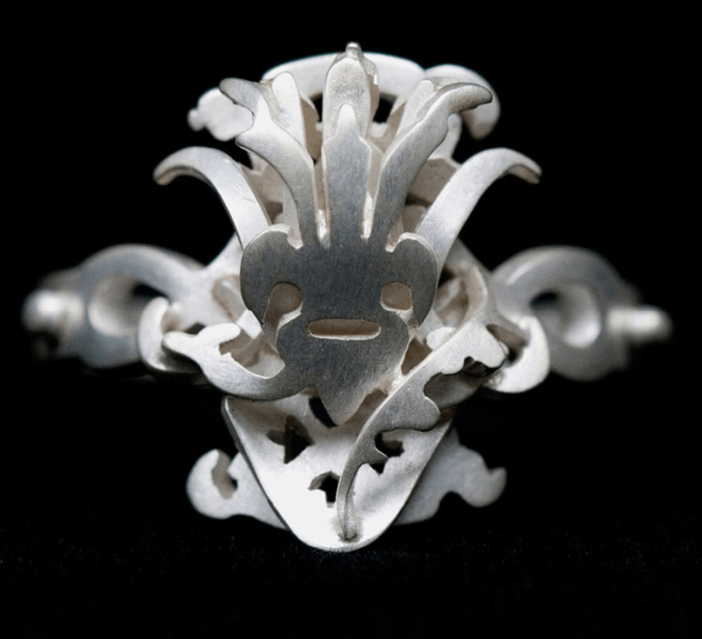
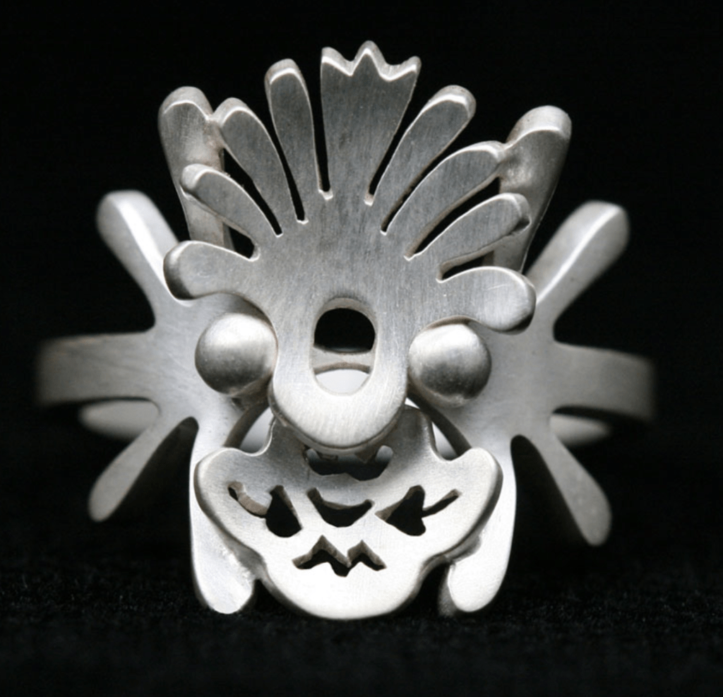
Gitte is a traditionally a, “jewelry artist” who hopes to create conversations about humans’ relationship with everyday objects. Her work explores objects that are surprising and often overlooked. She creates everything from functional objects to project based collaborations and commissioned pieces.
Gitte graduated in 1998 as a goldsmith from the Danish College of Jewelery and Silversmithing, and in 2002 in Art Jewelery from the Gerrit Rietveld Academy in Amsterdam.
One of the things most apparent about Nygaard is that she is a master at documenting her work: her photographs are amazing and compelling.
These First two pieces are from her collection BODONI where she abstracts text and uses it in her jewelry. I found this interesting because streets of big cities are often littered with street signs and text is used almost everywhere.
These next pieces (a part of her collection: Makers Move) really inspired me because the process is so inclusive. I love how she invites the public to be a part of her work. I am often saying that I wish more people knew how to sew or knew anything about, “making” so they could understand both how difficult it is and how important it is to preserve traditional craft and the ability of people to work with their hands.
It may be interesting to invite the public to be a part of this next piece (and record everything on video).
I really like how Nygaard talks about mending the relationship between maker and wearer AND wearer and object. This could be tied back into the idea of sustainable fashion because the public is being educated on process, how to make things, how difficult it is to make things, etc.
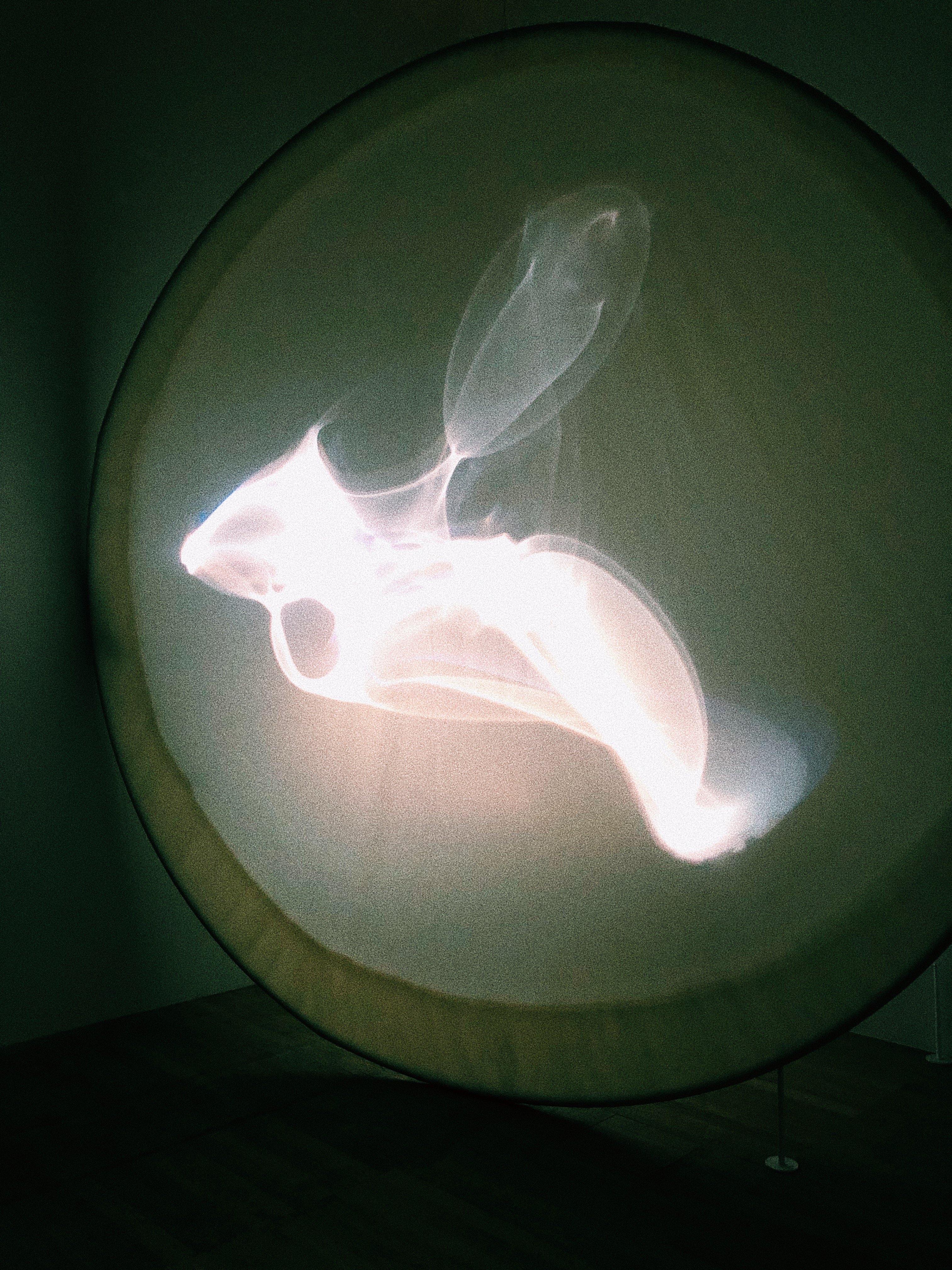
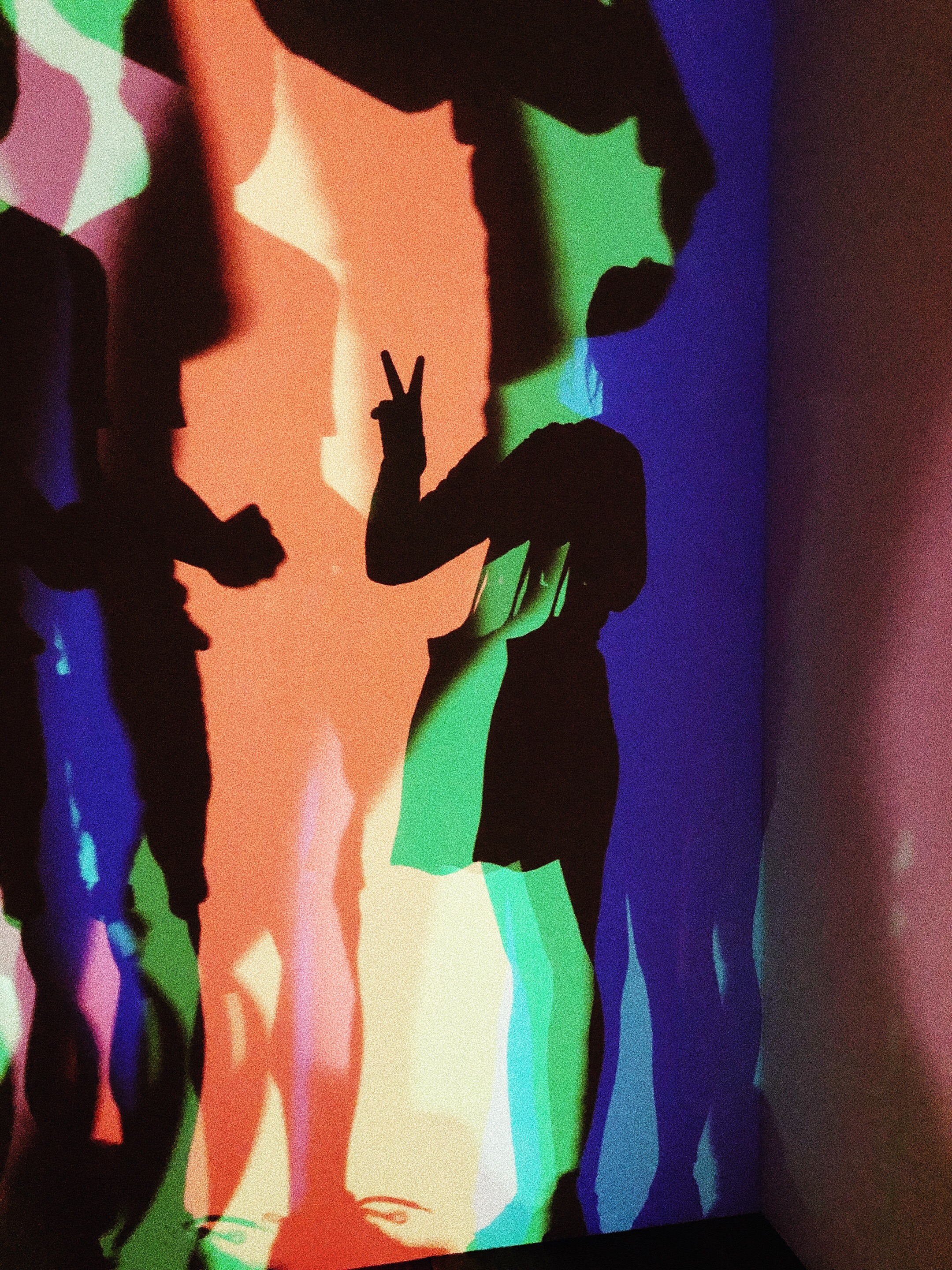
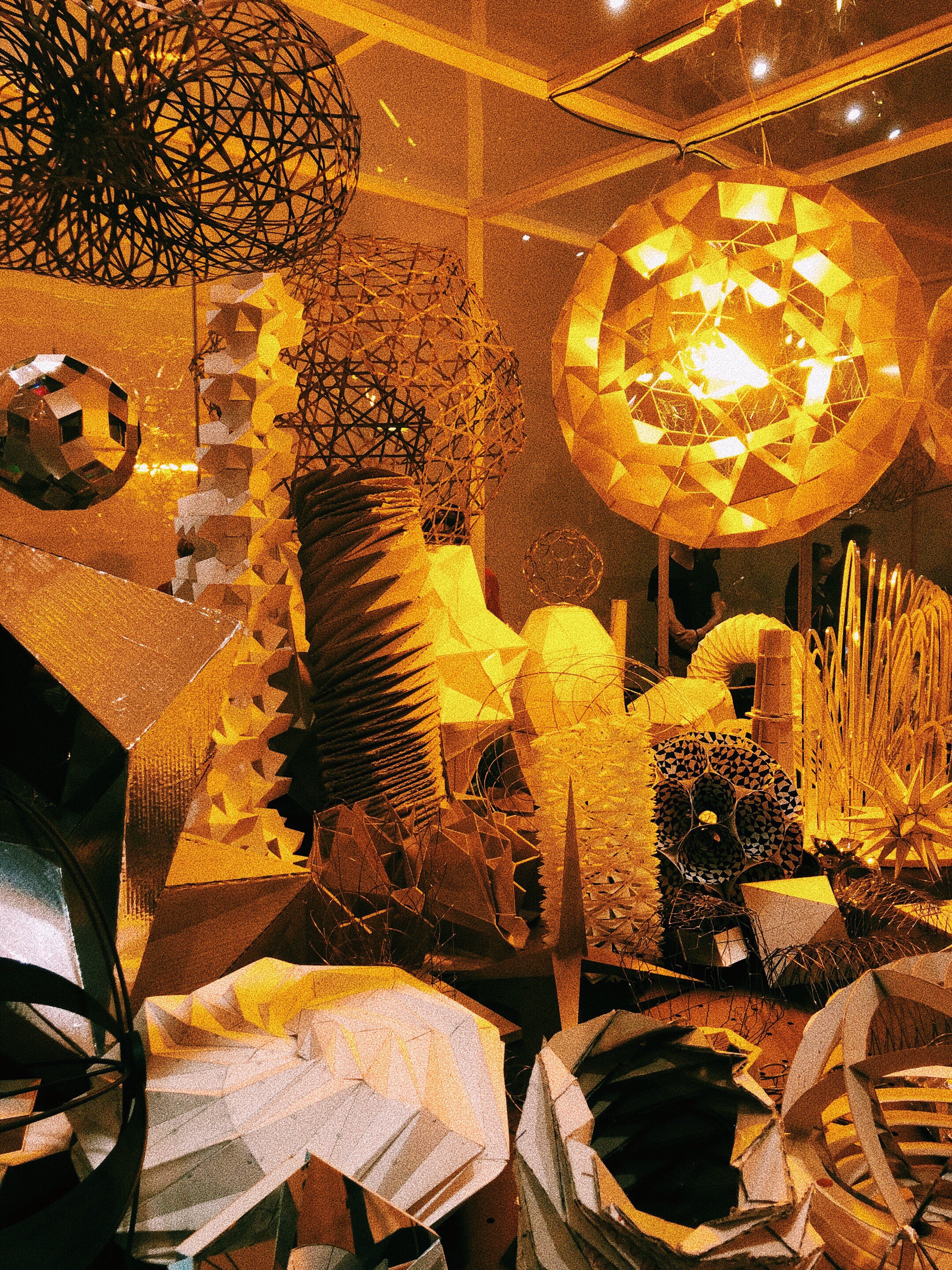
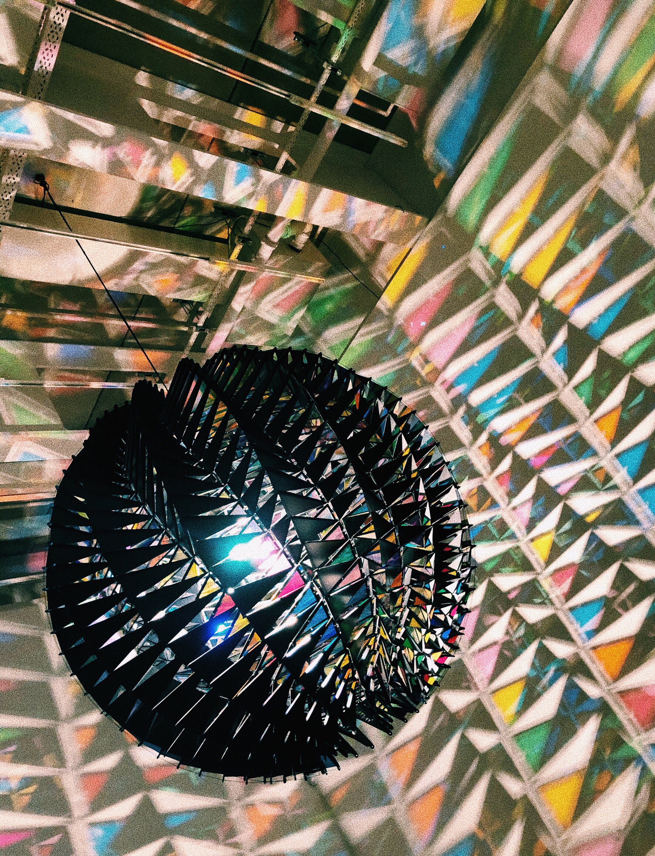
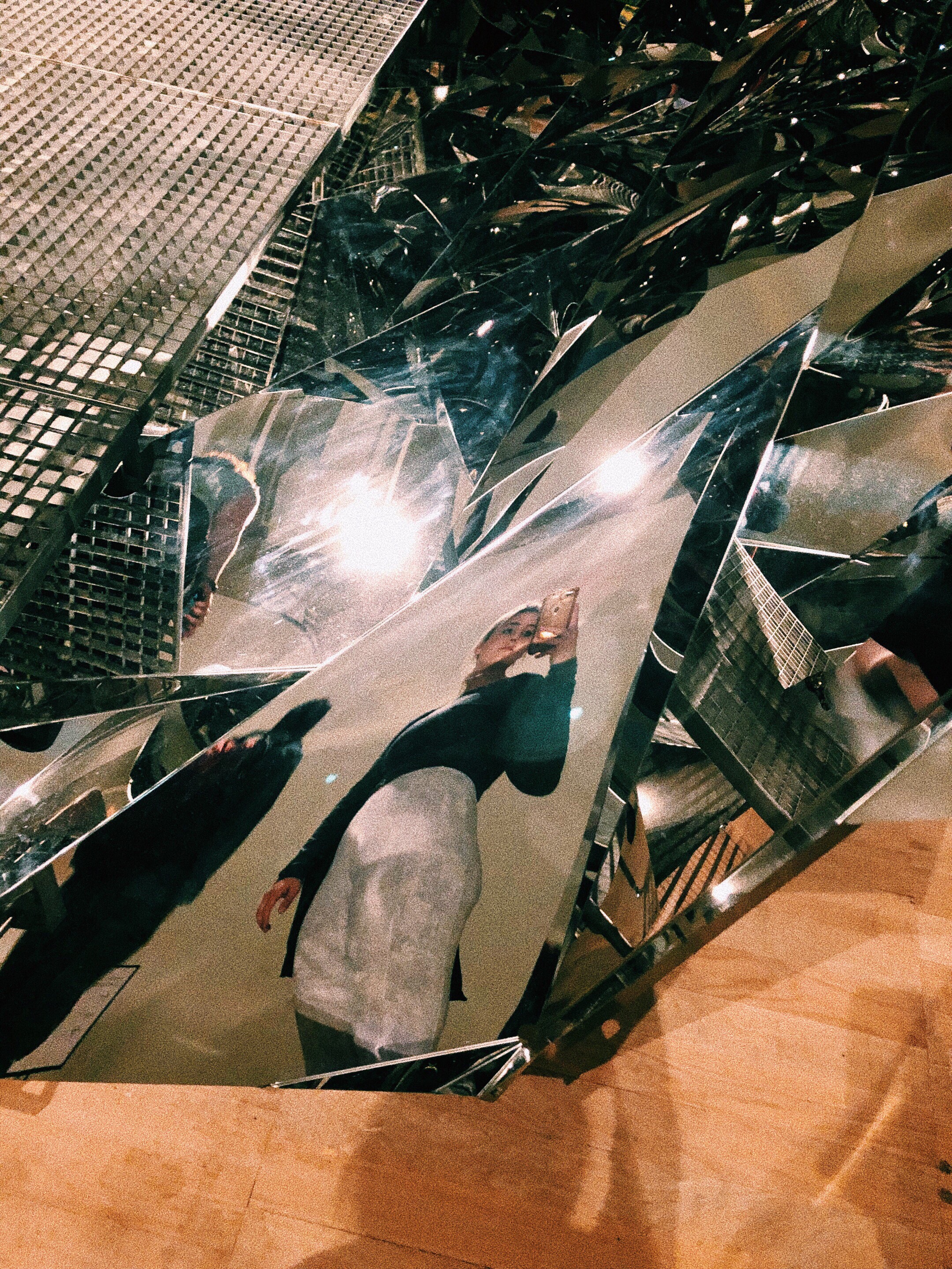
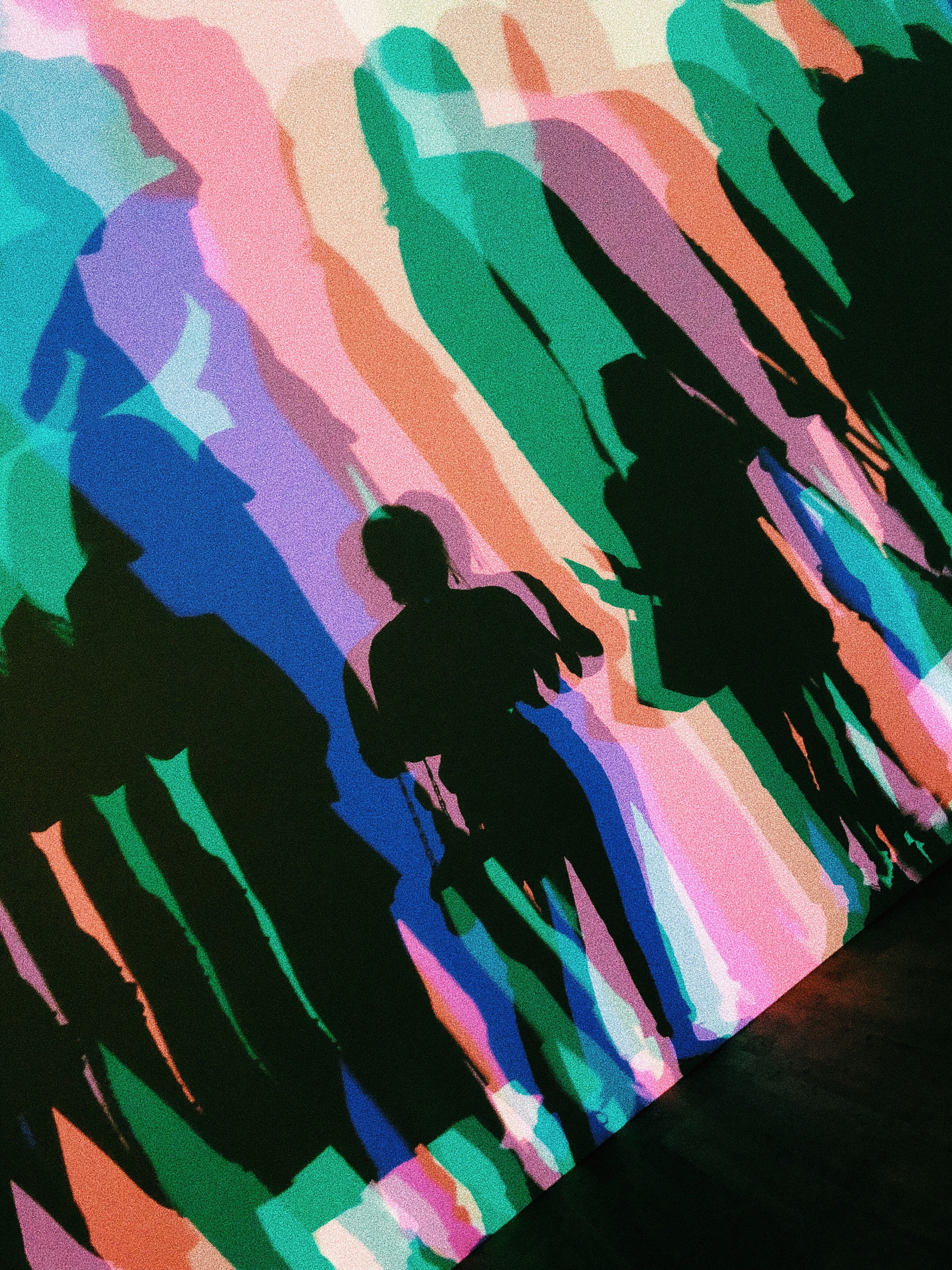
This exhibition was probably one of the best immersive/interactive exhibitions that I have ever been to in my life. Eliasson focuses on nature, interaction, and geometry through a variety of different techniques and mediums. I loved to see Your Uncertain Shadow (2010) in action, because people were collectively moving and smiling. This piece (and most of Eliasson’s work) is truly something that needs to be experienced.
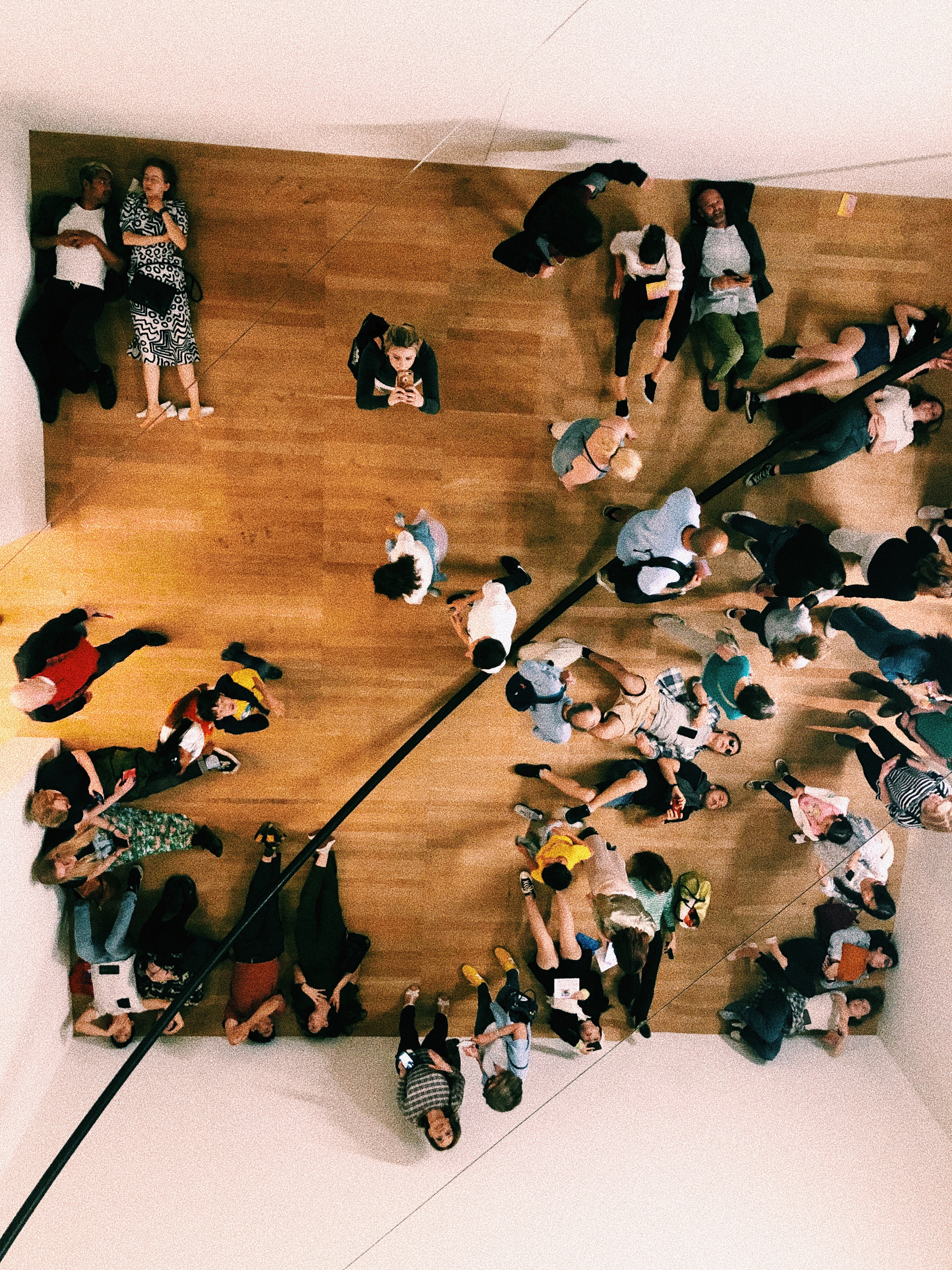
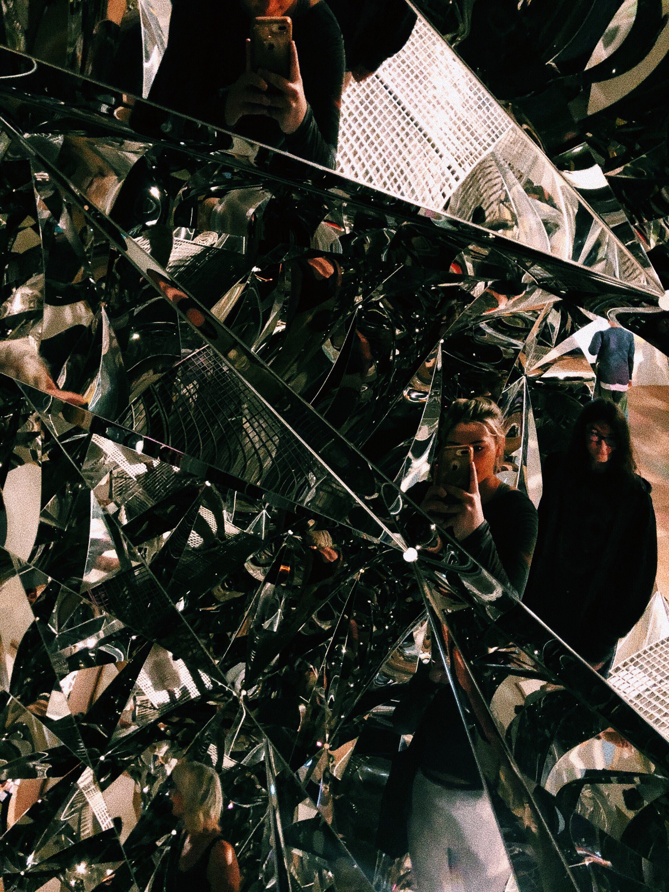
I also enjoyed How do we Live Together? (2019) because the mirrored effect was seamless. The effect was so enigmatic in a way.
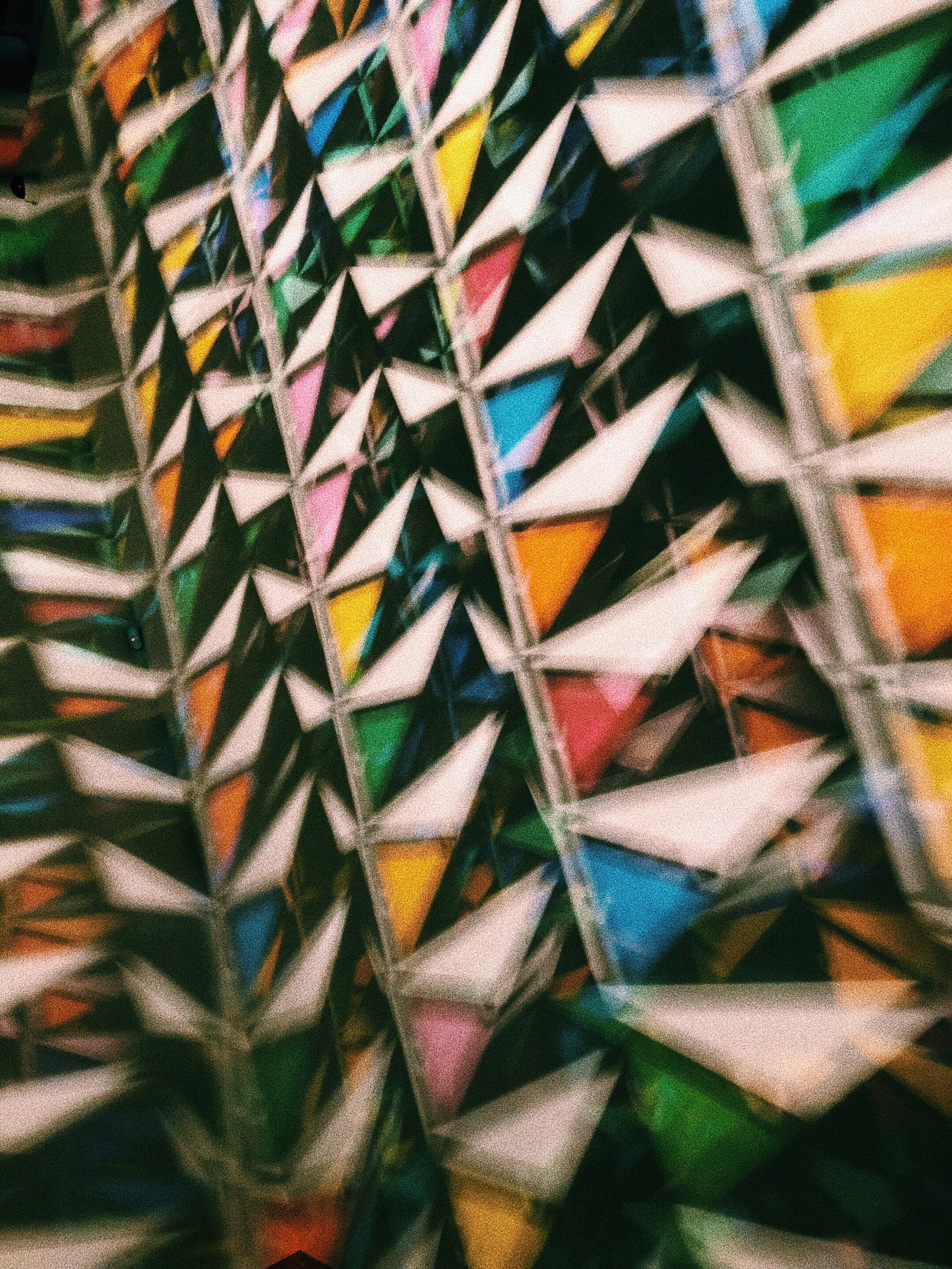
Eine Beschreibung einer Reflexion, oder aber eine angenehme Übung zu deren Eigenschaften (1995)
How do we live together; 2019
Your uncertain shadow (colour); 2010
Part of a process board
Model Room 2003
Your Spiral View
How do we all live together; 2019
The Glacier Series 1999
Your Planetary Window; 2019
In Real Life; 2019
In Real Life; 2019
Your Spiral View; 2002
Your Uncertain Shadow; 2010
My favorite however, was the Big Bang Fountain (2019). There were no photos allowed, so I have attached this video:
Eliasson is so good at involving all the senses in his work. I was completely bamboozled as I watched this piece. In person, you cannot tell that it is water because the room is so dark. It was mysterious and beautiful. Also, the cool air jutting out from the table, and the sound effects added to the sensory experience.
I think Eliasson my be my favorite contemporary artist. It is obvious that all of this works are so well thought out and considered.